
It Looks Like a Toyota:
Educational Approaches to Designing for Visual Brand Recognition
Toni-Matti Karjalainen
Decode Research Group / BIT Research Centre / Helsinki University of Technology, Espoo, Finland
Corresponding Author: toni.karjalainen@hut.fi
The aim of this descriptive paper is to suggest an educational approach and analytical methods that are useful in helping students grasp the theme of design for visual brand recognition. Visual recognition of brands and products has become a central competitive factor within various product categories. Companies must develop products with designs that not only appear attractive but also carry distinctive references to the ‘character’ of the brand, manifest in defined core values. This paper suggests that such ‘value-based’ design features involve explicit or implicit references, and depending on the brand’s strategic approach, can be consistently or flexibly used over the product portfolio. To be better prepared to face the challenges of design practice, design for visual brand recognition is a theme that needs to be embraced by new approaches also in design education. To meet the aim of the paper, examples of student projects are presented. They were co-organised by the author at the Chalmers University of Technology in Sweden in 2004 and 2005. Through projects, students analysed visual design strategies of selected brands and created new fictive design concepts on the basis of their analyses. In addition to educational contribution to the field of design, these exercises generated insightful qualitative data concerning the design of visual brand recognition, open for further exploration and development of research approaches.
Keywords - Brand Identity, Design Semantics, Education, Product Design, Visual Recognition
Relevance to Design Practice - The paper presents approaches and practical methods for design analysis that, in addition to educational contexts, are applicable to design practice. Insights into the visual recognition of selected brands are also provided.
Citation: Karjalainen, T. M. (2007). It looks like a Toyota: Educational approaches to designing for visual brand recognition. International Journal of Design, 1(1), 67-81.
Received November 16, 2006; Accepted January 23, 2007; Published March 30, 2007
Copyright: © 2007 Karjalainen. Copyright for this article is retained by the author, with first publication rights granted to International Journal of Design. All journal content, except where otherwise noted, is licensed under Creative Commons Attribution-NonCommercial-NoDerivs 2.5 License. By virtue of their appearance in this open access journal, articles are free to use, with proper attribution, in educational and other non-commercial settings.
Dr. Toni-Matti Karjalainen works as a Project Manager in the Decode Research Group at the Helsinki University of Technology, Finland. He holds a Doctor of Arts (Art and Design) degree from the University of Art and Design Helsinki and an M.Sc. degree from the Helsinki School of Economics. He worked as a visiting lecturer at the Chalmers University of Technology in Gothenburg, Sweden, from 2004-2007. In addition, Dr. Karjalainen lectures and holds workshops in various universities and schools all over the world and works in close collaboration with a number of Finnish and foreign companies. He is the manager of the Nordcode research network in Scandinavia. Toni-Matti Karjalainen’s research focus is on visual product and brand identity, product design, and new product development. His research has been presented in numerous conferences, books, and articles. More information can be found on his research page: http://decode.tkk.fi/tonimatti/research.html.
Introduction Product Design and Brand Recognition
Would you be able to recognise a product designed by BMW, Citroën, Jaguar, Porsche, Toyota, or Volvo? How about Apple, Bulgari, Caterpillar, Nike, Nokia, or Sony? Playing the game the other way around, what are the design features that you would consider typical for these brands?
Within various categories of consumer goods, it is easy to name a number of brands that are not only known for high quality products but also for their recognisable design. These brands use specific design features consistently over their product line-ups. Through design consistency, brands can become solid and unmistakeable. Most importantly, consistency also helps them nurture visible difference from their competitors, and product differentiation is what makes brands prosper or wither.
The emphasis of this article is on the visual dimension of design, which plays a critical role in the initial consumer perception and evaluation of product properties, as well as in the eventual product choice (Veryzer, 1998). Visual features catch our attention in shop displays, advertisements, magazines, and various other media, and direct our interpretation by linking specific associations and qualities to the product in question. In other words, design functions as a prior media to influence product and brand categorisation and to shape consumer beliefs about products and brands (Berkowitz, 1987; Bloch, 1995; Bouchenoire, 2003; Kreuzbauer and Malter, 2005). When we recognise a product, for instance, as an Apple, we attach, consciously and subconsciously, specific functional and symbolic qualities to the product and expect it to appear, feel, and function in a certain way. In addition to informing us about functional product properties, design acts as a carrier of various symbolic meanings. These meanings make customers feel more attached to products and, as in Apple’s case, can even contribute to the creation of entirely new lifestyles and social phenomena.
Semantic Transformation From Brand Characteristics to Design Cues
With regard to developing and maintaining brand recognition, design involves two important aspects: attractiveness and strategic meaning creation. Firstly, by simply developing visually attractive designs, companies can substantially strengthen their brand image (Page and Herr, 2002). Secondly, product design can be used strategically to foster favourable brand identity and to create brand value (Schmitt and Simonson, 1997; Stompff, 2003; Borja de Mozota, 2004). Designers can encode intentional meanings into products that, as a result, target customers then interpret in a favourable manner. By managing selected design features strategically and consistently, companies can substantially impact on the visual recognition of their brands (Warell, 2001; Pugliese and Cagan, 2002; McCormack and Cagan, 2004; Karjalainen, 2004).
Value-Based and Artificial Design Cues
Visual recognition can be achieved through various design features. Companies can select features, such as shapes, forms, colours, materials, surfaces, textures, graphical elements, and logos on the basis of their ‘plain’ attractiveness and simply use them repeatedly to create recognition. However, the intentional approach of strategic meaning creation suggests that brand design cues should be ‘value-based’ in order to contribute to a solid and consistent recognition. Value-based design cues evoke references that are closely linked to the brand’s core values. For example, BMW uses strong shapes and dynamic forms in its cars that clearly communicate the BMW values of power and performance, equating making BMW cars to “ultimate driving machines”, as the brand slogan has suggested.
A close link between design features and brand has also been illustrated by Ravasi and Lojacono (2005), who state that the brand’s design philosophy, including visual design features, should embrace the company’s competitive scope and strategic intent. As the authors continue, the unity of intent and consistency of action are starting points for successful design. In particular, design has a strong potential of evoking symbolic associations to support brand values (Creusen and Schoormans, 2005).
If the link between design references and brand core values are missing, design cues may be perceived as ‘artificial.’ The famous kidney-shaped grille of BMW is an example of an artificial design cue. Its appearance does not directly relate to BMW-specific values. Nonetheless, as the BMW case shows, artificial design cues can also become powerful signs of recognition when consistently used.
Brand character and design features
Symbolic associations and, in general, the meanings generated by design features are central points of interest within design semantics. There appear a variety of semantic or related approaches to product analysis intended to help designers understand how meanings are embodied in products (Krippendorff, 1989 and 2005; Monö 1997; Muller, 2001; Vihma, 1995; Steffen, 2000; Wikström, 2002; Karjalainen 2004). Brand recognition can be regarded as a special area of application within design semantics. The key question is how value-based design features can be constructed; in other words, how brand-specific meanings are evoked through design features. This concern implies the process of ‘semantic transformation’ (Karjalainen, 2004) in which qualitative brand or product characteristics get embodied in various physical design features of a product (see Figure 1). On the level of language, specific characteristics, often manifest as core values, are linked to specific brands and thus constitute the brand ‘character’. Volvo, for instance, is characteristically safe, Scandinavian and dynamic, whereas Nokia aims to be perceived as personal, friendly, and human (Karjalainen, 2004). The trick is to transform this character into the physical domain by designing deliberate semantic references to products.
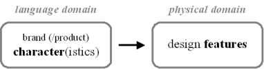
Figure 1. Semantic transformation occurs between the domains of language and physical reality, as design features are being created that carry semantic references to brand or product character.
Interestingly, brand character is not just a theoretical remark. For example, GM has named the organisational unit that integrates various design and branding activities of different GM brands as the “Brand Character Center” (Bouchenoire, 2003).
Explicit and Implicit Cues within Product Portfolio
Developing recognition requires more than one product. In order to create a distinctive identity and foster consistent associations, companies need to nurture visual consistency over their current portfolio and successive product generations. Consistency is fundamentally embedded already in the definition of recognition that proposes the idea of “re-cognition, cognitizing again, identifying something by its kind” (Krippendorff, 2005).
In practice, companies have a variety of strategic alternatives at their disposal as visual consistency and recognition are concerned. Inconsistency, manifest through revolutionary design, can itself act as a strategic principle and form the basis of recognition in some cases. At the other end of the spectrum, companies may find tight consistency as the most feasible strategy. Between these extremes, there are naturally numerous strategic variations. The selection of the most feasible strategy seems to be an industry-, company-, and context-sensitive issue, to which generic guidelines are difficult to formulate.
Products can be designed to carry explicit and implicit references (or simply called as explicit and implicit design cues) (Karjalainen, 2005; Crilly, 2005). Explicit visual references are embedded in the design features designers implement with the intention to be immediately perceived and recognised. For example, Volvo has defined explicit design cues that are used consistently over their entire product portfolio (Karjalainen, 2004). These include the strong ‘shoulder’ line, the V-shaped bonnet, the characteristic front with the soft nose and diagonal Volvo logo, the rear with its distinctively carved backlight, the flowing line from roof to boot-lid, and the third side window (see Figure 2).
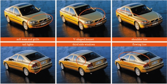
Figure 2. Volvo design cues, presented through the S60 model in the figure, are consistently used throughout the entire Volvo product portfolio.
The use of explicit cues is a rather straightforward task. Companies can simply repeat them from a product to another to create recognition, if that is the chosen strategy. In many cases, however, too much repetition can result in undesirable outcomes. Balancing between familiarity and novelty, and choosing between static, evolutionary and revolutionary design approaches are key concerns. Moreover, it should be noted that a ‘good’ design is not a collection of some predefined parts. It’s the global impression of a product that matters in terms of communication (Srinivasan et al., 1997; Yamamoto and Lambert, 1994).
In designing value-based references that also provide products with ‘fresh’ appearance and the overall impression of a high-quality design, the concept of implicit design cue is needed. Implicit (qualitative) references, or combinations of references, are not readily distinguished but implemented with the intention to be inherently perceived and recognised. They involve merely inherent associations - denoting the generic ‘design philosophy’ of the brand - that are related to the overall reputation, image, and appreciation of the brand and its products. Whereas explicit cues embody references that everyone can see, implicit cues comprise references that cannot be distinguished but, when used, ‘make sense’. Implicit cues are always value-based in this framework. If they fail to communicate the brand character, recognition is not supported.
Implicit cues can be embedded in a variety of different features. For instance, in the Volvo case, specific shapes are used to refer to characteristics, such as safety, dynamism, and Scandinavian design heritage. There are potentially a variety of different shapes that can be used to refer to these characteristics. For instance, Volvo could use alternating design features to denote Scandinavian design heritage in its cars. Such features could be classified as implicit design cues for Volvo, because they clearly refer to the Volvo core values even though they change in form from one product to the next. If these same shapes are repeatedly used in the brand’s products, they become explicit cues.
Conceptual Framework
Figure 3 summarises the main conceptual themes approached in the student exercises that will be next presented. The notion of semantic transformation concerns creation of design features that embody references to the brand character and, in particular, the defined core values. Such value-based design cues can be implicit or explicit. The generic product portfolio strategy of the brand is another central dimension. To build visually consistent portfolios, explicit design cues (value-based or artificial) are used. A flexible strategy allows the use of varying design features in which brand recognition is created through implicit cues.
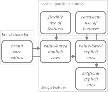
Figure 3. Main conceptual themes approached in the student exercises.
Approach of Chalmers Projects
Managing visual brand recognition is a demanding and complex task. Managers and designers must possess a firm knowledge of the markets in which the brand operates and apply this knowledge to the design of new products in a manner that is also strategically feasible. They need to internalise the construction of visual recognition in the specific case of their brand and products in order to apply it successfully. As suggested earlier, the use of explicit design cues is a fairly straightforward activity after the generic strategic decision concerning the feasible degree of visual consistency has been made. Successful use of implicit cues, in turn, requires inherent knowledge that is highly context-sensitive.
To grasp the theme of design for visual brand recognition in design education requires approaches that prepare future designers and design managers in facing the challenges that different companies and product contexts pose. During their studies, students have to be predisposed to lots of different real-life cases. Educational approaches should comprise both structured analyses and creative exercises that make students better equipped to ponder the semantic dimension of product design. This increases their capabilities to design both attractive and strategically feasible products.
Development of visual brand recognition through design is a theme that has been explored in the Master-level ‘Visual Brand Identity and Market Analysis’ course that is offered by the Chalmers University of Technology, in Gothenburg, Sweden. It belongs to the International Master’s Program in Automotive Industrial Design Engineering. The course includes a student project in which student groups (2-4 persons per group) analyse selected brands and create new design concepts. Similar projects, with a varying focus though, were co-organised by the author also at the University of Art and Design Helsinki in 2000 (see Karjalainen, 2001) and 2003.
To follow the main conceptual themes discussed in the previous chapter, a two-step approach is suggested (see Figure 4). This was used in the projects carried out at Chalmers in 2004 and 2005 (see also Karjalainen & Warell, 2005 and Karjalainen et al., 2006). The aim of the first assignment was to describe and define the core values of the selected brands. Moreover, their products and product portfolios were analysed to define the explicit and implicit design cues. To grasp the semantic transformation process in terms of creating value-based design cues, a creative design assignment followed the first part. There, students were asked to design fictive products, based on selected core values they had defined for the brands.
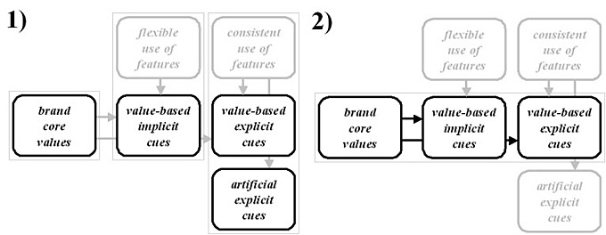
Figure 4. Two-step approach was used in the Chalmers projects. In the first part, brand core values and strategic use of visual product features (vertical dimension) were analysed. In the second part, the process of semantic transformation (horizontal dimension) from core values to value-based design cues was explored.
Analysing Brand Characters and Design Cues
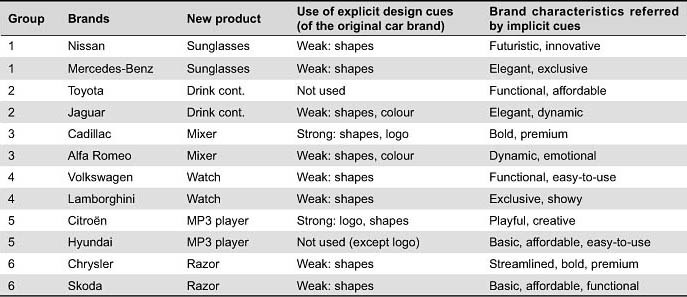
The focus of the first assignment was on defining the character and visual portfolio strategy of selected brands. In 2004, only automotive brands were analysed, but in 2005, the projects also included other brands (see Tables 1 and 2).
Core Values
First, the groups were asked to define the character of their two brands. The primary goal was to define the core values of the brands, not, however, only settling for the characteristics that the companies themselves promote as their core values. Analyses covered the positioning, target customers, and heritage of the brands, not forgetting the images that the students and their peers themselves had of these brands and their products.
The groups were encouraged to apply a variety of methods presented during the course and to develop their own creative methods for visual analyses. Support for brand analyses was offered by a variety of frames that were provided in the lectures or found within brand management literature (e.g., Kapferer, 1992; Aaker, 1996; Aaker and Joachimsthaler; 2000, Upshaw, 1995; Schmitt and Simonson, 1997; Urde, 1999; Upshaw and Taylor, 2000; Neumeier, 2003; Bedbury, 2003; and Wheeler, 2003). Analysis data was gathered from various sources, including through interviews, web pages, dealership visits, research literature, popular press, brochures, and workshops. The overall aim was to provide rich comparisons of the two selected brands. In 2004, the task was to find essential differences between the two automotive brands, whereas in 2005, the predominant goal was to try to locate similarities between the selected car brand and that of a brand from a very different product category (see Tables 1 and 2).
The core values defined in this exercise thus resulted from an extensive analysis of the brand character. In some cases, they may be biased, as the students had much freedom in their analyses and definitions. The purpose of the exercise was not to validate the ‘canonical’ values the brands promote, but students were asked to apply a variety of viewpoints in their analyses. In the end, probably resulting from the fact that all the selected brands had rather strong and established images, major disagreements did not occur.
Explicit Design Cues
After defining the brand core values, emphasis was placed on the analysis of visual design cues and visual design history of the brands. Definition of explicit design cues that the brands use over their product portfolios (usually limited to selected products) was stressed in the exercise. As the main visual method, the approach of Design Format Analysis (DFA), developed by Warell (2001), was used (see Figure 5). DFA explores the occurrence of selected design features among a variety of products. This method is useful in analysing the explicit cues that construct the visual recognition.
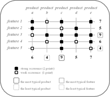
Figure 5. Application of the Design Format Analysis (Warell, 2001) was used as the primary approach in the visual analysis of brands’ product portfolios.
In the DFA process, a number of design features are first selected. Selection can be based on various criteria. Features that are deemed most important or otherwise relevant for visual recognition are selected from an initial analysis of products either through subjective selection or through more objective approaches. Features that the company itself has defined as the brand’s design cues can also be a good starting point for the selection. After the features are defined, selected products are next examined to determine whether or not they incorporate these features. The analysis can also start by examining products one by one to define the different features they entail and gradually constructing the grid. Various features, such as shapes, materials, and colours can be analysed through the DFA method. In the student exercises, shape and form features were most commonly used.
Figure 5 suggests a systematic use of DFA. Strong occurrence of a specific feature in a specific product can be marked, for example, with a black dot (e.g., product “a” incorporates feature “1”) and weak occurrence with a white dot (e.g., product “b” incorporates feature “4”). By summing up all the occurrences (e.g., black dot scoring 2 points and white 1 point), design features and products can be ranked in terms of their importance for visual brand recognition. In Figure 5, product “c” is the most typical product, and feature “3” is the most typical feature within this analysis.
DFA is of a qualitative nature and allows for flexible applications. The basic principle presented here can be adapted to different case-specific purposes. It can be used systematically to generate semi-quantitative data, although this is not the primary purpose of the approach. Reliability of the results is a problem, because they strongly depend on the selection criteria of included features and products. The occurrence of features in products (strong, weak, not at all) is also often based more on subjective evaluation than on exact measurements. The qualitative nature of DFA and its potentially biased results suggest that the method offers the strongest contribution when used for communication purposes, whether among designers or between them and other parties. DFA can boost insightful discussions with regard to the construction of a brand’s visual recognition. Moreover, DFA is predominantly a reactive analysis method but can also be proactively used, for instance, when planning the future product portfolio strategy of a certain brand.
DFA proved to be a useful educational tool. By using this method, students were able to identify the explicit design cues that the brands are recognised for and find the most typical products of the analysed brands. The method was used in various ways, ranging from light to extremely detailed analyses. In Figures 6 and 7, DFA of Toyota and Apple are presented as examples.
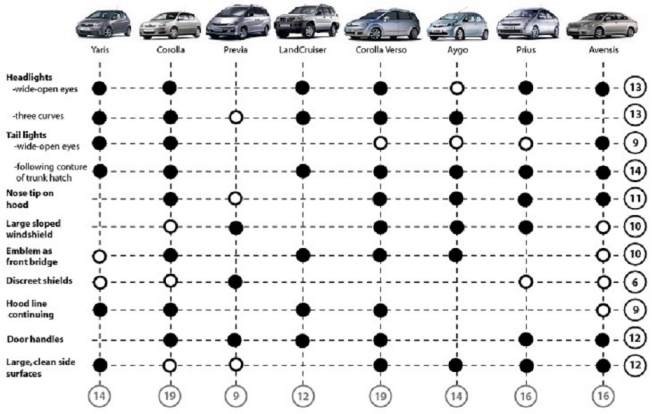
Figure 6. Design Format Analysis of a selected part of Toyota portfolio performed by Group 1/2005 (Ida Ljungman, Karin Lodin, and Karolina Starodub). As the analysis suggests, features such as “following couture of trunk hatch on tail lights” and “headlights with wide-open eyes and three curves” were deemed central for the recognition of Toyota. The Corolla and Corolla Verso were suggested as the most typical Toyota models.
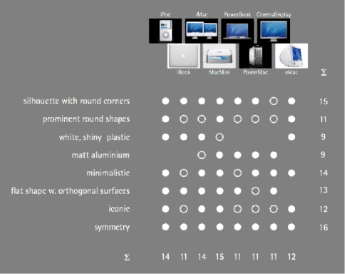
Figure 7. Design Format Analysis of selected Apple products performed by Group 3/2005 (Henrik Berggren and Katrin Strandberg). Of the analysed features, “symmetry”, “silhouette with round corners”, and “minimalistic” appeared the most typical. MacMini was deemed the most typical Apple product.
Students were also encouraged to use DFA in the analysis of the brand’s visual design history. This approach enabled students to identify the use of specific design features in the brand’s product history and to explore the features that function as important design cues for the brand and thus contribute to its visual recognition. Figure 8 presents an application of the approach to the case of Porsche. Nine Porsche models from the brand’s product history are presented in chronological order (from top down). Students found 14 features (A-N) that have been typical in Porsche models with their occurrences within the products presented by vertical lines; a black line denotes strong occurrence, grey line average occurrence, and white line weak occurrence. As indicated, many design features have been consistently used in the Porsche design history. These include the “large shoulder” (B) and “straight forward orientated bumper” (F). Some features, such as the “front large air intake” (L) and “sharper front lights” (M), have appeared only in the newer Porsche models.
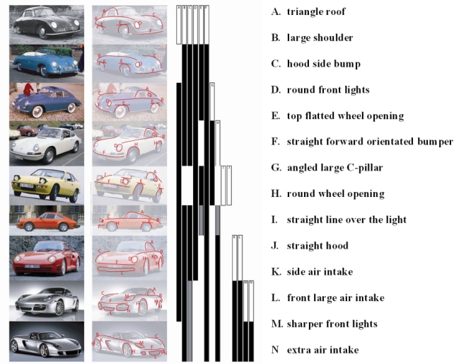
Figure 8. Design history analysis of Porsche performed by Group 8/2005 (Niklas Fahlquist and Fernando Pizer).
Implicit Design Cues
In the analysis of implicit design cues, the link between the brand character and design features is under specific scrutiny. Recognition can be managed through the development of design features that evoke associations to the brand core values. The analysis of implicit cues can start simply by asking whether a chosen design feature (or the entire product) reflects the brand core values. For example, in the Volvo case, does the shoulder of the car communicate safety? How about Scandinavian design heritage or dynamism?
In addition to subjective evaluations of value-based design cues, more objective approaches can also be used. The method of semantic differentials, developed by Osgood et al. (1957), provides a useful approach. It is the “first and well-known method to conceptualise characters” (Krippendorff 2005, 159) and is applicable also to the study of the link between brand characteristics and design features or products (see Figure 9). The associations that specific features evoke to specific brand characteristics (values) can be assessed on a scale ranging from “not at all associated” to “strongly associated”. The Volvo shoulder, for example, can be seen to evoke safety associations in a rather strong manner. If semantic differential scales are used to gather impressions of a large quantity of people, rather reliable data of the implicit recognition of the brand character can be generated.
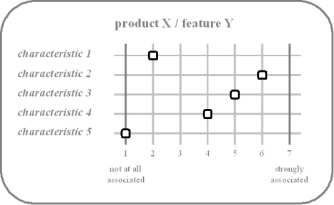
Figure 9. Application of the semantic differential method (Osgood et al., 1957; Krippendorff, 2005) can be used in the analysis of implicit brand design cues.
Students also explored a variety of other tools derived from these basic methods. One group of students in the 2005 project developed a method of “identity recognition grid” to help them define the brand typicality of a number of Toyota and Nokia products (see Figure 10). The grids were compiled in a workshop with other students. In addition to assessing the Toyota- and Nokia-typicality of the products, their appearance was evaluated in relation to brand core values in the Toyota case and stylistic product categories in the Nokia case. This method was particularly fruitful in discussing the implicit design cues of the brands. The author has used a similar approach in a number of other workshops, because it provides a highly analytical and communicative approach to the analysis of visual recognition. Again, the variability of this method is unlimited. Various scales and categories can be used, and product appearance can be assessed through pictures, mock-ups, or fully functioning products.
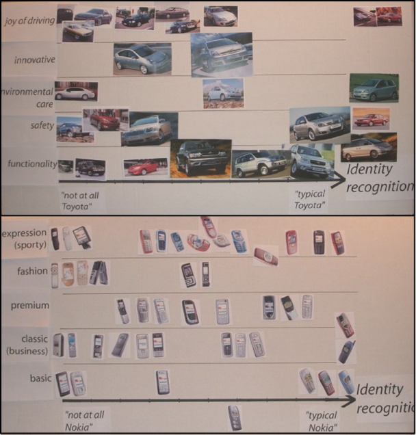
Figure 10. Identity recognition grid was developed by Group 1/2005 (Ida Ljungman, Karin Lodin, and Karolina Starodub) and used in a workshop where students were asked to position selected Toyota and Nokia products on the grid in accordance to their visual brand typicality and their visual references to brand core values (Toyota) and stylistic categories (Nokia).
Transforming Brand Character to Product Design
In the second exercise, students were asked to design new products that would communicate selected core values identified in the first assignment. In 2004, semantic transformation was experienced through a variety of different products, whereas in 2005 all the groups were asked to design a car dashboard/interior.
Do You Recognize This Tea Flask? - 2004 Projects
In the first year’s projects, the primary focus of the analysis part was on locating the essential differences between the two automotive brands that each group was given (see Table 1). In the design exercise, the students were asked to design a predefined product for both of the brands, stressing differentiation between their brands through visual design features. Table 1 presents the brands and products that were designed. It also presents examples of explicit and implicit design cues that were incorporated in the products, as summarised afterwards by the author on the basis of student presentations and project reports. The table provides simplified examples regarding the use of explicit cues that were directly transformed from the car brands’ visual features (whether they were strongly, weakly, or not at all used). Implicit cues, in turn, are described in terms of brand characteristics that are referred to by design features (stemming from students’ design intentions and argumentation).
Table 1. Analysed brands in the 2004 project, new products that students designed, and the design cues these products incorporated
Overall, strong explicit cues were scarcely used in the design of new products. One reason for this is that such cues are often category-specific, context-sensitive, and subject to product-specific terms of geometry, shape, and structure. The transfer of such cues from a product category to another is not straightforward. For example, direct application of specific automotive design cues, such as the grille or shoulder line, into other products would only result in a pastiche-type of appearance. To underline this aspect, students were encouraged to incorporate implicit cues in their designs. Implicit cues are more easily transferable, since they are not inherently connected to a specific product category. Rather, they may be manifest through a variety of shapes, colours, materials, and other design features. As a result, implicit cues were widely found in the new products as illustrated by the following examples.
Drink Containers
The thermos bottle designed for Toyota and the tea flask designed for Jaguar reflect well the differences between the two brands (see Figure 11). The Jaguar tea flask communicates distinguished luxury, elegance, and dynamism through distinctive materials, colours, shapes, and surface treatment. The flask also represents the British tea-drinking habit, and British heritage is a central characteristic of Jaguar brand. Jaguar products are characteristically products for self-assured individuals. The multi-purpose functionality of the Toyota thermos, on the other hand, reflects the Toyota characteristics of high functionality, quality, and value for the money. Colours and materials indicate that the product is developed with good usability in mind. This product, which is considerably lower in price than the Jaguar flask, is a suitable product for everyday use, such as family trips. Brand recognition of both products is thus merely created through implicit cues that refer to the brand characteristics. The products themselves don’t incorporate strong explicit cues. The basic shapes, which carry some resemblance to Toyota and Jaguar cars, however, can be considered weak explicit cues. The green colour of the Jaguar flask may also be explicitly recognised as a Jaguar cue.
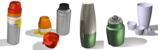
Figure 11. Toyota thermos (left) and Jaguar tea flask (right) designed by group 2/2004 (Oscar Ternbom, Petter Danielson, and Josef Davidsson).
Handheld Mixers
The mixers designed for Cadillac and Alfa Romeo also have remarkably different characters (see Figure 12). The Cadillac mixer carries strong explicit cues, such as the logo and the strong double-shaped organic lines resembling both the Cadillac logo and shapes used in Cadillac cars. Materials and surface treatment also incorporate implicit references to the premium and exclusive brand character of Cadillac. Furthermore, the bold design denotes the American automotive design heritage. The Alfa Romeo mixer, on the other hand, is quite different. Its flowing shape and red colour create a dynamic and emotional feeling and definitely represent the stereotypical Italian design. These features may also be recognised as explicit Alfa Romeo cues, although they can only be considered weak explicit cues.

Figure 12. Cadillac (left) and Alfa Romeo (right) mixers designed by group 3/2004 (Jonas Carlsson, Maria Eriksson, Per Eriksson, and Mikael Sandberg).
Watches
Implicit cues also played a major role in the design of watches for Lamborghini and Volkswagen, even though their shapes also contain weak explicit resemblance to the cars of these two brands (see Figure 13). The Lamborghini character is manifest through exclusive materials and technology as well as a very distinctive contour. These provide the product with a showy character, feeling of vanity and bad usability (worn uncomfortably between the two middle fingers). The Volkswagen watch is totally opposite. Its use of basic shapes and clear features denotes functionality, good value-for-money, and high engineering quality, which are all characteristic values of the Volkswagen brand.

Figure 13. Lamborghini (left) and Volkswagen (right) watches designed by group 4/2004 (Tobias Andersson, Petra Enarsson, Sara Larsson, and Emma Åkesson).
MP3 Players
Citroën and Hyundai MP3 players also incorporate distinctively different characters (see Figure 14). Citroën player has a few explicit cues, such as the Citroën logo, button icons inspired by the logo, and basic geometrical shapes typical of recent Citroën cars. The modular structure and innovative form refer implicitly to Citröen’s design philosophy, which is characterised by playfulness and creativity. The Hyundai player, in turn, is a basic, affordable, easy-to-use product, as suggested by its shapes, colours, and material choices. Except for the logo on the display, it is difficult to find any explicit cues on the Hyundai player.
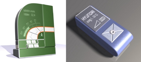
Figure 14. MP3 players designed for Citroën (left) and Hyundai (right) by group 5/2004 (Gustav Sand, Henrik Ingelsten, Siar Yavas, and Thomas Hordern).
Razors
Skoda and Chrysler razors incorporate shapes that may be seen as weak design cues of their respective brands (see Figure 15). However, in this case, recognition is built primarily on the implicit level as well. Shapes and materials used on the Skoda razor communicate the basic, affordable, and functional brand character. The orange colour also refers to the BIC brand that, in the razor category, has similar kinds of connotations as Skoda in the automotive world. The Chrysler razor is more distinctive and expensive. Through its complex form, exclusive materials, and shiny surfaces, it represents the American design heritage of streamlining and boldness, just as the Cadillac mixer mentioned earlier, and therefore looks like a premium product.
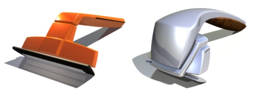
Figure 15. Skoda (left) and Chrysler (right) razors designed by group 6/2004 (Louise Wallentin, Lars Wettre, and Johanna Stridsman Dahlström).
How About This Dashboard? - 2005 Projects
Whereas the 2004 projects focused on distinguishing the differences in the visual brand philosophy of two automotive brands, the emphasis in 2005 was placed on merging the characters of an automotive brand with that of a brand from another product field. Students were further encouraged to create their own fictive brands based on those characteristics (core values) that they found similarly exposed by the original brands. As the second assignment, again following intensive analysis, students designed a dashboard (or a larger concept of a car interior) incorporating the core brand values and respective aspects of visual recognition. Figure 16 presents four successful examples of these projects that not only have a high design quality but also incorporate rich design cues.
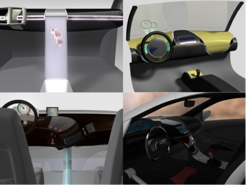
Figure 16. Dashboards and interiors designed by selected student groups: Bacalyte by Group 3/2005 (Henrik Berggren and Katrin Strandberg) (top left), the merger of Mercedes-Benz and Nike by Group 9/2005 (Stéphanie Abiven and Christian Eriksson) (top right), Vita by Group 10/2005 (Hanna Törngren, Tomas Pernek, and Sabina Tobalovic) (bottom left), and Pnevma by Group 7/2005 (Lazaros Anagnostopoulos, Georgios Delizisis, and Linda Knuutinen) (bottom right).
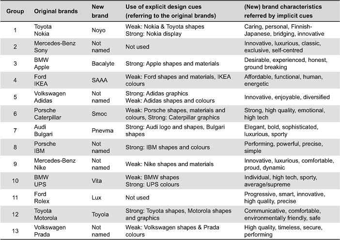
Table 2 summarises the use of explicit cues (referring to original brands) and implicit cues (referring to the character of the new brand) in these products. As the table shows, the variety of explicit and implicit cues was greater than in the previous year’s project. This can be explained by the nature of the products that were designed this year, which offer richer possibilities for the use of various design cues. Moreover, since students designed car interiors, they were able to transfer more explicit design cues from the automotive brands to their new designs. The assignment was also more flexible than in the previous year, as the students were encouraged to build new brands based on a few selected values that were derived from the original brands. The groups developed various strategies to approach the design task. Some groups attempted to combine the two original brands on an equal basis by incorporating values and visual design philosophy of both into the new brand (e.g., brands 6, 7, 10 and 12), while other groups created brands that were clearly dominated by one of the brands (e.g., brands 3 and 8). In some cases, the new brand and product carried very weak resemblance to the original brand (e.g., brands 2 and 11). The lack of explicit cues indicate that the students most likely experienced difficulties in defining them from the original brands themselves. Sony and Ford were examples of brands that students reported as difficult ones to define clear explicit cues.
Table 2. Analysed brands, new brands and design cues embedded in new product designs in the 2005 project
Creating Visual Recognition for the Noyo Brand
The projects in 2005 also included the task of creating new brands that aimed to merge the characters of the original brands. As an example, group 1/2005 worked with Toyota and Nokia and created a fictive brand named Noyo. To merge the characters of Toyota and Nokia in Noyo, “caring, personality, Finnish-Japanese heritage, building bridges, and innovation” were defined as Noyo’s core values. Using specific design cues, these characteristics were made visible and recognisable in the product. As a result, the Noyo product involves a variety of implicit cues (see figure 17). The personal experience of the product is created, for instance, with changeable lights, sound environment, and materials. The form language with smooth surfaces, in turn, generates a strong feeling of caring. Pure, wide, symmetric, and smooth surfaces give the appearance of harmony and friendliness. Moreover, opening up the front of the interior gives the user a feeling of space and closer interaction with the environment, which is common also in Japanese house designs. The heritage is also mirrored in the new product design as pure and natural contrasting colours, as well as transparent and glossy materials, are used. Overall, the interior is made of less material than classical car interiors, signalling that Noyo is concerned with the environmental impact of its products.
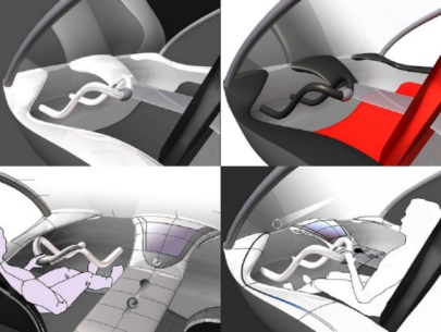
Figure 17. The Noyo concept was created by Group 1/2005 (Ida Ljungman, Karin Lodin, and Karolina Starodub) based on the core values of Toyota and Nokia.
In addition to these implicit cues, which stem from the Noyo core values and design philosophy, the group further defined explicit design cues for Noyo. The cues - dividing centre line, steering hoop, transparent materials, symmetrical forms, and slim surfaces - give the product a strong character. The centre console also carries explicit reference to a mobile phone display and the recognisable silhouette of Nokia products.
Conclusion
As the student exercises illustrate, successful development of visual brand recognition not only considers the often rather straightforward use of explicit design cues, but also, and often more importantly, the embodiment of implicit references into product design. The process of semantic transformation, creating design cues that correspond to the brand character and product portfolio strategy of the company, if properly conducted, requires firm knowledge of the feasible design features in different cases. Such knowledge is developed through experience and, of course, always supported by sheer intuition and creativity of designers. It is suggested that the project structure presented in this paper offers a potential approach through which students, future designers, and design managers, can be provided with a richness of insights into the ingredients of visual recognition in various different contexts.
According to the feedback gathered after project completion, students found the exercises highly useful and interesting. The projects at Chalmers were rather extensive and required lots of work from students during the two-month duration, but their generic approach can be used in various ways, and also as light versions. It is believed that similar exercises could be beneficial also in professional context, used by companies to boost creativity and to explore the development of their visual recognition.
This paper suggested a number of visual methods for the analysis of products with regard to their brand typicality. It was shown that basic methods, such as Design Format Analysis and semantic differentials, could be flexibly applied to different cases. Future research holds the important challenge of exploring and developing these methods further. Moreover, there is room for a variety of new creative methods to address both explicit and implicit design cues.
Grasping the implicit level of recognition is a particularly challenging task. Creative design exercises, such as the ones presented in this paper, offer an approach that can potentially reveal deep insights concerning implicit design cues. When transmitting visual features of brands to wholly new categories, some fundamentals of visual recognition may be revealed that otherwise would have remained unseen. The variation possibilities of such exercises are naturally unlimited. For example, in addition to the ‘realistic’ approach of this paper, various visual metaphors may be creatively explored as a means to ‘distilling’ brand and product identity (see Karjalainen, 2001).
Finally, structured exercises can provide the design research community with interesting data that leads to enhanced understanding of recognition, perception, and interpretation of various design features. The case- and context-dependent nature of brand and product recognition poses a serious challenge for design researchers. Variety undoubtedly contributes to the accumulation of qualitative understanding and knowledge base, but before any major conceptual postulations can be formed, more systematic data collection needs to be conducted. The exercises reported in this paper were not implemented from a research viewpoint, thereby resulting in limited contribution to the theoretical development of the subject. Nevertheless, the paper pointed out various conceptual themes that will hopefully encourage further theoretical and empirical explorations.
The exercises reported in this paper concerned a high degree of subjectivity, embedded already in the analysis tools and design briefs, which perhaps resulted in biased interpretations in some cases. Despite such flaws in terms of reliability and validity, most of the products (and brands) that were designed, ‘made sense’ from the viewpoint of the core values that they reflect. To examine the consistency between design intentions and final designs, recognition of the products was tested after the completion of the courses in ‘verification’ experiments. A number of respondents (design students and design managers) were asked to indicate whether the products make sense as representations of their respective brands (products 2004) and whether their visual appearance corresponded to the values they were designed to reflect (products 2005). The results of these tests indicated that the process of semantic transformation was successfully implemented in most cases, but some of the products clearly failed to communicate the intended character.
In future research, this combination of designing and verifying could be extended to a larger setting, including two main phases: semantic transformation and semantic attribution (see Figure 18). Such a setting would, in particular, offer a structured approach to analyse value-based design cues in products. First, products would be designed according to specified design intent (e.g., brand characteristics). Second, these product designs would be attributed with perceived characteristics by a number of persons, for instance, using semantic differential scales.
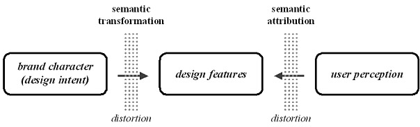
Figure 18. In future studies, analytical focus could be on the coherence between semantic transformation and semantic attribution as well as between the design intent and user perception.
If inconsistencies between the intent and the perception occur, they may be the result of two major ‘distortions’. Either the designer failed to ‘encode’ proper meanings into the product or the user does not succeed to correctly ‘decode’ them. Distortions in encoding can arise, for example, from unclear brand values, ill-defined design briefs, or weak knowledge of semantic transformation. Potential distortion in decoding can be a consequence, among other things, of the user’s weak experience in that the product category, inconsistent supporting information, or differences of cultural and social contexts. By conducting in-depth analyses of such shortcomings, user perception can be made more predictable in future cases.
When writing this in November 2006, new projects were in progress at the Chalmers University of Technology. Nine groups of four to five students each were again analysing the character and visual product identity of eighteen brands, creating new fictive brands, and transforming their characters into two different types of products. As the initial analysis of these projects indicates, further insights are being developed into the intriguing theme of design for visual brand recognition.
Acknowledgements
The author would like to thank Professor MariAnne Karlsson and her staff in the Division Design (Department of Product and Production Development) at the Chalmers University of Technology for letting him be involved in the “Visual Brand Identity and Market Analysis” course. In particular, appreciation is shown to the examiners of the course and his dear colleagues, Professor Ulrike Rahe and Dr. Anders Warell (currently in Massey University in New Zealand). Specific words of thanks should also go to the students of the course who creatively produced such high-quality results. Oscar Person from the Delft University of Technology in the Netherlands and the two anonymous reviewers are thanked for their valuable comments on the first manuscript of the paper.
References
- Aaker, D. A. (1996). Building strong brands. New York: Free Press.
- Aaker, D. A., & Joachimsthaler, E. (2000). Brand leadership. New York: Free Press.
- Bedbury, S. (2003). A new brand world. New York: Penguin Books.
- Berkowitz, M. (1987). Product shape as a design innovation strategy. Journal of Product Innovation Management, 4, 274-283.
- Bloch, P. H. (1995). Seeking the ideal form: Product design and consumer response. Journal of Marketing, 59(3), 16-29.
- Borja de Mozota, B. (2004). Design management: Using design to build brand value. New York: Allworth Press.
- Bouchenoire, J. L. (2003). Steering the brand in the auto industry. Design Management Journal, 14(1), 10-18.
- Creusen, M. E.H., & Schoormans, J. P.L. (2005). The different roles of product appearance in consumer choice. Journal of Product Innovation Management, 22, 63-81.
- Crilly, N. (2005). Product aesthetics: Representing designer intent and consumer response. PhD Thesis. Cambridge: University of Cambridge.
- Kapferer, J. N. (1992). Strategic brand management: New approaches to creating and evaluating brand equity. New York: Free Press.
- Karjalainen, T. M. (2001). When is a car like a drink? Metaphor as a means to distilling brand and product identity. Design Management Journal, 12(1), 66-71.
- Karjalainen, T. M. (2004). Semantic transformation in design: Communicating strategic brand identity through product design references. Helsinki: University of Art and Design Helsinki.
- Karjalainen, T. M., & Warell, A.(2005). Do you recognise this tea flask? Transformation of brand-specific product identity through visual design cues. Proceedings of the International Design Congress, IASDR 2005. Douliou, Taiwan, Oct 31 - Nov 4 2005.
- Karjalainen, T. M., Rahe, U., Ljungman, I, Lodin, K., & Starodub, K. (2006). “Noyo, creating your experience”: A case study on the creation of affective brand script and visual product identity. Proceedings of the 5th Conference on Design and Emotion. Gothenburg, Sweden, Sep 26-29 2006.
- Kreuzbauer, R., & Malter, A. J. (2005). Embodied cognition and new product design: Changing product form to influence brand categorization. Journal of Product Innovation Management, 22, 165-176.
- Krippendorff, K. (1989). On the essential contexts of artifacts or on the proposition that “design is making sense (of things)”. Design Issues, 5(2), 9-39.
- Krippendorff, K. (2005). The semantic turn: A new foundation for design. Boca Raton (FL): CRC Press.
- McCormack, J. P., & Cagan, J. (2004). Speaking the Buick language: Capturing, understanding, and exploring brand identity with shape grammars. Design Studies, 25(1), 1-29.
- Monö, R. (1997). Design for product understanding: The aesthetics of design from a semiotic approach. Stockholm: Liber.
- Muller, W. (2001). Order and meaning in design. Utrecht: Lemma Publishers.
- Neumeier, M. (2003). The brand gap: How to bridge the distance between business strategy and design. Indianapolis: New Riders.
- Osgood, C. E., Suci, G.J., & Tannenbaum, P. H. (1957). The measurement of meaning. Urbana, IL: University of Illinois Press.
- Page, C., & Herr, P. M. (2002). An investigation of the processes by which product design and brand strength interact to determine initial affect and quality judgments. Journal of Consumer Psychology, 12(2), 133-147.
- Pugliese, M.E. & Cagan, J. (2002). Capturing a rebel: Modelling the Harley-Davidson brand through a motorcycle shape grammar. Research in Engineering Design, 13(3), 139-156.
- Ravasi, D,. & Lojacono, G. (2005). Managing design and designers for strategic renewal. Long Range Planning, 38, 51-77.
- Schmitt, B., & Simonson, A. (1997). Marketing aesthetics: The strategic management of brands, identity and image. New York: Free Press.
- Srinivasan, V., Lovejoy, W. S., & Beach, D. (1997). Integrated product design for marketability and manufacturing. Journal of Marketing Research, 34(1), 154-163.
- Steffen, D. (2000). Design als Produktsprache: Der “Offenbacher Ansatz” in Theorie und Praxis. Frankfurt (Main): Verlag Form.
- Stompff, G. (2003). The forgotten bond: Brand identity and product design. Design Management Journal, 14(1), 26-32.
- Upshaw, L. B. (1995). Building brand identity: A strategy for success in a hostile marketplace. New York: John Wiley & Sons.
- Upshaw, L. B., & Taylor, E. L. (2000). The masterbrand mandate: The management strategy that unifies companies and multiplies value. New York: John Wiley & Sons.
- Urde, M. (1999). Brand orientation: A mindset for building brands into strategic resources. Journal of Marketing Management, 15(1-3), 117-133.
- eryzer, R.W. (1998). Key factors affecting customer evaluation of discontinuous new products. Journal of Product Innovation Management, 15(2), 136-150.
- Vihma, S. (1995). Products as representations. Helsinki: University of Art and Design Helsinki.
- Warell, A. (2001). Design syntactics: A functional approach to visual product form. Gothenburg: Chalmers University of Technology.
- Wheeler, A. (2003). Designing brand identity: A complete guide to creating, building, and maintaining strong brands. New Jersey: John Wiley & Sons.
- Wikström, L. (2002). Produktens budskap: Metoder för värdering av produkters semantiska funktioner ur ett användarperspektiv. Gothenburg: Chalmers University of Technology.
- Yamamoto, M., & Lambert, D. R. (1994). The impact of product aesthetics on the evaluation of industrial products. Journal of Product Innovation Management, 11(4), 309-324.
