
Hip and Authentic. Defining Neo-Retro Style in Package Design
Franck Celhay 1, Lise Magnier 2,*, and Jan Schoormans 2
1 Montpellier Business School, Montpellier, France
2 Delft University of Technology, Delft, The Netherlands
Styles in design have a strong evocative power for consumers and are commonly used by brands to communicate specific associations of ideas. This article describes the style elements and the associations related to a contemporary style in graphic design: the neo-retro style. We argue that this style is linked to the hipster subculture but used in a broader context. Complementary methods were used to progressively determine the styling elements and the values related to this style. Study 1, a multi-method qualitative study using creative sessions and content analysis, yields a description of the formative elements of the neo-retro style from both an analytical (structure, graphics, and information) and a holistic perspective (naturalness, harmony, elaborateness). In study 2, we designed eight coffee packages manipulating structural and graphical elements, namely the presence of ornaments, texture and variation in typefaces, and tested the associations evoked by these elements among 251 participants. The results first confirm quantitatively that these elements are evocative of the neo-retro style. We also show that this style is associated with values such as authenticity and craftsmanship and as such with the hipster subculture. The study contributes to theory and practice in the fields of design and brand management and shows that packaging elements can be manipulated to evoke values in the marketplace.
Keywords – Neo-retro Style, Retro Design, Package Design, Hipster, Authenticity, Branding.
Relevance to Design Practice – This research defines the formative elements of the ‘neo-retro style’. Knowledge about this style can assist designers in communicating values such as craftsmanship in package design.
Citation: Celhay, F., Magnier, L., & Schoormans, J. (2020). Hip and authentic. Defining neo-retro style in package design. International Journal of Design, 14(1), 35-49.
Received November 13, 2018; Accepted November 18, 2019; Published April 30, 2020.
Copyright: © 2020 Celhay, Magnier, & Schoormans. Copyright for this article is retained by the authors, with first publication rights granted to the International Journal of Design. All journal content, except where otherwise noted, is licensed under a Creative Commons Attribution-NonCommercial-NoDerivs 2.5 License. By virtue of their appearance in this open-access journal, articles are free to use, with proper attribution, in educational and other non-commercial settings.
*Corresponding Author: L.B.M.Magnier@tudelft.nl
Franck Celhay is associate professor at Montpellier Business School, Montpellier (France) where he teaches graphic design and brand communication. Franck’s research is about communication design, semiotics, and consumer behavior. Notably, he studies the influence of graphic design on consumers beliefs and behavior.
Lise Magnier is assistant professor of Sustainable Consumer Behaviour in the Faculty of Industrial Design Engineering at Delft University of Technology. Lise’s research interests lie in the fields of consumer behaviour, packaging, circularity, and sustainability. Specifically, she studies how materials, shapes, graphic, and communication design in packaging influence individual attitudes and behaviours towards products.
Jan Schoormans is full professor of Consumer Behaviour in the Faculty of Industrial Design Engineering, Delft University of Technology. His research focuses on consumer preferences and behaviour towards (the design of) new products. He has published on these topics in journals such as International Journal of Research in Marketing, Psychology and Marketing, Journal of Product Innovation Management, British Journal of Psychology, International Journal of Design, Design Studies, Journal of Engineering Design and the Design Journal.
Introduction
Designers generally aim to elicit positive emotions in consumers. One way of doing so is by referring to the past with their designs (Orth & Gal, 2014). This practice has been called retro design since the seventies, a term that refers to the appropriation of historical forms in design (Breathnach & Dermody, 2013). It is a common strategy for brands to communicate authenticity to consumers and to generate a feeling of nostalgia (Holbrook, 1993; Orth & Gal, 2014).
Although retro branding usually consists of reviving historical elements of a brand heritage (Cattaneo & Guerini, 2012), there is also a tendency among new brands to adopt a retro style for their packages despite a lack of genuine links to the past. Figure 1 shows examples of packages of newly established brands designed in a neo-retro style. These packages were selected from Dribbble (a social platform for designers) and were tagged as retro by their designers even though the brands are new to the market.
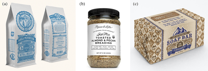
Figure 1. Examples of new brands using neo-retro packages:
(a) Cane sugar, design: Milos Milovanovic Milos;
(b) Breading, design: Britt Killion-Mottola; (c) Soap bar for dogs, design: Luliia S.
This tendency of new brands to use design elements referring to the past is referred to as made-up retro, new retro, or neo-retro (Fort-Rioche & Ackermann, 2013; Victionary, 2016). In this paper, we refer to this style as neo-retro. Heller and Chwast (2018) define style as a specific or characteristic manner of expression, design, construction or execution and claim that as it relates to graphic design, style suggests the dominant visual aesthetic of a particular time and place. While a vintage or retro style could refer to a specific and well-defined style from the past such as Art Deco or Art Nouveau, neo-retro is a contemporary style that quotes/reinterprets a wide range of styles and graphic elements from different moments in design history (Breathnach & Dermody, 2013). Unlike historical graphic styles, which have been well defined by design historians (Drucker & Mc Varish, 2013; Heller & Chwast, 2018; Jubert, 2006), there is a need to clarify the characteristics of the neo-retro style. A first objective of this research is therefore to define what neo-retro refers to and determine the visual elements that are typical of this contemporary style.
Many studies have described the role of package design as a communication tool to position a brand and to influence consumers (Kniazeva & Belk, 2007; Underwood, 2003). However, and to the best of our knowledge, there is no research that investigates the brand and product beliefs that the neo-retro style in package design is likely to communicate to consumers. Thus, this research will aim to investigate the associations of ideas generated by the neo-retro style in package design.
Finally, design history indicates that the emergence of new styles is often linked to the development of a socio-cultural movement and to a specific historical context (Drucker & McVarish, 2013; Jubert, 2006). This has been the case, for instance, in the development of the Arts and Crafts, Art Nouveau, Psychedelic, and Punk styles. Here, the same observation can be made for the strong rise of the neo-retro style, as it seems to have emerged from the hipster subculture. A subculture is defined as a group that is part of a dominant culture, but which differs from it in terms of beliefs, values, and norms (Dowd & Dowd, 2003). Indeed, hipsters are depicted in the consumer culture literature as young, urban and creative middle-class people whose lifestyles are oriented towards a “valorisation of ‘authentic’ vintage goods, kitsch retro styles and artisanal production” (Maly & Varis, 2016; Schiermer, 2014). Moreover, in many design blogs and press articles the labels hipster style, retro style, and neo-retro style appear to be used as synonyms (Doll, 2012; Stein, 2012). Therefore, a last objective of this research will be to explore whether the neo-retro style is indeed connected to the hipster subculture.
To summarise, earlier research on retro design (Brown, Kozinets, & Sherry Jr, 2003; Cattaneo & Guerini, 2012; Fort-Rioche & Ackermann, 2013; Orth & Gal, 2014) has not described the design elements that are typical of the neo-retro style, nor has it looked at the associations of ideas that neo-retro style in package design is likely to generate. In this paper we aim to complement the existing research by answering two research questions: 1) Which design elements and factors define the neo-retro style or in other words what are the formative elements of the neo-retro style? 2) Are the values communicated by this style related to the hipster subculture?
To answer these research questions, we first discuss the literature in terms of the possible approaches (analytical and holistic) to define the neo-retro style in package design, as well as the literature on hipsters’ values. Next, we conduct a qualitative study composed of two sub-studies in order to identify the design elements and factors that define the neo-retro style. Finally, we conduct a quantitative study to test whether the elements that emerged from the qualitative study are perceived as retro when included in a new package design and to investigate whether the neo-retro style communicates values that are in line with the hipster subculture. Figure 2 gives a visual representation of the research process. It describes how the different methods are used to progressively obtain insights on the formative elements of the neo-retro style and on the values evocated by these elements. It also shows how each phase replicates and complements results obtained in previous phases.
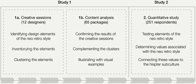
Figure 2. General process of the research.
Theoretical Background
The Neo-Retro Style: Analytical and Holistic Approaches
Previous research has shown that consumers make inferences about the product and the brand based on the visual presentation of the packages (Becker, van Rompay, Schifferstein, & Galetzka, 2011; Berkowitz, 1987; Gordon, Finlay, & Watts, 1994; Orth & Malkewitz, 2008). By selecting specific design elements like the geometry, textures, materials, colours, graphics, and details of a product packaging, designers are able to communicate specific brand values or product attributes and as such encourage specific consumer responses (Celhay & Remaud, 2018; Mugge, Massink, Hultink, & van den Berg-Weitzel, 2014; Orth, Campana, & Malkewitz, 2010; Underwood, 2003; Wrigley, 2013). However, since the market reception of a design may differ from the designer’s intent (Crilly, Maier, & Clarkson, 2008), a large body of research attempts to better understand how consumers respond to different package design elements and styles.
In this body of research, two different yet complementary approaches have been adopted: analytical and holistic. The analytical approach studies the influence of package design elements independently. Research has for example examined the role of colour (Dichter, 1964; Gordon et al., 1994; Spence & Velasco, 2018; Wei, Ou, Luo, & Hutchings, 2014), shape (Folkes & Matta, 2004; Pantin-Sohier, 2009; Raghubir & Greenleaf, 2006), images (Hémar-Nicolas, 2011; Te Vaarwerk, Van Rompay, & Okken, 2015), or typography (Schroll, Schnurr, Grewal, Johar, & Aggarwal, 2018; Van Rompay & Pruyn, 2011) on consumer perceptions and evaluations.
The analytical approach demonstrates that the modification of a single design element in a package may have a significant impact on the consumer response. This approach can be applied to the study of the design of neo-retro packages. Using this analytical research approach enables understanding which design elements define the neo-retro style and how these design elements contribute to consumers’ responses.
Next to the analytical approach, Orth and Malkewitz (2008) proposed a different approach to package research. These authors state that according to the principles of the Gestalt theory, the perception of a package design is holistic and that, in matters of design, the whole is different from the sum of the parts. Thus, a holistic research approach is necessary as, in a real context, all the different elements of a package design interact with each other, and their conjoint effect is different from their individual ones.
Previous research suggests three high-order variables that allow researchers and practitioners to differentiate package design from a holistic point of view: naturalness, harmony, and elaborateness (Henderson & Cote, 1998; Henderson, Cote, Leong, & Schmitt, 2003; Henderson, Giese, & Cote, 2004; Orth & Malkewitz, 2008). The first factor, naturalness, reflects the degree to which constitutive design elements depict commonly experienced objects, using organic shapes and figurative illustrations. The second factor, harmony, is relative to the overall symmetry and balance of the design. The third factor, elaborateness, is a combination of design element complexity, activity and depth. This factor captures the concept of design richness. In complement to the analytical approach, we will use these three factors to define the neo-retro packages from a holistic point of view.
The Neo-Retro Style: A Contemporary Style
Surprisingly, none of the studies that examine package design holistically refer to historic or contemporary styles. Yet, these styles could be defined as holistic and are sometimes used by contemporary brands for their packages. Examples include the Art Nouveau-styled bottle of the Perrier-Jouet champagne, the de Stijl-inspired L’Oreal Studio Line cosmetics or the flat design take-away packages of McDonald’s burgers1 (cf. Figure 3).
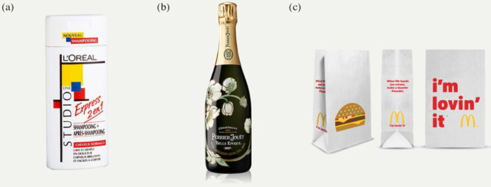
Figure 3. (a) De Stijl, (b) Art Nouveau, and (c) Flat Design styles in packaging design.
Referring to historically situated styles would strengthen the classification of package designs from a holistic point of view. In addition, knowledge about the historical context or cultural movement that led to the development of these styles would enable to better understand the set of brand values and product attributes that are likely to be communicated to the consumer. Several marketing studies have emphasized that the categories defined by design historians should be used to classify styles of brand visual expression and to analyse the values associated with these styles. These authors contend that design history can provide a contextualizing counterpoint to information processing views of how brand visual styles influence consumer response (Favier, Celhay, & Pantin-Sohier, 2019; Pracejus, Olsen, & O’Guinn, 2006; Schroeder, 2005).
In this paper, we propose that the neo-retro style is a contemporary style whose development seems to be connected to a 21st century subculture—the hipster subculture. Hubbard (2016) observes that contemporary hipsters are mainly defined through “their adoption of styles that exist in opposition to mainstream consumer culture, something particularly manifest in a valorisation of authentic vintage goods, kitsch retro styles and artisanal production” (p. 2). This point of view is shared by Hendlin, Anderson, & Glantz (2010) who add that the hipster identity is constructed mainly through what they consume. Thus, hipsters are usually described as trendy consumers, producers or distributors of niche or rarefied cultural items, such as ‘indie’ music, real ale, craft coffee, organic burgers and vintage or ‘pre-digital’ objects. In addition, most of the academic research on the topic converges in observing that the hipster subculture is constructed around a precise set of values such as the valorisation of authenticity, craftsmanship, past and traditional means of production, creativity, cosmopolitanism, eclecticism, sustainability through organic food and vegetarian or vegan lifestyles or progressive politics (Hubbard, 2016; Le Grand, 2018; Maly & Varis, 2016; Schiermer, 2014; Scott, 2017).
Next to the values attached to the hipster subculture, there is also a wide consensus among all the research papers devoted to the hipster phenomenon that hipsters have developed a specific style often referred to as a hipster aesthetic (Hendlin et al., 2010; Hubbard, 2016; le Grand, 2018; Michael, 2015; Schiermer, 2014; Scott, 2017; Thorén, Edenius, Lundström, & Kitzmann, 2017). This specific style has been adopted in fashion design, interior design, product design, and finally in package design. All the articles mentioning the hipster aesthetic define it as using, quoting or reinterpreting elements of different retro styles in design. In practice, hipsters have launched new brands of packaged goods (e.g., craft coffee or artisanal beers), and the design style they have used is indeed often based on a reinterpretation of retro styles in design.
While hipsters are frequently the object of denigration for being snobbish and for their concern to appear ‘cool’ (Arsel & Thompson, 2010; Le Grand, 2018), the hipster style has been widely diffused in society and does not strictly belong to this subculture anymore. Scott (2017) and Hubbard (2016) describe hipsters as micro-entrepreneurs associated with the creative industries. The status of trendy consumers/producers linked to the hipster subculture positions them as trendsetters. Several articles report that hipsters have been extensively imitated by mainstream consumers (Hendlin et al., 2010; Le Grand, 2018). In addition, many brands have started to follow the hipster style to promote the authenticity of their products (Arsel & Thompson, 2010; Hendlin et al., 2010). As a result, the use of hipster style elements in package design goes beyond what is produced by hipsters themselves, and we have therefore decided to give a more general name to this contemporary style: the neo-retro style.
Based on the above, we propose that the neo-retro style is a contemporary style connected to the hipster subculture and that this style reflects some of the hipster values.
Study 1: Defining the Neo-Retro Style in Package Design
To identify the design elements that define the neo-retro style, we conducted a qualitative study consisting of two complementary sub-studies. First, we organised two creative sessions with designers. In these sessions, designers were asked to discuss the design elements that are representative of the neo-retro style. Next, we performed a content analysis on a corpus of 65 contemporary packages tagged as retro by professional graphic designers.
Data Collection
Two creative sessions were conducted with six participants each. Participants were all in possession of at least a Bachelor’s degree in Industrial Design Engineering. The topic of the sessions was to define the elements of the neo-retro style in fast-moving consumer goods (FMCG) packaging. Due to their general knowledge about design styles and their specific knowledge of design characteristics, the use of designers was relevant to obtain an accurate overview of the design elements related to the neo-retro style. In addition, previous research has validated the use of designers to define and obtain feedback on specific design characteristics (Henderson et al., 2004; Mugge, 2011; Orth & Malkewitz, 2008). The method for the creative session was adapted from creative problem solving (CPS), which consists of a three-stage process: exploring the challenge, generating ideas, and developing concept(s). Due to the nature of the task, we focused on the idea generation stage. The exploration of the challenge and the concept(s) development were less relevant because the challenge (i.e., defining the element of the neo-retro style in fast-moving consumer goods) was already well defined and we were mostly interested in the overview of the elements formative of the neo-retro style. The creative sessions were conducted in three steps following the three-stage diamond for idea generation adapted from Tassoul and Buijs (2007). These three steps consist in diverging, clustering, and converging (Figure 4).
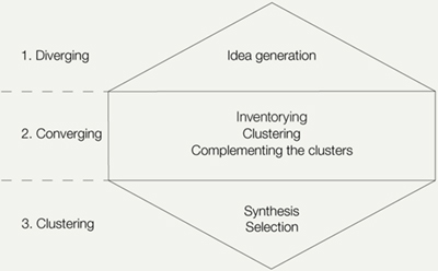
Figure 4. Use of the three-stage diamond of idea generation (adapted from Tassoul & Buijs, 2007).
In the first diverging stage, participants were invited to discuss what neo-retro style in FMCG meant to them in general terms. Next, they created a collage with the aim of generating a visual representation of the context, user groups and design elements related to neo-retro style in packaging design (Muller, 2001). Finally, a brainstorm session was conducted to determine the elements of the neo-retro style in packaging design. In this stage, participants were invited to generate as many ideas as possible. Next, they were invited to structure information and to cluster the different ideas into categories and subcategories of design elements (clustering phase). This stage consists in discerning structures and making connections between the different elements generated. After clusters were created, participants were invited to complement the clusters and to generate more ideas in each category. Finally, at the end of the session, participants were invited to select several elements representative of neo-retro style to develop a concept for a neo-retro package (converging phase). This last stage gave us information about the design elements of the neo-retro style that designers considered the most relevant.
Next, we conducted a second data collection using the Dribbble platform. Dribbble is one of the main social networks for designers to share their work. Created in 2009, Dribbble showcased around 640,000 design projects in 2017, that is, at the moment of the data collection. When a designer publishes his/her work on the platform, he/she has to tag it with key words. Other designers can then react to the work by posting comments and liking it or not. Members of the platform can therefore research designs according to specific key words and create thematic collections (called buckets) regrouping diverse works of interest. The platform therefore provides an excellent tool for identifying the visual codes of the neo-retro style as defined by an expert audience. Several authors have mentioned Dribbble as an important social platform for creative professionals (especially graphic designers) (Alfimtsev, Basarab, Devyatkov, & Levanov, 2015; Easterday, Lewis, & Gerber, 2017; Staton, 2014). In addition, several academic publications have realised a content analysis on a selection of images retrieved from social media platforms (Hum et al., 2011) and selected based on their hashtags (Rokka & Canniford, 2016; Tiggemann & Zaccardo, 2018). Consequently, retrieving packaging designs from a social platform for graphic designers based on their hashtags represents a relevant selection method. We selected 65 contemporary packages that were tagged as retro and had the highest number of likes on the platform. The stimuli collected were heterogeneous in terms of product categories and packaging formats, but homogeneous in that they were classified as retro by design experts.
Data Analysis
We used the material collected during the creative sessions to start identifying and categorising the different design elements that are typical of the neo-retro style according to the participants. The design elements identified during the creative sessions were categorised according to the literature into three groups of design elements and three holistic factors. The three groups of design elements are structural, graphical, and informational (Magnier & Schoormans, 2017). The structural design elements are material, size, and shape. The graphical design elements are colours, typography, illustrations, ornaments, and patterns, and the informational design elements are textual claims. The three holistic factors are: naturalness, elaborateness, and harmony (Orth & Malkewitz, 2008). Appendix 1 presents the table we used to categorise the design elements of the neo-retro style into different categories and subcategories. This structure enabled us to avoid redundancy and to ensure internal homogeneity (i.e., coherence within each category) and external heterogeneity (i.e., distinct categories that represent the data set).
Then, we complemented this first data collection with a content analysis of the 65 retro packages identified on the Dribbble platform. The content analysis was performed according to the recommendations of Kassarjian (1977). The packages have been analysed according to the same observation grid that was used to classify the design elements identified during the creative session. As the aim of the study was to identify the design elements that are typical of neo-retro style, we looked for recurrences of the different design elements and holistic factors of the 65 packages. The coding process showed that the results of the two data-collection methods have been largely convergent, sometimes complementary but never contradictory. This indicates a consensus among designers regarding the elements and the style of neo-retro design.
Results
Design Elements
We categorised the elements of neo-retro package design according to three different groups of design elements (cf. Appendix 1). The structural design elements that emerged from our analyses were mostly related to materials, as size and shape are mostly product category-dependent. The graphical elements that emerged from our analyses were related to colours, typography, illustrations, ornaments, patterns, and graphical textures. The informational elements that arose from our analysis were related to specific textual claims such as the date of establishment. The detailed results of this analysis are presented below.
Structural Elements
The analysis shows that neo-retro styled packages often use materials that refer to old packages (e.g., glass bottles), with a physical texture and with material imperfections. We noted the use of organic materials such as wood, leather, or natural fabrics such as linen. Moreover, the use of non-glossy materials such as cardboard or brown paper is preferred over plastic. Similarly, textured materials are preferred over smooth/slick materials. These structural elements usually suggest craftsmanship, authenticity and eco-friendliness (Barnes, 2017).
Graphical Elements
Colours have three dimensions: the hue (the place of the colour within the spectrum), the lightness (the light or dark character of the colour), and the intensity (the brightness or dullness of the colour) (Lupton & Phillips, 2008). The analysis indicates that every colour hue can be used but that nature-inspired colours dominate, with a strong recurrence of hues such as sepia, orange, ochre, beige, and yellow. It also appears that visual codes in terms of colours are related to colour intensity. A majority of packages used dull colours, probably to suggest a colour that has faded over time. In terms of lightness, light/pastel colours are preferred to dark ones. In addition, another visual code is relative to the colour combinations scheme, as the majority of the packages were either monochromatic or used a very limited range of colours. This choice of a limited colour palette is probably dictated by the desire to suggest a past period in time when colour print options were more limited.
Typography refers to the choices made in terms of layout, typefaces, and fonts (Blanchard, 1998). Our analysis reveals that there is not one specific kind of typeface used in neo-retro packages. Instead, we can note that neo-retro stimuli often use a large mix of different typefaces from different families (serifs, without serifs, cursive script, blackletters, tuscan) in a wide variety of fonts (thin/regular/bold/black; roman/italic). In terms of layout, the packages often used a centred layout with warp (text in a badge, an arc, a flag, or a banner) or bulge effects. These typographical choices are reminiscent of the Victorian style, a historic graphic style from the end of the 19th century, and therefore convey a sense of the past (Drucker & Mc Varish, 2013; Jubert, 2006).
Illustrations: No specific theme of illustration emerged from our codes. All kinds of illustration seem possible (e.g., animals, vehicles, trees). However, the style of the illustration often refers to craft techniques such as engraving or woodcut, which relate to historic graphic styles such as the Art and Craft. Although numerically produced and vector-based, most of the illustrations in neo-retro packages suggest hand-drawn images and craft printmaking through the use of roughen effects.
Ornaments and patterns: Jury (2015) defines ornaments as a purely decorative element, i.e., something with no practical or informational function. Patterns are a specific case of ornament in which a single motif is repeated across the surface of the design. Our analysis reveals that neo-retro packages often contain ornaments and patterns, which can evoke historic graphic styles such as Art Nouveau or Art Deco. Notably, a large proportion of packages tend to sophisticate the typeface through the use of swashes, flourishes, double strokes, hatch patterns, and drop shadows.
Graphical texture and imperfections: We distinguished graphical textures and imperfections from material textures and imperfections. Material textures and imperfections result from the choice of a specific material such as wood or leather and are therefore real. Graphical textures and imperfections are produced numerically to simulate craft printmaking techniques. Our study indicates that neo-retro packages use graphical textures and roughen effects to alter the smoothness of their vector graphics and produce a non-numeric feeling. This substantial use of graphical textures and imperfections aims to convey a feeling of craftsmanship (Barnes, 2017).
Informational Elements
Textual claims: The use of textual claims that evoke craftsmanship—such as handmade and locally produced—are present in many stimuli. Next, claims related to the process of production were also mentioned, such as craft vs. fast production or small batches. Finally, the date of establishment appeared to be an important element of neo-retro designs. The use of since and established in, followed by a year, appeared to be typical, although most of the brands using this code had actually been launched fairly recently.
Holistic Variables
We used the three high-order variables (Henderson & Cote, 1998; Henderson et al., 2003; Henderson et al., 2004; Orth & Malkewitz, 2008)—naturalness, harmony, and elaborateness (see above)—in the coding process to classify the neo-retro style.
Naturalness can be recognised often in the stimuli. The use of natural materials and/or organic fabrics, textures, and imperfections as well as figurative illustrations, script typefaces, swashes, and flourishes produce an overall impression that the product is natural and organic.
Harmony is high in our neo-retro stimuli. Although there is some contrast due to the use of different typefaces and fonts, most of the packages in the study use a centred layout and a limited colour palette with dull colours. This all contributes to an overall feeling of harmony.
Elaborateness: A substantial use of different typefaces, ornaments, patterns, textures, and the large number of text/claims found in the stimuli generally produce an overall sense of complexity. Only a few packages in our sample successfully produced a retro feeling while using a simple design.
Figure 5 provides a visual illustration of these elements of style while Appendix 1 summarizes the design elements and holistic factors of the neo retro style in a table.
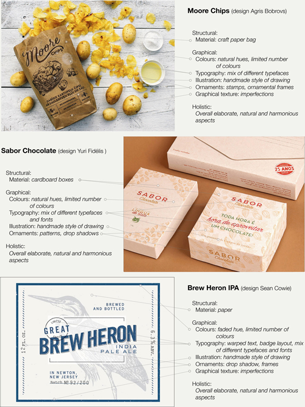
Figure 5. Examples of packages from the Dribbble sample and description of their neo-retro style elements.
Study 2: Values and Beliefs Associated with the Neo-Retro Style
The first study allowed us to identify the visual elements that are typical of the neo-retro style. To increase the validity of this research, we performed a second study that focused on the values and beliefs that people associate with neo-retro package design. Moreover, we were interested in further investigating to what degree these packages are related to the hipster values. In order to study these questions in a systematic controlled way, we designed eight different stimuli that differ in the presence of neo-retro elements. We tested whether these different elements were evocative of the neo-retro style and investigated their associated values and beliefs through a free word association task.
Procedure
Stimuli
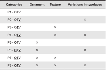
The product category chosen in this study was coffee as it is a frequently purchased product that is widely used by students. Moreover, coffee companies often use retro visual codes (e.g., date of establishment, signature, textures) in their packaging design. In addition, a large amount of experiments and quantitative studies have successfully used coffee as a target product category, which demonstrates its suitability as a stimulus for this study (De Pelsmacker, Driesen, & Rayp, 2005; Magnier, Schoormans, & Mugge, 2016; Schoormans & Robben, 1997; Thøgersen & Nielsen, 2016). A graphic designer created eight coffee stimuli. The stimuli differed in terms of ornaments, texture, and variation in typeface. We decided to use these three elements because of their widespread presence in the corpus of stimuli collected in the first study. In order to assess the effect of ornaments on the perception of neo-retro designs, some of the stimuli (referred to as neutral version) displayed no ornaments, while others displayed different small ornaments above and below the text as well as on both sides of the brand. The typeface of the brand also presented a drop shadow with a hatched pattern. In order to manipulate the texture, the package was either made of a soft plastic in the neutral version or of a textured paper-like material in the neo-retro version. Moreover, graphical textures and small imperfections have been added to the print areas in the neo-retro stimuli. In order to manipulate the typeface variation, the text was presented with different typeface styles (serif, sans serif, and cursive script) and some of the text was warped in upper and lower arcs. In the neutral version, the text was presented with the same typeface, and only the size and the weight of the typeface were changed to keep the stimuli realistic.
In the coding system of the packages, O stands for ornaments, T for textures, and V for variation in typefaces. The letters were presented in bold type and underlined when the elements were manipulated (e.g., O: no ornament; O: presence of ornaments) (cf. Table 1). The stimuli range from a completely neutral design (only neutral design elements included, coded as OTV) to a completely neo-retro design (all three neo-retro design elements included, coded as OTV) (Figure 3). We made sure that the stimuli were as realistic and qualitative as possible by using professional mock-ups and by adding the Fairisle brand. This brand is not sold in the country where the data were collected.
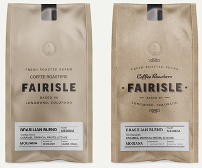
Figure 6. Left: Neutral stimuli ‘OTV’ (only neutral design elements); Right: neo-retro stimuli ‘OTV’ (presence of ornaments, texture and variation in typefaces).
Table 1. Manipulations of our stimuli.
Participants
Students were recruited to participate in the study and were randomly assigned to one of the eight stimuli. Two hundred and fifty-one respondents aged between 18 and 43 years (M = 20.72 years, Female = 54.2%) participated in the survey. Participants had the possibility to enter a lottery to win four vouchers of 25 euros.
Measurements
Participants were presented with one of the eight stimuli and asked to evaluate the perception of neo-retro design with the following two items: “I think this packaging has a retro look”, and “I think this packaging has a look from the past” on 7-point Likert scales. This measurement was used to test whether the design elements uncovered in study 1 were evocative of the neo-retro style. Next, participants were asked to evaluate the stimulus using a free word association task following the approach as developed by Ares et al. (2011). Specifically, participants were asked to answer the following question: “What does this package of coffee evoke to you? Please write down all words, idea associations, emotions, or images that come to your mind when looking at this package.”
Results
Perception of Neo-retro
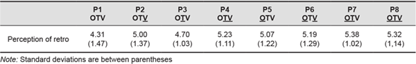
To check whether the stimuli differed in the perception of neo-retro design, the means for the eight stimuli were calculated. Means are presented for the eight stimuli in Table 2. The means show that the manipulations were effective: packages that contain more neo-retro elements were perceived as more retro.
Table 2. Means and standard deviations of each stimulus on the perception of retro.
Moreover, we checked whether each element manipulated—the presence of ornaments, the texture and the variation in typeface—affected the perception of retro. Results show that each of these graphic elements increase the perception of retro (Figure 7), giving further support to the results of our qualitative study.
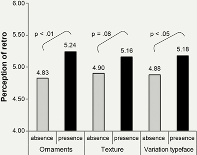
Figure 7. Influence of ornaments, texture and typeface variation on the perception of retro.
Free Word Association Task
In order to analyse the values, ideas and beliefs generated by the participants, a lexical content analysis was conducted. Given the high number of responses to be analysed (N = 251), we used lexical analysis software (Sphinx Quali). This software has semi-automatic functions that facilitate the analysis of a large corpus of responses. The software identified and recoded expressions that are composed of several words and appear several times in our data. The presence or absence of expressions in each respondent’s responses was coded and the number of occurrences was calculated. Next, the software automatically grouped together words that share the same lexical root (e.g., craft, craftsmanship, etc.). In order to avoid errors and misinterpretation, we manually checked each group proposed by the software. Last, a manual grouping procedure served to refine the analysis. Finally, the software generated a new variable to code the presence or absence of the 30 most frequently mentioned lexical categories. As each response was connected to one of the eight stimuli, the identification of the most frequent lexical categories for each stimulus could be carried out. This data allowed using correspondence analysis to check for differences in the perception of the eight packages. Correspondence Analysis is a multivariate graphical technique designed to explore relationships among categorical data (Hoffman & Franke, 1986; Moscarola, 2018) The results of the correspondence analysis are presented in Figure 8.
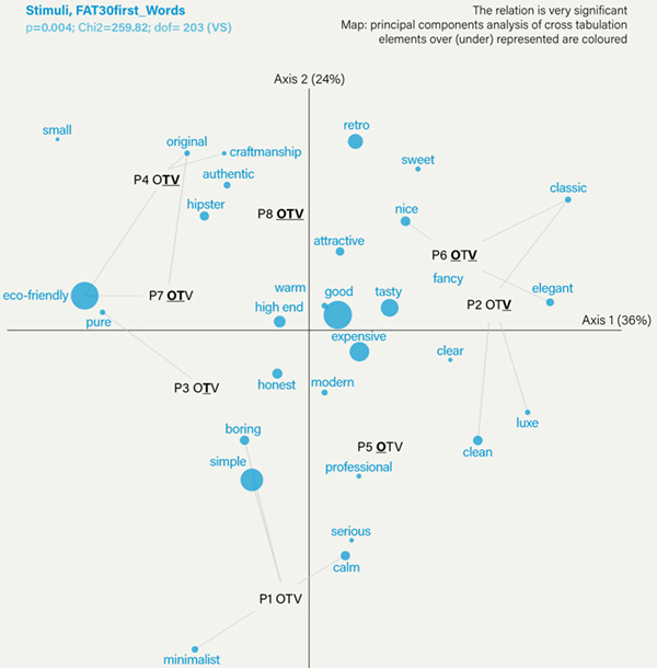
Figure 8. Correspondence analysis.
The relation between the package design and the association of ideas generated is significant (p = .004), indicating that even slight variations in the package design significantly affect the associations of ideas. The percentages on the axes indicate the information on the map represents 60% of the variance in the total data collected.
The package with neutral elements only (OTV) is at the bottom of the map. The three packages that contain only one retro element (OTV; OTV, or OTV) are in the middle of the map. The packages with two or three neo-retro elements (OTV, OTV, OTV, and OTV) are at the top of the map. This result further indicates that the manipulations were effective, as the packages situated at the top of the map (with two or more retro elements) are those perceived as being more retro.
The correspondence map allows us to see which beliefs and values are related to the different stimuli. First of all, it can be seen that the neo-retro stimuli that are located at the top of the map are associated with values like retro, originality, craftsmanship, authenticity, and smallness. These stimuli are also associated with hipster. The stimuli with fewer neo-retro elements are associated with values like modern, boring, calm, and serious.
The map also shows a number of more detailed effects. The packages with textures appear at the left of the map and are strongly associated with eco-friendliness. Second, the packages with typeface variation are located at the top of the map. This indicates that typeface variation contributes more to the retro association than the other elements. Two of these packages also appear at the right of the map and indicate that type variation also produces specific idea associations such as classic and elegant. Finally, packages with ornaments are not located in any specific area of the map. These design elements do not seem to produce specific associations or ideas although such elements contribute to the overall perception of retro when combined with others.
The results also indicate that the packages adopting a neo-retro style through the use of several retro elements produce brand and product beliefs that are in line with the values of the hipster subculture. Packages 4, 7, and 8 produce the following associations of ideas: hipster, authentic, craftsmanship, eco-friendly, small (meaning small companies/brands/production), and retro. These results confirm what was suggested by our literature review and our qualitative study: the neo-retro style in package design is linked to the hipster subculture and communicates brand and product beliefs that are linked to the values of hipsters.
Discussion and Limitations
Theoretical and Practical Implications
This paper contributes to the literature in design and art history by defining a widely used contemporary style (Breathnach & Dermody, 2013). While historic styles have been well defined by art historians, there is a call to define contemporary styles more clearly (Drucker & McVarish, 2013; Heller & Chwast, 2018). We add to the literature in contemporary design by defining the context of the development of the neo-retro style, the specific design elements of neo-retro style and holistic aspects related to this style. From an analytical perspective, our analysis reveals that the neo-retro style uses structural elements such as organic, textured materials, and fabrics; graphical elements such as ornaments and patterns, warped text, dull colours, and roughen effects; and informational elements such as claims referring to the past, craftsmanship, and small production batches. From a holistic perspective, the analysis shows that the neo-retro style can be summarised as a style that focuses on natural, organic aspects, uses harmonious designs, and gives an overall impression of complexity.
By linking the neo-retro style to the hipster subculture and its values, we contribute to the literature in design history that underlines the fact that styles are often related to socio-cultural movements and specific historical contexts (Drucker & McVarish, 2013). This research states that neo-retro style emerged from hipster subculture. We therefore contribute to the sociological literature on hipsters by linking the values attached to the hipster subculture to a specific design style. The specific use of certain retro elements contributes to reflecting authenticity and craftsmanship, which fit the values central to the hipster subculture, such as the rejection of industrialised society and the valorisation of more authentic commercial relationships (Le Grand, 2018). The style of many of the packaged products launched by hipsters (e.g., craft coffee or beer) is often referred to as hipster. This style uses, quotes or reinterprets elements of different styles from the past. In this paper, we relate to this style but named it neo-retro style as we argue that this style is used in a much broader context than the hipster subculture itself.
This paper also contributes to the literature in brand management and more specifically on the influence of the package design on brand impressions (Orth & Malkewitz, 2008; Van Rompay & Pruyn, 2011). Two different approaches have been adopted to analyse the influence of package design on brand perceptions: analytical and holistic. Both approaches have advantages and limitations. By focusing on the manipulation of specific design elements separately, analytical approaches usually disregard the interactions of the different elements of the package creating a lack of external validity. Conversely, by investigating the consumer response to a large sample of real packages that are classified from a holistic perspective, holistic approaches do not detail the contribution of the different design elements to the brand perception. Our research approach can be described as syncretic as it benefits from the advantages of both approaches. The first study allowed the identification of the design elements that are typical of the neo retro style and the second study allowed to test all the possible combinations of the selected design elements. This second study enabled to investigate the overall effect of the neo retro style (holistic perspective) while controlling for the relative contributions of the different design elements (analytical perspective) and measuring the impact of the different combinations. By doing so, this research demonstrates that the combination of different styles of typeface, ornaments, texture, and imperfections allows to communicate brand values such as craftsmanship, authenticity, or hipness, with the texture more specifically contributing to a perception of eco-friendliness and the use of different styles of typefaces to a perception of elegance.
This paper also contributes to the literature on the analysis of package design from a holistic point of view. Orth and Malkewitz (2008) have defined three levels in the description of holistic package designs—design elements, higher order design factors, and holistic designs. Different design elements (e.g., colour, typography, images) are displayed on the package and their interaction produces an overall impression. This overall impression can be described along higher order design factors (e.g., naturalness, harmony, or elaborateness). Based on how the packages score on the different higher order design factors, they define five holistic designs (e.g., a massive holistic design scores high on the design factors weight, compressed, size and low on naturalness and harmony). By testing packages belonging to the five types of holistic designs, the authors found significant relationships between these holistic designs and some brand personality traits. However, the observed relationships partially differed when the study was replicated from one product category (wines) to another (perfumes). As the approach was essentially based on statistical analyses, it does not provide any socio-cultural background explaining the observed relationships. In our paper, we show that historic and socio-cultural approaches represent an alternative, potentially more comprehensive, way to identify holistic styles, and to understand why they are associated to certain brand values.
This paper has practical implications for designers and managers. This paper can help managers to better communicate their packaging design needs with designers using the taxonomy of design elements of the neo-retro formative elements once they have established that the positioning of their brand is authentic and hip, and should evoke craftsmanship (cf. Table A.1). Given the great possibilities of elements relevant to evoking these values, and considering that few managers have design experience, it would seem to be useful to accurately describe the analytical and holistic elements of packaging. This paper provides a repertoire of design elements that can help managers and designers share a vocabulary and associations, which has been called for in previous research (Glen Mick, 1986; Orth & Malkewitz, 2008).
This study provides a set of readily available elements of the neo-retro style for designers. Designers can use this repertoire of design elements as guidelines to create packages with a hip and authentic feel. For example, designers can refer to our taxonomy and be inspired by the different types of patterns, typefaces, ornaments, or colours. Moreover, this study can help designers to understand how applying a neo-retro style in package design influences perceptions of the product and the brand. They can emphasise specific associations by emphasizing specific elements. For example, in our study the presence of texture emphasises the perception of eco-friendliness and pureness (packages 3, 4, 7, 8), while typeface variation (packages 2, 4, 6, 8) is associated with terms such as authenticity, hipster or craftsmanship (cf. Figure 5).
Limitations and Directions for Further Research
Although this research offers valuable implications for researchers, designers, and brand managers some limitations should be noted and taken into account in further research.
First, the quantitative study was carried out among students. This convenience sample cannot be assumed to be representative of the Dutch population and further research should strive to diversify the sample in terms of age, education, and income in order to increase external validity. Specifically, future research could test whether the level of education influences consumers’ evaluations of a package presenting a neo-retro design as Snelders, Mugge, and Huinink (2014) demonstrated that individuals with a high level of education have the most positive preferences towards product designs classified as authentic. In addition, this study could be replicated in different countries to highlight how cultural differences influence responses to the neo-retro style in packaging design.
Second, we tested the effect of certain elements of the neo-retro style on two dependent variables: retro and authenticity. The qualitative data collected in the survey (free association task) revealed a series of values related to craftsmanship, hipster, eco-friendliness, originality, quality, or high-end character, which were not tested through means comparisons. Further research should test the influence of the neo-retro style on these values. Furthermore, whether the evaluations of craftsmanship, authenticity or quality of packaging displaying a retro-style lead to actual purchase or a higher willingness to pay is still unclear. Further research should therefore also strive to test how the neo-retro style in packaging design influences behaviour. Such a research would be valuable to establish how the neo-retro style elements influence the marketing value of products.
Third, coffee was chosen to test the effect of neo-retro styles on consumers’ response but it would be interesting to replicate the results of this study with other products. Neo-retro style might not be adequate for all product categories. For example, products for which people expect effectiveness and for which the latest manufacturing techniques and technologies are needed (e.g., medication) might not be considered the best candidates for a packaging displaying a neo-retro style. Further research could explore the categories for which the neo-retro style is suitable, and the categories for which it is not.
Fourth, it is also unclear how long the neo-retro style will communicate these values. We can question whether the definition and the value of neo-retro style elements in package design will change over time. A long-term longitudinal study could enable the assessment of consumers’ long-term associations with the neo-retro style in packaging design (Arnould & Thomson, 2005). In addition, such a study could examine the evolution of the presentation of socio-cultural values in packaging design.
Fifth, although it is clear that neo-retro style is used in the packaging of products that have been recently introduced on the market, future research could explore the impact of the incongruence of the date of creation of a brand and neo-retro style. This type of research could also examine how the neo-retro style elements can help establish a brand’s image.
Finally, the focus of the present research has been on the neo-retro style, which is only one of the contemporary graphic design styles available for package design. As explained in the introduction, graphic styles from the past have been well documented and defined by design historians but this type of work is missing for contemporary graphic styles. Our work brings a contribution to the field as defining one of them. However, more work is needed to analyse the other contemporary graphic styles that co-exist and are available to designers and brands. Further research could carry on this task and help establish a typology of contemporary graphic design styles that specify the specificities of each of them and the values that they can communicate.
Conclusion
Looking back at the images that inspired this research (cf. Figure 1 & 5), and after having defined the neo-retro style, its context, its formative elements and its effect on individuals’ responses, we now have a clearer understanding of the processes that link this specific style to a certain idea of hipness and authenticity. Heller and Chwast (2018) explain that according to Hermann Broch “a preponderance of ‘neo this’ and ‘neo that’ in any period of art really signifies that the false or fraudulent is pervasive” (p. 10). Our study does not demonstrate the opposite, as neo-retro style can be used to simulate brand heritage and craftsmanship. It could thus be false from this point of view. However, it most likely reflects a true desire for authenticity in a digital age and some of the concerns of our contemporary society.
Endnote
- 1. De Stijl style was based on geometric compositions organized around rectangular shapes in plain primary colours, black thick straight lines and white negative space. The Art Nouveau style was based on organic shapes and ornaments inspired from nature, romantic themes of illustrations and compositions organized along sinusoidal lines. The flat design style emerged more recently with the development of smartphone applications and is recognizable through the use of figurative icons made of simple vector shapes, plain colours with no 3D rendering.
References
- Alfimtsev, A., Basarab, M., Devyatkov, V., & Levanov, A. (2015). A new methodology of usability testing on the base of the analysis of user’s electroencephalogram. Journal of Computer Sciences and Applications, 3(5), 105-111.
- Ares, G., Piqueras-Fiszman, B., Varela, P., Marco, R. M., López, A. M., & Fiszman, S. (2011). Food labels: Do consumers perceive what semiotics want to convey? Food Quality and Preference, 22(7), 689-698.
- Arnould, E. J., & Thompson, C. J. (2005). Consumer culture theory (CCT): Twenty years of research. Journal of Consumer Research, 31(4), 868-882.
- Arsel, Z., & Thompson, C. J. (2010). Demythologizing consumption practices: How consumers protect their field-dependent identity investments from devaluing marketplace myths. Journal of Consumer Research, 37(5), 791-806.
- Barnes, A. (2017). Telling stories: The role of graphic design and branding in the creation of ‘authenticity’within food packaging. International Journal of Food Design, 2(2), 183-202.
- Becker, L., van Rompay, T. J., Schifferstein, H. N., & Galetzka, M. (2011). Tough package, strong taste: The influence of packaging design on taste impressions and product evaluations. Food Quality and Preference, 22(1), 17-23.
- Berkowitz, M. (1987). Product shape as a design innovation strategy. Journal of Product Innovation Management, 4(4), 274-283.
- Blanchard, G. (1998). Aide au choix de la typographie [Help with the choice of typography]. Gap, France: Editions Adverbum.
- Breathnach, T., & Dermody, B. (2013). The appeal of the past: Retro type and typography. InPrint, 2(1), 30-48.
- Brown, S., Kozinets, R. V., & Sherry Jr, J. F. (2003). Teaching old brands new tricks: Retro branding and the revival of brand meaning. Journal of Marketing, 67(3), 19-33.
- Cattaneo, E., & Guerini, C. (2012). Assessing the revival potential of brands from the past: How relevant is nostalgia in retro branding strategies? Journal of Brand Management, 19(8), 680-687.
- Celhay, F., & Remaud, H. (2018). What does your wine label mean to consumers? A semiotic investigation of Bordeaux wine visual codes. Food Quality and Preference, 65, 129-145.
- Crilly, N., Maier, A., & Clarkson, P. J. (2008). Representing artefacts as media: Modelling the relationship between designer intent and consumer experience. International Journal of Design, 2(3), 15-27.
- De Pelsmacker, P., Driesen, L., & Rayp, G. (2005). Do consumers care about ethics? Willingness to pay for fair-trade coffee. Journal of Consumer Affairs, 39(2), 363-385.
- Dichter, E. (1964). Handbook of consumer motivations. New York, NY: McGraw-Hill.
- Doll, J. (2012, December 6). The hipster designers who sold out the hipster design world. The Atlantic. Retrieved from https://www.theatlantic.com/entertainment/archive/2012/12/hipster-designers-who-sold-out-hipster-design-world/320772/
- Dowd, J. J., & Dowd, L. A. (2003). The center holds: From subcultures to social worlds. Teaching Sociology, 31(1), 20-37.
- Drucker, J., & McVarish, E. (2013). Graphic design history. New York, NY: Pearson.
- Easterday, M. W., Lewis, D. R., & Gerber, E. M. (2017). Designing crowd critique systems for formative feedback. International Journal of Artificial Intelligence in Education, 27(3), 623-663.
- Favier, M., Celhay, F., & Pantin-Sohier, G. (2019). Is less more or a bore? Package design simplicity and brand perception: An application to Champagne. Journal of Retailing and Consumer Services, 46, 11-20.
- Folkes, V., & Matta, S. (2004). The effect of package shape on consumers’ judgments of product volume: Attention as a mental contaminant. Journal of Consumer Research, 31(2), 390-401.
- Fort-Rioche, L., & Ackermann, C.-L. (2013). Consumer innovativeness, perceived innovation and attitude towards “neo-retro”-product design. European Journal of Innovation Management, 16(4), 495-516.
- Ganassali, S. (2014). Enquêtes et analyse de données avec Sphinx [Survey and data analysis with Sphinx]. New York, NY: Pearson.
- Glen Mick, D. (1986). Consumer Research and Semiotics: Exploring the Morphology of Signs, Symbols, and Significance. Journal of Consumer Research, 13(2), 193-213.
- Gordon, A., Finlay, K., & Watts, T. (1994). The psychological effects of colour in consumer product packaging. Canadian Journal of Marketing Research, 13(3), 3-11.
- Heller, S., & Chwast, S. (2018). Graphic style. From victorian to hipster. New York, NY: Abrams.
- Hémar-Nicolas, V. (2011). Brand characters on packaging, a catalyst for children’s purchase request: The moderating effect of the narrative presentation of the character, the child’s familiarity with the character and the child’s educational level. Recherche et Applications en Marketing (English Edition), 26(4), 23-50.
- Henderson, P. W., & Cote, J. A. (1998). Guidelines for selecting or modifying logos. Journal of Marketing, 62(2), 14-30.
- Henderson, P. W., Cote, J. A., Leong, S. M., & Schmitt, B. (2003). Building strong brands in Asia: Selecting the visual components of image to maximize brand strength. International Journal of Research in Marketing, 20(4), 297-313.
- Henderson, P. W., Giese, J. L., & Cote, J. A. (2004). Impression management using typeface design. Journal of Marketing, 68(4), 60-72.
- Hendlin, Y., Anderson, S. J., & Glantz, S. A. (2010). ‘Acceptable rebellion’: Marketing hipster aesthetics to sell camel cigarettes in the US. Tobacco Control, 19(3), 213-222.
- Hoffman, D. L., & Franke, G. R. (1986). Correspondence analysis: Graphical representation of categorical data in marketing research. Journal of Marketing Research, 23(3), 213-227.
- Holbrook, M. B. (1993). Nostalgia and consumption preferences: Some emerging patterns of consumer tastes. Journal of Consumer Research, 20(2), 245-256.
- Hubbard, P. (2016). Hipsters on our high streets: Consuming the gentrification frontier. Sociological Research Online, 21(3), 1-6.
- Hum, N. J., Chamberlin, P. E., Hambright, B. L., Portwood, A. C., Schat, A. C., & Bevan, J. L. (2011). A picture is worth a thousand words: A content analysis of Facebook profile photographs. Computers in Human Behavior, 27(5), 1828-1833.
- Jubert, R. (2006). Typography and graphic design: From antiquity to the present. Paris, France: Flammarion.
- Jury, D. (2015). The little book of typographic ornament. London, UK: L.K. Publishing.
- Kassarjian, H. H. (1977). Content analysis in consumer research. Journal of Consumer Research, 4(1), 8-18.
- Kniazeva, M., & Belk, R. W. (2007). Packaging as vehicle for mythologizing the brand. Consumption Markets & Culture, 10(1), 51-69.
- le Grand, E. (2018). Representing the middle-class ‘hipster’: Emerging modes of distinction, generational oppositions and gentrification. European Journal of Cultural Studies, 1-17. https://doi.org/10.1177/1367549418772168
- Lupton, E., & Phillips, J. C. (2008). Graphic design: The new basics. New York, NY: Princeton Architectural Press.
- Magnier, L., & Schoormans, J. (2017). How do packaging material, colour and environmental claim influence package, brand and product evaluations? Packaging Technology and Science, 30(11), 735-751.
- Magnier, L., Schoormans, J. P. L., & Mugge, R. (2016). Judging a product by its cover: Packaging sustainability and perceptions of quality in food products. Food Quality and Preference, 53, 132-142.
- Maly, I., & Varis, P. (2016). The 21st-century hipster: On micro-populations in times of superdiversity. European Journal of Cultural Studies, 19(6), 637-653.
- Michael, J. (2015). It’s really not hip to be a hipster: Negotiating trends and authenticity in the cultural field. Journal of Consumer Culture, 15(2), 163-182.
- Moscarola, J. (2018). Faire parler les données. Méthodologies quantitatives et qualitatives [Make the data speak. Quantitative and qualitative methodologies]. Caen, France: Editions Management et Société.
- Mugge, R. (2011). The effect of a business-like personality on the perceived performance quality of products. International Journal of Design, 5(3), 2011.
- Mugge, R., Massink, T., Hultink, E. J., & van den Berg-Weitzel, L. (2014). Designing a premium package: Some guidelines for designers and marketers. The Design Journal, 17(4), 583-605.
- Muller, W. (2001). Order and meaning in design. West Lafayette, IN: Purdue University Press.
- Orth, U. R., Campana, D., & Malkewitz, K. (2010). Formation of consumer price expectation based on package design: Attractive and quality routes. Journal of Marketing Theory and Practice, 18(1), 23-40.
- Orth, U. R., & Gal, S. (2014). Persuasive mechanisms of nostalgic brand packages. Applied Cognitive Psychology, 28(2), 161-173.
- Orth, U. R., & Malkewitz, K. (2008). Holistic package design and consumer brand impressions. Journal of Marketing, 72(3), 64-81.
- Pantin-Sohier, G. (2009). The influence of the product package on functional and symbolic associations of brand image. Recherche et Applications en Marketing (English Edition), 24(2), 53-71.
- Pracejus, J. W., Olsen, G. D., & O’Guinn, T. C. (2006). How nothing became something: White space, rhetoric, history, and meaning. Journal of Consumer Research, 33(1), 82-90.
- Raghubir, P., & Greenleaf, E. A. (2006). Ratios in proportion: What should the shape of the package be? Journal of Marketing, 70(2), 95-107.
- Rokka, J., & Canniford, R. (2016). Heterotopian selfies: How social media destabilizes brand assemblages. European Journal of Marketing, 50(9/10), 1789-1813.
- Schiermer, B. (2014). Late-modern hipsters: New tendencies in popular culture. Acta Sociologica, 57(2), 167-181.
- Schoormans, J. P., & Robben, H. S. (1997). The effect of new package design on product attention, categorization and evaluation. Journal of Economic Psychology, 18(2), 271-287.
- Schroeder, J. E. (2005). The artist and the brand. European Journal of Marketing, 39(11/12), 1291-1305.
- Schroll, R., Schnurr, B., Grewal, D., Johar, G., & Aggarwal, P. (2018). Humanizing products with handwritten typefaces. Journal of Consumer Research, 45(3), 648-672.
- Scott, M. (2017). ‘Hipster capitalism’in the age of austerity? Polanyi meets Bourdieu’s new petite bourgeoisie. Cultural Sociology, 11(1), 60-76.
- Snelders, D., Mugge, R., & Huinink, M. (2014). Using social distinctions in taste for analysing design styles across product categories. International Journal of Design, 8(3), 23-34.
- Spence, C., & Velasco, C. (2018). On the multiple effects of packaging colour on consumer behaviour and product experience in the ‘food and beverage’ and ‘home and personal care’ categories. Food Quality and Preference, 68, 226-237.
- Staton, M. (2014, January). The degree is doomed. Harvard Business Review. Retrieved from https://hbr.org/2014/01 /the-degree-is-doomed
- Stein, J. D. (2012, December 5). They get around. The New York Times. Retrieved from https://www.nytimes.com/2012/12/06/fashion/the-design-team-roman-williams-gets-around.html?pagewanted=all
- Tassoul, M., & Buijs, J. (2007). Clustering: An essential step from diverging to converging. Creativity and Innovation Management, 16(1), 16-26.
- Te Vaarwerk, M., Van Rompay, T., & Okken, V. (2015). Under cover and close at hand: Embodied metaphor in packaging design. International Journal of Design, 9(1), 29-37.
- Thøgersen, J., & Nielsen, K. S. (2016). A better carbon footprint label. Journal of Cleaner Production, 125, 86-94.
- Thorén, C., Edenius, M., Lundström, J. E., & Kitzmann, A. (2017). The hipster’s dilemma: What is analogue or digital in the post-digital society? Convergence: The International Journal of Research into New Media Technologies, 25(2), 324-339.
- Tiggemann, M., & Zaccardo, M. (2018). ‘Strong is the new skinny’: A content analysis of #fitspiration images on Instagram. Journal of Health Psychology, 23(8), 1003-1011.
- Underwood, R. L. (2003). The communicative power of product packaging: Creating brand identity via lived and mediated experience. Journal of Marketing Theory and Practice, 11(1), 62-76.
- Van Rompay, T. J., & Pruyn, A. T. (2011). When visual product features speak the same language: Effects of shape-typeface congruence on brand perception and price expectations. Journal of Product Innovation Management, 28(4), 599-610.
- Victionary. (2016). New retro. Graphics & logos made in retro style. Hong Kong, China: Victionary.
- Wei, S. -T., Ou, L. -C., Luo, M. R., & Hutchings, J. B. (2014). Package design: Colour harmony and consumer expectations. International Journal of Design, 8(1), 109-126.
- Wrigley, C. (2013). Design dialogue: The visceral hedonic rhetoric framework. Design Issues, 29(2), 82-95.
Appendix 1: Results of the Qualitative Study
| Analytical | Structural | Materials | High-quality materials: organic materials; leather; wood; natural fabrics (e.g., linen); glass jars; rustic materials Old materials: metallic cans; old milk bottles; glass bottles Paper over plastic: brown paper (bags); not glossy; natural-looking; cardboard; paper bag; no plastics Imperfections and texture: the material used have natural imperfections and a texture |
| Graphical | Colours | Colour hue: nature-inspired colours; sepia; orange; ochre; brown; yellow; yellowish; grey; olive green; black & white Colour lightness: light; pastel colours Colour intensity: faded; unsaturated; dull colours Colour scheme: Single coloured (or maximum of 2); limited combinations of colours ; no colour gradient |
|
| Typography | Layout: centred layout; warped text (text in arches, text in a bulge); badges layout (text in a circle) Typeface: mix of different typefaces from different families (scripts, non scripts, serif, sans serif, tuscans, blackletters) reminding the Victorian style. Scripts typefaces (imitating handwriting); capital letters with serifs; typewriter fonts; road 66 style are frequent. Fonts: mix of fonts in terms of case (uppercases and lowercases fonts) boldness (thin and bold fonts) and orientation (roman and italics fonts) |
||
| Illustrations | Not computerised: Handmade drawings of the product; No 3D renderings; no vectors; drawings with round curves Signed: Presence of a signature Forms: repetitive; basic shapes; organic shapes |
||
| Ornaments | Patterns: presence of patterns; structured patterns; hatch patterns; gingham fabrics; floral patterns geometric patterns; drop shadow with hatching patterns inside; use of multiple stripes; multiple strokes Ornaments: decorative ornaments; stamps; banners; ornamental frames; frames; flourishes; round shapes; wavy lines; waves; dots |
||
| Graphical texture |
Reliefs: engraved patterns or signatures; embossing Imperfections: human imperfections; traces of use; old inks; damaged colours (as if already there for a long time); irregular edges |
||
| Verbal | Claims | Not automated: handmade; craft vs. fast production; locally produced, small batches Senses: sensorial claims (e.g., emm, it smells good) Personal: family recipe; use of a person’s name |
|
| Date of establishment | Reference to the year of establishment; since; year of creation; since 1930 | ||
| Holistic | Elaborateness | Overall elaborate and complex aspect due to: a large amount of text, the presence of ornaments, patterns, textures, and typeface sophistication | |
| Naturalness | Naturalness: overall natural aspect due to the imperfections and textures, due to the use of organic material (brown paper, wood, leather) | ||
| Harmony | Overall harmonious aspect due to the use of a limited range of desaturated colours and centred layouts which produce a feeling of balance | ||
