Effect of Visual Quality and Animation of Concept Representations on Users’ Responses to Early Design Concepts: A Study on the Adaptive Patient Room Concept
Derya Ozcelik Buskermolen 1,*, Jacques Terken 1, Berry Eggen 1, and Evert van Loenen 2
1 Eindhoven University of Technology, Eindhoven, The Netherlands
2 Philips Research, Eindhoven, The Netherlands
New technologies enable designers to create advanced visual representations of concepts (e.g., animations, renderings) early in the design process. However, it is not clear whether and how the properties of such concept representations affect the users’ understanding of the concept and the nature of the feedback they provide. To explore this we conducted an experiment with forty-eight participants. We manipulated the medium (a series of stills vs. an animation) and visual quality (sketchy vs. refined) of visual concept representations presenting a concept for an adaptive patient room and investigated the nature of the feedback provided. The medium and visual quality had no effect on the concept comprehension, judgements on hedonic quality and appeal, and transportation to the narrative world. Visual quality had an effect on representation realism. Participants who were shown visually refined representations were more convinced that the concept would behave the same in real life as it was shown in the representation. Medium had no effect on the quality of the feedback elicited from users; visual quality did. Participants who saw sketchy representations provided more elaborate feedback and suggestions and grounded their feedback on past experiences. Based on these results, designers can be recommended to utilize sketchy representations if they want to elicit feedback grounded on past experiences. If the aim is to elicit definite judgements, visually refined representations can be more helpful.
Keywords – Animation, Concept Evaluation, Concept Representations, User Feedback, Visual Quality.
Relevance to Design Practice – New technologies enable designers to create advanced concept representations (animations, renderings) early in the design process. Do these representations help users to understand the concepts better and provide useful feedback? This research provides insights about how such properties of concept representations affect the quality of the feedback elicited from users.
Citation: Buskermolen Ozcelik, D., Terken, J., Eggen, B., & Van Loenen, E. (2015). Effect of visual quality and animation of concept representations on users’ responses to early design concepts: A study on the adaptive patient room concept. International Journal of Design, 9(1), 91-106.
Received March 6, 2013; Accepted August 25, 2014; Published April 30, 2015.
Copyright: © 2015 Ozcelik Buskermolen, Terken, Eggen and Van Loenen. Copyright for this article is retained by the authors, with first publication rights granted to the International Journal of Design. All journal content, except where otherwise noted, is licensed under a Creative Commons Attribution-NonCommercial-NoDerivs 2.5 License. By virtue of their appearance in this open-access journal, articles are free to use, with proper attribution, in educational and other non-commercial settings.
*Corresponding Author: derya.ozcelik@gmail.com.
Dr. Derya Ozcelik Buskermolen studied Industrial Design at Middle East Technical University (METU), in Ankara, Turkey (MSc, 2007). In October 2013, she received her PhD degree from Eindhoven University of Technology. In her PhD, she investigated how to obtain end-user feedback on really new design concepts in the very early stages of their development, when there is not yet any prototype available to show to the users. She studied the use of storytelling in that process. She conducted her studies in collaboration with several industry leading companies in the Netherlands. Her research resulted in the Co-constructing Stories method aiming to support the designers in eliciting in-depth end-user feedback on early design ideas. Dr. Ozcelik Buskermolen’s research interests include qualitative design research methods, participatory design and designing for the user experience.
Dr. Jacques Terken is Associate Professor in the Department for Industrial Design, Eindhoven University of Technology. He has a degree in Cognitive Psychology. His research and teaching specialties are user-system interaction and user experience, with a special interest in how we can obtain user feedback in the very early stages of design for radical/disruptive innovations. Over the last few years, his research has focused on the automotive domain, in particular advanced driver assistance systems and human factors of vehicle automation.
Prof Dr. Berry Eggen is a full professor and vice-dean of the Industrial Design department at the Eindhoven University of Technology, where he chairs the User-Centered Engineering research group. He is also an adjunct professor at the School of Design of the Faculty of Design, Architecture and Building of the University of Technology, Sydney, Australia. Over the years he led design research groups in the areas of information ergonomics, multimodal interaction (including lighting and sound) and intelligent interfaces. His current research activities include interaction design research for playful interactions and the exploration of decentralized systems approaches to ambient intelligence. Within the field of multimodal research his interests include lighting and sound innovations in the living room and public spaces, and the exploration of light and sound as calm environmental information displays.
Prof Dr. Evert van Loenen is Principal Scientist in the Human Interaction & Experiences department of Philips Research, and furthermore part-time full professor in Smart Lighting in the Department of the Built Environment of Eindhoven University of Technology. He has been involved in Ambient Intelligence research from the start of the field in 1999, more specifically in user Centered design, user system interaction, context awareness and experience research. His current research focuses on light and health in the built environment, exploring how environmental factors such as daylight, artificial light, views and sounds impact health and health recovery processes.
Introduction
In the early phases of the design process designers question whether they are working on the “right” design concept, i.e., whether a proposed concept would meaningfully fit in the lives of people (Buxton, 2007). One way to answer this question is to discuss early design concepts with users. For that, designers need to externalize their design ideas and prepare concept representations which communicate the role that the design would have in the lives of people (Houde & Hill, 1997). These representations should communicate the attributes and benefits of the design concept (Veryzer, 1998) and help the user imagine using it so that s/he can make judgements about whether the design concept matches his/her needs and interests. Story-based representations are considered to be effective in communicating the aforementioned aspects of the design concept and focusing the discussion on the role of the new design concept in people’s everyday life (Houde & Hill, 1997). Among the story-based concept representations, storyboards are the most commonly used. Such representations usually consist of a sequence of sketchy pictures with captions (van der Lelie, 2006). However, new technologies enable designers to create more advanced representations, even early in the design process, through utilizing animations, videos, and augmented and virtual reality. These media allow sounds, motion and light effects to be included in the representations and enable a “feel” of experience (Stappers, Gaver, & Overbeeke, 2003; Olivier, Xu, Monk, & Hoey, 2009). Such advanced representations may be particularly helpful to communicate “dynamic” (4D) concepts, that is, concepts for applications (products, services) that show behaviour. For static (3D) designs, a (series of) still(s) might do, but for 4D applications, it might be important to present the concept “in action” and not only the steady states resulting from the actions. On the other hand, creating these advanced concept representations requires more time and effort in comparison to creating classical storyboards. Then the question arises: Do these advanced representations help users more than the sketchy, static representations to understand the concept, and to envision its implications on their life? In this paper, we present a study investigating the effect of two properties of visual concept representations on the nature of the user feedback on early design concepts.
Lim, Stolterman and Tenenberg (2008) argue that the material, the resolution and the scope of concept representations affect people’s perception of, and reaction to, the design concept. However, there are varying opinions about whether sketchy or advanced concept representations elicit better feedback. Houde and Hill (1997) argue that design ideas communicated through rough representations cannot easily be interpreted and understood by people who are not familiar with the design concept. On the other hand, van der Lelie (2006) argues that advanced representations would be accepted “as it is” and would inhibit critical feedback. Designers have the same dilemma as well (Ozcelik, Quevedo, Thalen, & Terken, 2011). Sketchy representations are believed to be better than visually refined representations in communicating that the design is in an early stage and any feedback is welcomed. At the same time, it is believed that feedback elicited through sketchy representations may not be reliable as the user might have made misinterpretations.
In this paper we present a study comparing the nature of user feedback on an adaptive patient room concept presented through different concept representations. We compare the user feedback elicited through sketchy representations to the user feedback elicited through visually refined representations to gain insights about whether and how the visual properties of concept representations influence the users’ understanding of the concept and the nature of the feedback they provide. We also compare the user feedback elicited through a series of stills to the user feedback elicited through an animation to gain insights about whether and how demonstrating the gradual transitions of light and sound (which play a central role in the chosen design concept) influence the users’ perception of the concept and the nature of their feedback. We use a simple form of animation which demonstrates gradual transitions of light and sound through fade-in and out to keep the two conditions as comparable as possible.
Related Work
Properties of concept representations have been discussed in the literature through the concept of fidelity. Fidelity is defined as the extent to which the prototype approximates to the final design with respect to different dimensions. Several frameworks have been developed to identify these dimensions (see Wiklund et al, 1992; Virzi et al., 1996; Nilsson & Siponen, 2006; McCurdy et al., 2006). These frameworks focus on the material qualities of prototypes and the qualities of the interaction. In recent frameworks (see Sauer & Sondergger, 2009; Sauer et al, 2010; Dahl et al., 2010) the definition of fidelity is broadened and defined as the approximation of the test condition to the final use condition, including the test environment, task scenarios and user characteristics. However, developments in Human Computer Interaction challenge even the latter approaches, as they focus mainly on graphical user interfaces and usability. Today, in more and more applications interfaces are embedded in physical objects and environments (Dourish, 2001) and the boundaries between the concept and the context have been blurred. In addition, user-product interaction goes beyond usability. Providing meaningful experiences is adopted as the pledge of interaction design. In order to elicit feedback from users about whether or not the design concepts would be meaningful for their life, the users should help to evaluate the concepts holistically. For that, the concepts should be presented to them through proper representation techniques. It is desired that the utilized concept representations convey the experiential attributes of the design concept in a holistic manner and help users to imagine how they would experience the design concept in their everyday life.
In the literature, two approaches are adopted, while evaluating early design concepts with users, to convey the feel of the experience that the design concept aims to evoke. The first approach proposes the use of early prototypes of the design concepts in real settings, accompanied by role-playing, so that a simulation of the desired experience, in related contexts, can be reached, when the ‘real experience’ cannot be enabled (e.g., Brandt & Grunnet, 2000; Buchenau & Suri, 2000). In such approaches, the prototypes function as props facilitating imagination through role playing. The second approach aims to enable the user to experience the concept not physically but mentally. In this approach, storylines are used to communicate what people do and experience when they make use of the design concept (Carroll, 1995). Users are invited to sessions, they are shown the stories about the concept and their feedback on the concept is elicited through a dialogue. This approach is especially preferred when the concept cannot be easily prototyped and/or the evaluations cannot be carried out in real settings. In this research we are interested in the second approach. We hypothesize that how concept stories are externalized and communicated to users might play a role in how users perceive the concepts and imagine experiencing them, as there is no other facilitation such as the real setting and role-playing used in the first approach.
Visual Representations of Concept Stories
Stories have been used in the HCI domain since 1990s (Briggs et al., 2012); they can convey the interaction between the user and the design concept including inner motivations of the people and the context around the interaction (Quesenbery & Brooks, 2010). They are especially valued in representing really new design ideas, when there is no prototype to be shown (Diederiks & Hoonhout, 2007; van den Hende et al., 2007). Several media are used in order to communicate concept stories to the potential users (Figure 1). Text is the most common (Haumer, Heymans, Jarke, & Pohl, 1999; Rolland et al., 1998). Text based representations are popular due to their roughness and ambiguity; however, they are also limited in most settings where addition of pictures or sounds can be more informative (Haumer et al., 1999).
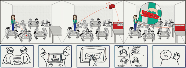
Figure 1. Sample design stories (courtesy Saskia Bakker (above) and Berke Atasoy (below)).
Designers have been utilizing various visual media in addition to text to convey their message in an effective way. Related literature refers to two aspects of visual representation of concept stories: the medium they utilize (e.g., storyboards, photos, videos), and the visual quality they have. Storyboard is the most popular medium among the visual representations of stories. They enable the viewer to experience the interactions through empathizing with the character and/or the situation, and to reflect on the visualized situation through his/her own everyday expertise (van der Lelie, 2006). Storyboards only add visual information to the textual representation of stories. We argue that for some concepts the inclusion of motion and sounds might be more informative. Animations or videos can be used for such cases. It is argued that video can be powerful in triggering intellectual and emotional responses from the viewer, as it engages both the visual and auditory senses and uses a variety of verbal, musical and visual codes (Mancini et al., 2010). This is supported by Little & Briggs (2009) who tell us using video “allows individuals to discuss their own experiences, express their beliefs and expectations” (p. 2). Although they use different media, both storyboards and videos aim to evoke reactions from users related to an experience that they did not live themselves but can identify with cognitively (van der Lelie, 2006; Mancini et al., 2010). We agree with the argument that, representations utilizing augmented and virtual reality (VR) enable the ‘feel’ of experience by bringing the dimension of reality to the representation (Olivier et al., 2009; Stappers et al., 2003). In addition to the static, dynamic and virtual representation of stories, there are also representations which do not totally fit to one specific group but are a combination. For example, storyboards can be shown on a computer screen in the form of flip chart animations which enable the inclusion of sounds to static pictures. Moreover, video collages (Keller & Stappers, 2001) are used to create “sketchy environments” by using pictures, videos, animations, and sounds with the possibilities of VR, in order to create a sense of presence in the environment concerning the design concept.
Several studies have investigated the effect of medium on the user feedback concerning the overall experience that will be enabled by the concept. Van den Hende et al. (2007) investigated the effect of different representations of early concept narratives (drawn visualization, photo realistic visualization and animation) on absorbing the participants in the narrative world (transportation), comprehension of the concept, informing participants adequately about the concept, and evoking the belief that the concept will behave in real life as told in the story. The authors concluded that presentation format did not have a significant effect on any of the measures, except for transportation. Transportation was equally strong for drawn visualization and photo realistic visualization and less strong for the animation. Sellen, Massimi, Lottridge, Truong and Bittle (2009) investigated how the medium (storyboard vs. video) used to externalize design concepts affects the number of (positive-neutral-negative) comments on the concept, number of verbal references to the concept representation and number of utterances referring to participant’s preferences or traits. The authors could not find an effect of medium except for self-reference. Accordingly, the storyboard elicited significantly more self-reference than the video. Moreover, authors argued that “storyboards allow participants to place themselves in the scene more easily, but at the risk of miscomprehension” (p. 637). Diefenbach, Hassenzah, Eckoldt and Laschke (2010) presented two product concepts in four different ways: text description, text and pictures, text and video, text and real interaction. Representation format did not influence global product evaluation (product’s general goodness) and perceptions of the product character (pragmatic and hedonic quality).
The other dimension concerns the visual quality of concept representations. Visual quality refers to the “look” of the concept representation and refers to how realistic the representation looks: visual quality of a concept representation ranges from sketchy to refined. The literature reveals varying opinions about the desired visual quality of concept representations. Van der Lelie (2006) favours a sketchy look as it evokes comments and suggestions while visually refined representations tend to be accepted ‘as it is’ without leaving much room for discussion. Stappers et al. (2001) criticize realistic representations for putting “the objective world first and the user’s experience second” (p. 92). Instead of visually refined representations, they advise the use of more expressive representations “which are tuned to the user’s experience rather than to the natural world” (p. 109). On the other hand, Houde and Hill (1997) argue that sketchy concept representations might be difficult to interpret for people who are not familiar with the design concept, and the design idea communicated with such representations would not seem real to them. Thus higher resolution representations might work better for a broader audience. Van Klaveren (2012) brings another dimension to the discussion. She argues that representations to be shown to the users should be attractive, as the time and effort spent on these materials convey the message that the designer really cares about the experiences of the participants and their responses. These discussions reveal that the visual quality of concept representations focusing on experiential aspects of design concepts is still a debatable issue.
The Present Study
The literature shows that the visual representations that go with stories presenting the design concepts differ from each other in two respects: their visual quality and the medium they utilize. The current study investigates the effect of visual quality and medium on (1) users’ understanding of the concept, (2) users’ ability to imagine using the concept in their lives (van den Hende et al., 2007), (3) their appreciation of the design concept (Sellen et al., 2009; Diefenbach et al., 2010), (4) and the nature of the feedback they provide.
The review of the related literature showed that sketchy looking and visually refined representations are thought to have different benefits and limitations. In this study, we compare the sketchy and visually refined representations of concept stories regarding the aforementioned dimensions and aim to contribute to the discussion. There are several media which can be used to present the visual representations that go with the concept stories to users. In this study, we compare a sequence of stills with an animation, in order to understand whether or not presenting the gradual transition of light and sound (which play a central role in the chosen concept) has positive effects on the dimensions listed above. With this study we aim to provide insights for designers about the creation and use of representations in their dialogue with end-users, in the early phases of the design process.
Based on the related research the following hypotheses were put forward:
- More instances of comprehension problems will be observed in the sketchy looking condition than in the visually refined condition (Houde & Hill, 1997), and in the stills condition than in the animation condition (Sellen et al., 2009).
- No difference will be observed between the test conditions regarding the judgements of the participants on the appeal and hedonic quality of the concept (Diefenbach et al., 2010).
- Participants in the stills condition will more easily be absorbed in the narrative world (transportation) than the participants in the animation condition (van der Hende et al., 2007).
- Participants in the visually refined condition will believe more that the concept will behave in real life as described in the concept representation (van der Lelie, 2006).
- Participants in the sketchy condition will be more critical towards the concept than participants in the visually refined condition (van der Lelie, 2006).
- Stills will elicit more self-reference than the animation (Sellen et al., 2009).
Furthermore, it was hypothesized that learning styles of participants might affect how well people understand the concept through concept representations with different properties. Litzinger, Lee, Wise and Felder (2007) describe learning styles as “characteristic preferences for alternative ways for taking in and processing information” (p.309). In the model proposed by Solomon and Felder (1999) four dimensions of learning styles are distinguished: processing (active–reflective), perception (sensing–intuitive), input (visual-verbal) and understanding (sequential–global). We incorporated these styles in our study; however, we were only interested in the dimension of input. We hypothesized that personal preference for learning new information through visual or verbal stimuli would affect the performance of the participants regarding: (1) comprehension of the concept, (2) their believing the concept will work in real life as presented in the representation, (3) their being absorbed in the narrative world, and (4) their judgements on the hedonic quality of the concept. We hypothesized that visual learners will benefit more from visually refined representations and animation than verbal learners.
The Design Case
An early concept of a new product, an adaptive patient room, was chosen as a design case for the study. The adaptive patient room concept is a smart environment which adapts to the events happening in the patient room through the transition of light and sounds (Daemen et al., 2013). The concept is designed by the in-house research and development department of a company whose focus is on translating new technologies into design concepts that will improve people’s lives. For this study we collaborated with them.
Method
Materials
The concept scenario was about a patient called Jonathan who was staying in the hospital after his back surgery. The room that he was staying in was an adaptive patient room that responds to the events happening in the room. The scenario was obtained from the design team and it explained how the room adapts to different events happening in the room through changing the lighting and the sounds (Figure 2). Based on this scenario, four concept representations were prepared, which differ in two dimensions: visual quality (sketchy vs. refined) and medium (stills vs. animation) (Figure 2). First, five stills for the concept story were created. The first still showed the neutral view of the room, when there is no event triggering the room to adapt. The following stills showed the changes resulting from the events explained in the scenario. A sketchy looking version was sketched with pen and paper (Figure 2 bottom left). A visually refined version was composed from CAD renderings of the patient room (Figure 2 bottom right). Next, two animations, visually refined and sketchy looking, were prepared on the basis of the stills. The gradual transitions of light and sounds were animated through fade in and out. For example, the sun rise atmosphere was animated such that the darker hospital room gradually became brighter as the wake up light was gradually lit up. This type of animation was chosen for the study for two reasons. Firstly, we wanted two conditions (stills vs. animation) to be as comparable as possible. If we had chosen a more advanced animation the difference between the stills and the animation would be too big to compare. Secondly, the concept incorporated transitions of light and sound and were suitable to be animated through fade in and out. In our representations we did not use any human figure even though there was a main character in the concept story. We thought that the human figure included in the representations should comply with their visual quality. For visually refined condition the figure should be a real-looking character. We were concerned that including a real-looking character in the representation can create a barrier for participants to empathize with the main character and also with the story (McCloud, 1994).
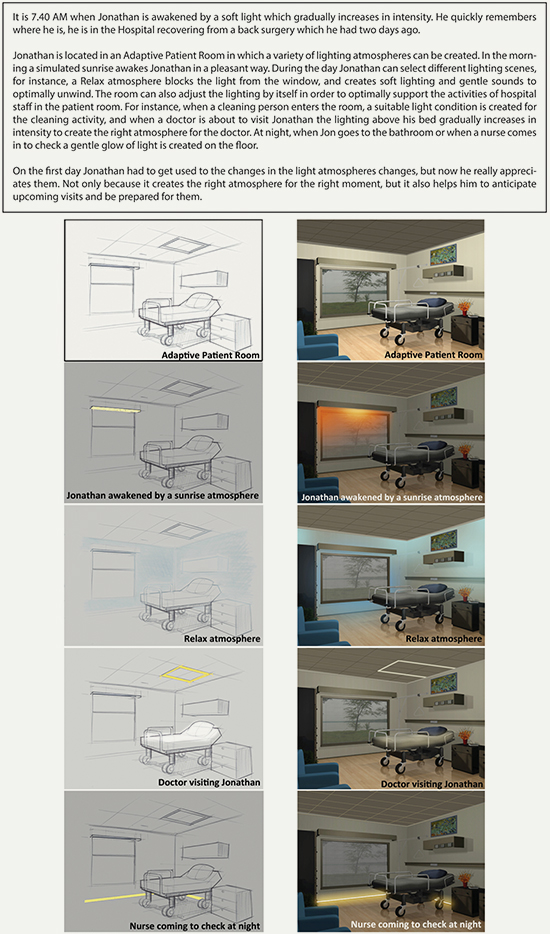
Figure 2. The written scenario (above), sketchy stills (bottom left) and visually refined stills (bottom right).
Participants
The study was carried out with forty-eight participants between 20 and 58 years of age (M = 32.48, SD = 9.39) and a high educational background. Requirement for participation was that they stayed in a hospital at least one night within the past five years. Such a requirement was set because patient rooms are special environments. The experience of staying in a patient room cannot be easily imagined without having actually stayed there. Not being familiar with the actual context of use, participants would have found it difficult to evaluate the concept and provide feedback. Participants were recruited via emails, social networking sites and invitation posters. They received a small fee for participation.
Procedure
A between-subjects design was applied, with twelve participants for each condition. Between subjects design is an experiment that has two or more groups of subjects each being tested by a different testing factor simultaneously. It is used to avoid carry over effects. We met with the participants individually, in a meeting room. First, they were welcomed and informed about the study. Participants were told that a group of designers were working on the design of a new hospital room and that they needed feedback on whether or not the concept would be found valuable by users and why. We said to the participants that since they were familiar with the context, their feedback on the design would be helpful to the designers to develop the concept further. After the introduction, the participants filled a questionnaire about learning styles. Then they were given the written scenario of the concept (Figure 2), with no visual aids. They were invited to read the scenario, as many times as they wanted, so that they can form a high mental image of the concept which will make it easier for them to digest the information communicated through the concept representations. As such, it will be easier for participants to evaluate the concept and provide elaborate feedback. Furthermore, asking participants in all test conditions to read the same written scenario of the concept, before they saw different representations of it, ensured us that every participant had the same baseline before they were confronted with different representations of the concept. Next, we presented them with one of the four concept representations. Participants receiving a series of stills examined it in their own pace; participants receiving an animation were allowed to watch it as often as desired. After they were confident that they understood the concept, they filled a questionnaire assessing the comprehension of the concept. Then they were given questionnaires measuring appeal and hedonic quality, transportation, representation informativeness and representation realism. Finally, we interviewed them to learn their opinions about the concept. The whole session lasted about 45 minutes.
Measures
The study used measures around concept comprehension, appeal and hedonic quality, transportation, representation informativeness, representation realism, learning styles and qualitative feedback. Each of these is presented below.
Concept comprehension
A questionnaire was composed to assess comprehension of the concept containing 24 statements about the concept, half true and half false (adapted from van den Hende et al., 2007). They were asked to rate each statement as false or true depending on their understanding of the concept (e.g., some of the light atmospheres are created automatically by the room and some others can be controlled by Jonathan (true/false)), resulting in a score between “0” and “24”.
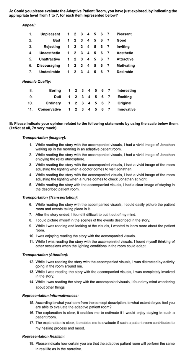
Appeal and hedonic quality
The semantic differential developed by Hassenzahl et al. (2000) was used to measure whether the visual quality and/or the medium of the concept representations had an effect on the judgements regarding perceived hedonic quality (HQ) and appeal of the concept. We employed four items of the scale concerning hedonic quality and seven items concerning appeal as the other items were not applicable for the chosen concept (Appendix). Cronbach’s alphas for the scales of hedonic quality and appeal were .74 and .85, respectively, showing that the internal consistency of the scales is satisfactory.
Transportation
The scale of transportation was developed by Green and Brock (2000) and employed within the study of van den Hende et al. (2007). The scale of transportation consists of three subscales: imagery (the degree to which the participant can actually imagine the things explained through the concept representation), transportation (the degree to which the participant can be immersed in the story) and attention (whether or not the participant feels distracted while s/he is reading the story) (Appendix). Cronbach’s alphas for imagery (.80) and transportation (.67) were satisfactory, whereas that of attention (.41) was too low to be accepted. Thus only the data for imagery and transportation were analysed further.
Representation informativeness
The scale of representation informativeness adapted from van den Hende et al. (2007) was used to measure whether the concept representation was found informative enough to make a judgement on the concept. The scale consists of three 7-point Likert-type items (see Appendix). Cronbach’s alpha for representation informativeness scale was .80.
Representation realism
A one-item scale from van den Hende et al. (2007) was used to measure how certain participants were that the concept will behave in real life as described in the concept representation (Appendix).
Learning styles
The Index of Learning Styles (ILS) Questionnaire by Solomon and Felder (1999) was used to measure the learning preferences of participants (e.g., When I think about what I did yesterday, I am most likely to get; a) Pictures; b) Words). Although it is not a validated scale, previous research (e.g., Litzinger et al., 2007, Liversay et al., 2002, Zywno, 2003) indicated that it is a suitable and statistically acceptable tool for characterizing learning preferences.
Qualitative feedback
Semi-structured interviews were conducted to elicit feedback and suggestions about the concept. The interviews were carried out after the questionnaires. Participants’ past experiences in a patient room, their positive and negative feedbacks on the new concept and their suggestions towards improving the concept were inquired during the interviews. We recorded the interviews and transcribed them.
Results
Results of Quantitative Measures
The quantitative measures were applied in order to investigate whether the visual quality of the concept representations and whether they were animated or not had an effect on how well the users understand the concept, how well they can imagine using these concepts in their lives, and their judgments about the hedonic quality of the concept. ANCOVA analyses were conducted with test conditions as independent measures and the judgments of participants on each measure of interest as dependent variable. The learning styles of the participants were used as covariates in these analyses. Covariates are described as independent variables which are not part of the main experimental manipulation but might have an influence on the dependent variable (Field, 2005). In this study, we hypothesized that preference of participants for learning new information through visual or verbal stimuli would affect their judgments on the measures of interest. However, the analyses did not show any effect of learning styles on any of the measures. The results of ANCOVA analyses for each measure are reported below.
Comprehension
All participants scored a high number of correct answers (M = 20.4 out of 24 statements, SD = 2.0, minimum score = 16, maximum score = 24). The result of ANCOVA analysis showed that visual quality (F1,40 = .052, p = .82, β = .056), medium (F1,40 = .33, p = .57, β = .09) and the interaction of visual quality and medium (F1,40 = .67, p = .42, β = .13 ) did not have any significant effect on the measure of comprehension.
Hedonic Quality and Appeal
The result of ANCOVA analysis indicated that participants in all conditions associated the concept with high hedonic quality (Mtotal = 5.9 on a 7-point scale, SD = .7) and they also found the concept appealing (Mtotal = 5.8 on a 7-point scale, SD = .6). There was no statistically significant effect of visual quality (F1,40 = 1.17, p = .29, β = .18) or medium (F1,40 = .66, p = .42, β = .12) on the judgments of hedonic quality. Visual quality (F1,40 = 1.25, p = .27, β = .19) and medium (F1,40 = .00, p = .95, β = .05) did not show any effect on the judgments of appeal as well.
Transportation
Participants in all groups scored high for the measure of imagery (Mtotal = 5.4, SD = .9) and also for the measure of transportation (Mtotal = 5.7, SD = .8) ANCOVA analysis indicated that visual quality (F1,40 = 2.80, p = .10, β = .37) and medium (F1,40 = .91, p = .34, β = .15) did not have a significant effect on imagery. The effect of visual quality (F(1,40) = .79, p = .38, β = .14) and medium (F1,40 = .34, p = .56, β = .09) on transportation was also not significant.
Representation Informativeness
Participants found the concept representations highly informative in all conditions (Mtotal = 5.5, SD = .9) According to ANCOVA analysis there was no significant effect of visual quality (F1,40 = .75, p = .39, β = .13) or medium (F1,40 = .02, p = .88, β = .05) on the judgments regarding how informative the representation was.
Representation Realism
The result of ANCOVA analysis indicated that the participants who were confronted with refined representations had a stronger belief that the concept would behave the same in real life as it was shown in the representation (M = 5.5, SD = 1.2) than the participants who were confronted with sketchy representations (M = 4.8, SD = 1.6). The difference was significant (F1,40 = 4.28, p = .04, β = .52). Medium did not show a significant effect on representation realism (F1,40 = 1.46, p = .23, β = .22).
Results of Qualitative Measures
Interviews were conducted in order to find out whether the properties of concept representations affect the quality of the feedback and suggestions provided by the users. The interviews were transcribed by the first author. The analysis was conducted according to the verbal analysis method described by Chi (1997). Accordingly, the qualitative data were examined for emerging patterns. A coding scheme was developed to capture these patterns and the codings were analyzed quantitatively to determine whether there are significant differences between test conditions.
To examine the emerging patterns in the data, the transcriptions were segmented as follows: Each comment (feedback, remark, suggestion) about a part of the concept (wake up light, relax light, doctor light, night light and/or adaptive patient room as a whole) constituted a single segment. If such a comment contained multiple judgements, the separate judgements were treated as separate segments. If a judgement contained multiple argumentations, each argumentation was treated as a single segment, unless they formed a chain of reasoning, in which case the whole chain was treated as one segment. The chain of reasoning was included in the segment because the reasoning behind the comments of participants was as important as the subsequent feedback or the suggestion. Such segmentation led to a relatively big grain size. The example below illustrates how the segmentation was done:
Q: In the future if you need to stay in the hospital again, would you want to stay in a room which is described like here?
A: (1)Yes, I think that would be nice. Because it is less disturbing when the nurse comes in the morning, opens the curtains, or it was even like that they first came with breakfast, they rushed with breakfast, if you wake up ok it is time to wake up get into the rhythm (2) and also that you know when the doctor is coming because otherwise you are kind of waiting and suddenly he is there. And I think it is nice that you have some time to adapt to it, the light is changing gradually and then you say something is going to happen. (3) It is quite boring in the hospital room so it is nice that something is happening. (4) And with the light at night, I did not realize that the light is on when the nurse is coming. I thought it would be on all the time so it is not going on and off and wakes you up. But I think it is also nice that you do not have to put some light next to your bed when you want to go to bathroom, because there is light all the time. (5) But especially the relax atmosphere...ok you can change the light and go into sleep for example and it also becomes for the other patients that ok this person wants to relax. (6) And I doubt whether that would have worked for me, because I was in the room with more people, but (7) I would appreciate it. You can create a cocoon with dimmed lights and the other people as well.
Qualitative data are usually voluminous, and as such, researchers tend to find it overwhelming to analyze the entire data and it is common practice in the field to code a sample (Chi, 1997). To reach a coding scheme we also coded a sample of our entire data. We used two of the three general heuristics for data reduction: choosing a sub-set on the basis of “non-content” criterion and random sampling. We choose two random interviews from each test condition (in total eight interviews out of forty eight) and analyzed them through open coding. This analysis resulted in the coding scheme shown in Figure 3.
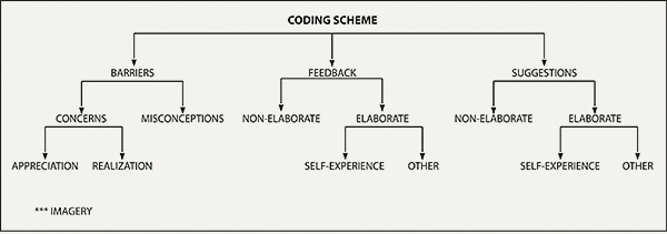
Figure 3. Coding scheme used for the qualitative analysis.
Interrater Reliability
Having built the coding scheme, another set of eight transcriptions were coded by two independent researchers according to the established scheme. Inter-rater reliability was assessed using the Kappa statistic and found to be substantial (Kappa = 0.746, p < .0.001).
Analysis
Reaching a high score for inter-rater reliability, the remaining thirty two transcripts were coded by only one of the raters according to the aforementioned scheme. The rater did not know which transcript belong to which condition. In order to investigate whether the distribution of participants’ comments across the categories in the scheme differs between conditions, the number of comments per participant were counted for each category. Between-subjects ANOVA tests were conducted for each category with visual quality and medium as independent variables and the number of comments per participant as dependent variable. Qualitative analysis incorporated the concerns of the participants about the concept, and the quality of the feedback/suggestion they provided (whether or not and how they elaborated their feedback/suggestions on the concept itself). Learning styles were not included as covariates in these analyses because there was no a priori reason to expect that the quality of the feedback obtained from the participants will be affected by their preference to learn new information through visual or verbal stimuli.
Misconceptions and Concerns
Although the analysis of quantitative measures, mentioned earlier, indicated that participants belonging to all conditions had a high level of concept comprehension, qualitative analysis revealed that some participants misunderstood some parts of the concept. However, in accordance with quantitative measures, the number of misconceptions per test group was low and there was no significant effect of visual quality or medium on the distribution of misconceptions.
In their feedback, participants pointed out two kinds of concerns: concerns about the realization of the concept and concerns about the appreciation of the concept. The quotes below exemplify these categories respectively.
So I am really thinking of how this control works, if I want to change the mood in the room. What does the patient need to do actually to achieve it? It also depends on what he is capable of, I think in the hospitals there are different patients. I can imagine you need to help some patients. (Participant C3)
The wake up light…I do not know…I need to experience that. I do not know what it is like to wake up with gradually increasing lights instead of an alarm clock. I really have no real, clear ideas about it. (Participant A11)
With respect to concerns, ANOVA results indicated that participants who received sketchy representations were more concerned about whether they would really appreciate such a concept in real life circumstances (M = 1.4 quotes) than participants who received visually refined representations (M = .6 quotes) (F1,44 = 6.06, p = .018, β = .67). The former did not make clear cut decisions. Instead, they elaborated the situations and stated in which conditions they would appreciate the concept and in which conditions they would not like it:
This one (the relax atmosphere) I like a lot but how much choices do I have is important for me. If I do not have enough choices I would not use it. It also depends on the room. If the room is dark it is good to use these kinds of things but if the room has enough light, you do not have to use them. But in the Netherlands they will help us. (Participant B9)
There was no significant effect of medium on the distribution of concerns.
Feedback
Participants provided two kinds of feedback. Some participants provided their opinions and clearly explained the underlying reason. Such feedback was labelled elaborate feedback. The quotes below illustrate elaborate feedback.
I kind of like it that Jonathan kind of gets a warning before the doctor actually comes so that he can prepare himself maybe wake up a little because he can be sleeping in bed. And it is practical as well because the doctor will have some more light to examine the patient. And that is exactly how I imagined it to be.(Participant A4)
That is good [doctor light informing the patient in advance] because you never know when the doctor is coming. In case you have visitors you can send the visitors. I definitely like it that you know that (when the doctor is coming). For example, if you know in ten minutes time he will come in, you can say to your visitors leave me alone now. (Participant B2)
In other cases participants provided an opinion about the concept but did not mention any motivation behind their opinion or did not elaborate their motivation. Such feedback was labelled non-elaborate feedback. The quotes below illustrate non-elaborate feedback.
I like the fact that not the whole room is illuminated but just that part the doctor needs, I like that. (Participant B7)
But for the nurse stuff, the light goes on when she comes, I think it is nice, it is more relaxing. (Participant D2)
ANOVA results indicated that participants who were confronted with sketchy representations gave more elaborate feedback (M = 3.8 quotes) than participants who were confronted with refined visuals (M = 2.5 quotes) (F1,40 = 4.60, p = .04, β = .55). Also, participants who were confronted with sketchy representations gave less non-elaborate feedback (M= 1.3 quotes) than participants who were confronted with refined visuals (M = 3.1 quotes) (F1,40 = 16.41, p = .00, β = .97). There was no statistically significant effect of medium on the distribution of elaborate and non-elaborate feedback.
Further analysis of the data indicated that there is a difference regarding the content of the elaborate feedback. Some participants elaborated their feedback by giving examples from their past experiences, while other participants reasoned their feedback by considering more general factors, referring to different user groups and different circumstances. The first quote below illustrates the former kind of elaborate feedback while the second one exemplifies the latter.
I gave birth at 5 am in the morning. Then the nurse brought the baby to me for breast feeding, it was very dark and it was very difficult for me to wake up because I was also very tired. So if there were light which simulates the sunrise then I would not feel that awkward may be. It was in October, it was dark, the weather is gloomy, and I had pain so I remember that day very depressive. (Participant C5)
And with relax atmosphere…I really like the fact that the walls can change color because I believe that the color of walls are very influential on the mood of the person who are inside the room. So if you can change them it would be a nice possibility to beneficially influence the mood of the patient. (Participant B12)
ANOVA results indicated that participants who received sketchy representations talked more about their past experiences (M = 1.7 quotes) than participants who received refined representations (M = .87 quotes) (F1,40 = 6.94, p = .01, β = .73). There was no statistically significant effect of medium on the distribution of elaborate feedback containing references to past experiences.
Suggestions
The analysis of suggestions revealed that some participants made suggestions and explained their suggestions with clear reasoning, while others made suggestions but did not indicate or elaborate their motivation. The first group of suggestions was labelled elaborate suggestions while the second group was labelled non-elaborate suggestions. The first quote below illustrates elaborate suggestions while the second quote illustrates non-elaborate suggestions.
It [the nurse light at night] should not be on and off that you are disturbed by it. A small dimmed light that you can get out of the bed to the toilet and the nurse can walk by and knows which beds are occupied...You do not need to light up the room and awake everyone. I would rather it to be on all the time. Maybe it can be less bright when you are sleeping and it gets brighter when you wake up and going to bathroom.(Participant A1)
For example, you have to eat inside the hospital room, maybe another scheme for the eating concept. Because you create for the relaxing, it can also be for the eating. (Participant D2)
The results of ANOVAs showed that participants who received sketchy representations provided more elaborate suggestions (M = 3.4 quotes) than the participants who received refined representations (M = 1.6 quotes) (F1,40 = 7.25, p = .01, β = .75). Also, participants who received sketchy representations provided less non-elaborate suggestions (M = 1.2 quotes) than participants who received refined representations (M = 1.9 quotes) (F1,40 = 3.97, p = .05, β = .50). The effect of medium was not significant.
The analysis also revealed a difference in the content of elaborate suggestions. Some participants motivated their suggestions with their past experiences, like the first quote below, while some others explained their suggestions with more general reasoning, like the second quote below.
There might be times that I even do not want the day light, how am I going to cope with it? May be I can also control the blackouts. When I was in the hospital there were many times that did not want the sun shine in the room. I was under anesthesia and wanted to sleep. So I think there should be blackouts. (Participant C6)
A hospital room is generally not so nice so you can do something that makes it look better so you can add to the experience of the pleasantness. (Participant B1)
ANOVA results showed that participants who received sketchy representations referred more to their past experiences while motivating their suggestions (M = 1 quote), than participants who received refined representations (M = .3 quotes) (F1,40 = 3.98, p = .05, β = .50). The effect of medium was not significant.
Conclusions and Discussion
This study investigated the effect of the properties of visual concept representations on the users’ comprehension of the concept, their ability to envision a future context where they use the concept, their emotional responses towards the concept and on the quality of feedback and suggestions they provide. A concept for an adaptive patient room was chosen as a case. We manipulated the visual quality (sketchy vs. refined) and the medium (a series of stills vs. an animation) of the concept representations and we used both quantitative and qualitative measures to explore whether these properties have an effect on dimensions of interest. Neither visual quality nor medium had a significant effect on most of the quantitative measures we incorporated. We observed a significant effect of visual quality only on judgements of representation realism: participants who received visually refined representations believed more strongly that the concept will behave the same in real life as it was shown in the representation than participants who received sketchy representations.
From the results of qualitative analysis we argue that the visual quality of concept representations had an effect on the concerns of participants and on the quality of feedback and suggestions they provided, while the manipulation of the medium did not. The study revealed that the visual quality of the concept representations had a significant effect on the concerns of participants about whether they would appreciate the concept in their own contexts. Participants who were shown sketchy representations questioned this aspect more than the participants who received visually refined representations. In the study sketchy representations were found to elicit more elaborate feedback and suggestions in comparison to refined representations. Moreover, participants who received sketchy representations tended to elaborate their feedback and suggestions by giving more reference to their past experiences than the participants who saw refined representations.
Implications of Quantitative Measures
The results for quantitative measures supported the results of previous work. Like Diefenbach et al. (2010), we could not find any effect of animation and visual quality on the judgments of appeal and hedonic quality. The results for comprehension, imagery and representation informativeness were in accordance with Van den Hende et al. (2007). However in that study the authors observed a significant effect of the chosen medium on the transportation which was not observed in this study. Since in both studies the manipulations of the medium were comparable, a possible explanation may relate to the context that each study concerned. Our study was related to a hospital context and we carried out the study with participants who stayed in the hospital. For most of the participants the period they stayed in the hospital was a significant experience in their lives which might have positively contributed to the transportation, regardless of the properties of the concept representations. In our study we observed that the participants who were shown visually refined representations believed more in the applicability of the concept. This finding supports the claim of Van Der Lelie (2006) who argues that visually refined representations tend to be accepted ‘as it is’ and people do not question them so much. Finally, the learning styles of the participants did not show any effect on any of the measures incorporated in the study. It might be related to the design case used in the study. The case was depicting a hospital room which responds to the happenings in the room with changes of light and sounds. Participants, who have already stayed in the hospital themselves, might have found the events depicted in the story and the concept easy to understand and imagine regardless of their being visual and verbal learners. For more complex concepts learning styles of participants might still make a difference.
Based upon the results of the quantitative measures design researchers can be recommended to use concept representations which are easier and quicker for them to create, as there is no indication that more refined visual representations and animation enhance the comprehension of users, their being able to imagine using the concept in their daily life, and their emotional responses to the concept. However, if it is desirable that participants do not question whether the concept can technically be realized or not, or if the look of the concept is the focus of research, the use of visually refined representations is more appropriate.
Implications of Qualitative Measures
The study revealed that when people are confronted with sketchy representations, they do not make clear cut judgments on whether they appreciate the concept or not. Instead, they tend to elaborate in which circumstances they would like it and in which other circumstances they would not like it. In the study we also found that people who are exposed to sketchy representations tend to elaborate their feedback and suggestions with clear reasoning. Buxton (2007) defines sketches as ambiguous representations whose value derives from the fact that they can be interpreted in different ways and new relations can be seen within them. Our study revealed that this ambiguity motivates people to question more and prevents them from making clear cut decisions without elaboration. In their study Sellen et al. (2009) found that storyboards elicit more self-reference than videos. In our study we did not observe such a difference between a series of stills and an animated representation of the concept. An explanation for this can be the manipulation of the medium in the respective studies. Participants in the study of Sellen et al. (2009) might have found the video representation too concrete to identify themselves with the main character and the story. The animations we used were more abstract representations in comparison to videos and they might not have formed a barrier for participants to get empathized with the main character and the story. However, we observed that sketchy representations elicit more feedback and suggestions revealing past experiences of people than refined representations. McCloud (1994) suggests an explanation of such an effect. While discussing the visual quality in comics, McCloud states that the more cartoon-like the face of a cartoon character is, “the more people it could said to describe” (p. 31). The same argument might also be valid for concept representations. Refined representations of the adaptive patient room showed a particular hospital room which was furnished with a certain style. However, the sketchy representations were rather generic and it could stand for more hospital rooms than the refined representations. Thus sketchy looking representations might have been more effective in reminding people of the hospital room they stayed in and stimulated them to talk about what they experienced there. In fact, during the study, when we showed the sketchy representation, we heard from several participants that the room they stayed in looked like the room shown in the representation.
These findings raised the following question: Whether or not, and why, elaborate feedback from users and feedback revealing their past experiences are regarded useful by designers, in the early phases of the design process? To gain insights concerning these questions we did a follow-up study with designers of the adaptive patient room (Ozcelik Buskermolen, Terken J., & Eggen, 2012). There were four designers working on the case. We first gave them a set of unprocessed user quotes. In the set there were equal numbers of quotes in each feedback/suggestion category (non-elaborate, elaborate, and elaborate based on past experiences). The designers were asked to rate the usefulness of each quote on a five-point scale and to provide his/her motivation for regarding the feedback useful. Later, a workshop was organized with these designers through which designers discussed which user feedback/suggestions were useful for them and why. The results showed that designers found the quotes classified as non-elaborate feedback/suggestions of little use (M = 2.81 and 2.43 respectively). However, elaborate feedback/suggestions, and feedback/suggestions based on past experiences were found useful by the designers (M = 3.8, 3.85, 3.63 and 3.8 respectively). The results of the workshop showed that in the early concept evaluations the designers would like to elicit three types of information: what is good and bad about the concept and why, what is the ideal experience that would be expected from such a concept, and the past experiences of end-users. The designers said that early user feedback reveals whether they are designing the right thing or not and what are the issues to be improved. Knowing the motivations behind the feedback is crucial to interpret the feedback and to decide how the concept should be improved. The designers extensively discussed the importance of learning about past experiences of end-users. They believed that previous experiences reveal specific issues that are not easy for designers to imagine. Knowing previous experiences of people helps designers to understand the motivations behind people’s opinions. Thus designers have a deeper understanding and more ground to base the concept improvements on. The participants said that personal stories of users are used in discussions within the team. They help to provide examples and illustrate situations.
In conclusion, based on the results of the present study, sketchy representations can be recommended to designers when they want to elicit not only the judgements of users about the concept but also the motivations behind these judgements. Sketchy representations can also be advised if designers want to elicit users’ retrospective stories related to the context of interest. Such stories would help designers to enrich their understanding about the users and the use contexts. However, if designers want to obtain clear cut judgements like whether or not users appreciate the concept and if they are not interested in the motivation behind these judgements, visually refined representations would be a better option.
Limitations and Future Work
The current study concerned a particular type of product (an adaptive patient room), a particular phase within the design process (early concept phase) and a specific question: is this a good idea to proceed? The result of the study should be interpreted within that frame. The fact that the manipulation of the visual quality of the concept representations has an effect on the gathered feedback and the manipulation of the medium did not, might be related to the specific design case we chose. As the concept was related to light and sound changes within a room setting, seeing the end results might have been enough for the participants as they could have guessed how the transition from A to B might happen. However, it is possible that in other cases the transitions might be more important. In those cases the chosen medium might make a difference, as well. Thus in the future, the current results should be supplemented with results from other cases. Furthermore, in this study we compared a series of stills with an animation. In the animation we showed the gradual transitions of lights and sounds through fade in and out. It was a rather simple animation that may not be representative for the full range of possible animations. However, we chose this kind of animation to have an animated representation of the concept which is as comparable as possible to a series of stills presenting the design concept. Our results should be viewed from this perspective. We acknowledge that a more advanced animation might give different results. Moreover, further studies should also consider other types of media, such as video and VR, as such advanced representations might contribute comprehension and transportation more than a fade in and out animation. The text accompanying the concept representations might have had an influence on the effect of the medium, as well, especially concerning the transportation. For the future studies it should be investigated whether such an effect exits. Finally, large amount of the data was rated by the first author of the paper. However, a possible observer-expectancy effect was minimized as the rater did not know which transcript belonged to which condition.
Our study showed that sketchy looking representations work better in eliciting elaborate feedback and suggestions which also refer to the past experiences of the participants. Based on this finding we recommend designers to use such kind of representations while they are showing their early concepts to end-users. However, it might not always be easy to prepare such representations for designers. Our previous studies show that designers may prefer to prepare nice looking representations by using materials already existing in their archives, like renders and pictures or they may prefer to create certain representations (e.g., sketches or 2D digital presentations) based on their skills and not so much based on considerations concerning the type of feedback such representations elicit (Ozcelik Buskemolen & Terken, 2012). Thus in addition to studies about the effect of concept representations on the early user designer dialogue, there should also be studies about methods and techniques that designers can utilize during their dialogue with users. Such methods and techniques should empower designers in eliciting the user feedback and suggestions they need, as it might not be only about the qualities of concept representations but also about how these representations are used in the dialogue with users (Briggs et al., 2012; Houde & Hill, 1997).
Acknowledgement
The work reported in this paper was made possible through a grant from the Dutch Government under the IOP-IPCR Program.
References
- Brandt, E., & Grunnet, C. (2000). Evoking the future: Drama and props in user centred design. In T. Cherkasky, J. Greenbaum, P. Mambrey, and J. K. Pors (Eds.), In Proceedings of the 6th Biennial Participatory Design Conference (pp. 121-131). New York, NY: ACM.
- Briggs, P., Blythe, M., Vines, J., Lindsay, S., Dunphy, P., Nicholson, J., … Oliver, P. (2012). Invisible design: Exploring insights and ideas through ambiguous film scenarios. In Proceedings of the Conference on Designing Interactive Systems (pp. 534-542). New York, NY: ACM.
- Buchenau, M., & Suri, J. F. (2000). Experience prototyping. In Proceedings of the Conference on Designing Interactive Systems (pp. 424-432). New York, NY: ACM.
- Buxton, B. (2007). Sketching user experiences: Getting the design right and the right design. San Francisco, CA: Elsevier.
- Carroll, J. M. (1995). Scenario-based design: Envisioning work and technology in system development. New York, NY: John Wiley and Sons.
- Chi, M. T. H. (1997). Quantifying qualitative analysis of verbal data: A practical guide. Journal of the Learning Sciences, 6(3), 271-315.
- Daemen, E. M. L., Behere, S., Cuppen, R. P. G., Facey, J., Flinsenberg, I. C. M., van Loenen, E. J., & Rajae-Jordans, R. J. E. (2013). Lighting design: Creating an adaptive healing room for neurology patients. World Health Design Journal, 6(1) 72-77.
- Dahl, Y., Alsos, O.A., & Svanaes, D. (2010). Fidelity considerations for simulation based usability assessments of mobile ICT for hospitals. International Journal of Human Computer Interaction, 26(5), 445-476.
- Diederiks, E. M. A., & Hoonhout, H. C. M. (2007). Radical innovation and end-user involvement: The ambilight case. Knowledge, Technology and Policy, 20(1), 31-38.
- Diefenbach, S., Hassenzah, M., Eckoldt, K., & Laschke, M. (2010). The impact of concept (re)presentation on user’s evaluation and perception. In Proceedings of the 6th Nordic Conference on Human-Computer Interaction (pp. 631-634). New York, NY: ACM.
- Dourish, P. (2001). Seeking a foundation for context-aware computing. Human-computer Interaction, 16(2-4), 229-241.
- Field, A. (2005). Discovering statistics using SPSS. London, UK: Sage.
- Green, M. C., & Brock, T. C. (2000). The role of transportation in the persuasiveness of public narratives. Journal of Personality and Social Psychology, 79(5), 701-721.
- Hassenzahl, M., Platz, A., Burmester, M., & Lehner., K. (2000). Hedonic and ergonomic quality aspects determine a software’s appeal. In Proceedings of the SIGCHI Conference on Human Factors in Computing Systems (pp. 201-208). New York: NY: ACM.
- Haumer, P., Heymans, P., Jarke, M., & Pohl, K. (1999). Bridging the gap between past and future in RE: A scenario-based approach. In Proceedings of IEEE International Symposium on Requirements Engineering (pp. 66-73). New York, NY: IEEE.
- Houde, S., & Hill, C. (1997). What do prototypes prototype? In M. G. Helander, T. K. Landauer & P. Prabhu (Eds.), Handbook of human-computer interaction (2nd ed., pp. 367-381). Amsterdam, the Netherlands: Elsevier.
- Keller, I., & Stappers, P. J. (2001). Presence for design: Conveying atmosphere through video collages. Cyber Psychology and Behavior, 4(2), 215-223.
- Lim, Y. K., Stolterman, E., & Tenenberg, J. (2008). The anatomy of prototypes: Prototypes as filters, prototypes as manifestations of design ideas. Transactions on Computer-Human Interaction, 15(2), 1-27.
- Little, L., & Briggs, P. (2009). Privacy factors for successful ubiquitous computing. International Journal of E-Business Research, 5(2), 1-20.
- Litzinger, T. A., Lee, S. H., Wise, J. C., & Felder, R. M. (2007). A psychometric study of the index of learning styles. Journal of Engineering Education, 96(4), 309-319.
- Livesay, G., Dee, K., Felder, R., Hites,L., Nauman, E., & O’Neal, E. (2002). Statistical evaluation of the Index of Learning Styles. In Proceedings of American Society of Engineering Education. Washington, DC: ASEE.
- Mancini, C., Rogers, Y., Bandara, A. K., Coe, T., Jedrzejczyk, L., Joinson, A. N., …Nuseibeh, B. (2010) Contravision: Exploring users’ reactions to futuristic technology. In Proceedings of SIGCHI Conference on Human Factors in Computing Systems (pp. 153-162). New York, NY: ACM.
- McCloud, S. (1994). Understanding comics: The invisible art. New York, NY: HarperPerennial.
- McCurdy, M., Connors, C., Pyrzak, G., Kanefsky, B., & Vera A. (2006). Breaking the fidelity barrier: An examination of our current characterization of prototypes and an example of mixed-fidelity success. In Proceedings of the SIGCHI Conference on Human Factors in Computing Systems (pp. 1233-1242). New York, NY: ACM..
- Nilsson, J., & Siponen, J. (2006). Challenging the HCI concept of fidelity by positioning Ozlab prototypes. In Proceedings of the 14th International Conference on Information Systems Development (pp. 349-360). New York, NY: Springer.
- Olivier, P., Xu, G., Monk, A., & Hoey, J. (2009). Ambient kitchen: Designing situated services using a high fidelity prototyping environment. In Proceedings of the 2nd International Conference on Pervasive Technologies Related to Assistive Environments (No. 47). New York, NY: ACM..
- Ozcelik Buskermolen, D., Terken, J., & Eggen, B. (2012). Informing user experience design about users: Insights from practice. In Proceedings of the SIGCHI Conference on Human Factors in Computing Systems (pp. 1757-1762). New York, NY: ACM.
- Ozcelik, D., Quevedo, J., Thalen, J., & Terken, J. (2011). On the development of electronic design tools and associated guidelines for supporting the early stages of the design process. In Proceedings of the 2nd DESIRE Network Conference on Creativity and Innovation in Design (pp. 115-126). New York, NY: ACM.
- Quesenbery, W., & Brooks, K. (2010). Storytelling for user experience: Crafting stories for better design. Brookly, NY: Rosenfeld Media.
- Rolland, C., Achour, C. B., Cauvet, C., Ralyté, J., Sutcliffe, A., Maiden, N., … Heymans, P. (1998). A proposal for a scenario classification framework. Requirements Engineering, 3(1), 23-47.
- Sauer, J., & Sonderegger, A. (2009). The influence of prototype fidelity and aesthetics of design in usability tests: Effects on user behaviour, subjective evaluation and emotion. Applied Ergonomics, 40(4), 670-677.
- Sauer, J., Seibel, K., & Rüttinger, B. (2010). The influence of user expertise and prototype fidelity in usability tests. Applied Ergonomics, 41(1), 130-140.
- Sellen, K. M., Massimi, M. A., Lottridge, D. M., Truong K. N., & Bittle, S. A. (2009). The people-prototype problem: Understanding the interaction between prototype format and user group. In Proceedings of the SIGCHI Conference on Human Factors in Computing Systems (pp. 635-638). New York, NY: ACM.
- Solomon, B. A., & Felder, R. M. (1999). Index of learning styles questionnaire. Retrieved August 10, 2010, from http://www.engr.ncsu.edu/learningstyles/ilsweb.html, accessed
- Stappers, P. J., Gaver, W., & Overbeeke, K. (2003). Beyond the limits of real-time realism: Moving from stimulation correspondence to information correspondence. In L. J. Hettinger & M. W. Haas (Eds.), Virtual and adaptive environments: Applications, implications, and human performance issues (pp. 91-110). Mahwah, NJ: Lawrence Erlbaum Associates.
- Stappers, P. J., Saakes, D., & Adriaanse, J. (2001). On the narrative structure of virtual reality walkthroughs: An analysis and proposed design. In B. de Vries, J. van Leeuwen & H. Achten (Eds.), Proceedings of the 9th International Conference on Computer Aided Architecture Design Futures (pp. 125-138). Dordrecht, the Netherlands: Springer.
- Van den Hende, E. A., Schoormans, J. P. L., Morel, K. P. N., Lashina, T., van Loenen, E., & de Boevere, E. I. (2007). Using early concept narratives to collect valid customer input about breakthrough technologies: The effect of application visualization on transportation. Technological Forecasting and Social Change, 74(9), 1773-1787.
- Van der Lelie, C. (2006). The value of storyboards in the product design process. Personal and Ubiquitous Computing, 10(2-3), 159-162.
- Van Klaveren, R. (2012). Artistic participatory practices as a vehicle for togetherness. In Proceedings of 12th Conference on Participatory Design (pp. 93-96). New York, NY: ACM.
- Virzi, R. A., Sokolov, J. L., & Karis, D. (1996). Usability problem identification using both low- and high fidelity prototypes. In Proceedings of the SIGCHI Conference on Human Factors on Computing Systems (pp. 236-243). New York, NY: ACM.
- Veryzer, R. W. (1998). Key factors affecting customer evaluation of discontinuous new products. Journal of Product Innovation Management, 15(2), 136-150.
- Wiklund, M. E., Thurrott, C. W., & Dumas, J. S. (1992). Does fidelity of software prototypes affect the perception of usability? In Proceedings of the 36th Annual Meeting of the Human Factors Society (pp. 399-403). Santa Monica, CA: SAGE.
- Zywno, M. S. (2003). A contribution of validation of score meaning for Felder-Solomon’s Index of learning styles. In Proceedings of American Society for Engineering Education Annual Conference & Exposition (pp. 1-16). Washington, DC: ASEE.
Appendix
The questionnaire used in the study is shown below. The scales that the items belong to are indicated above the related items to help the reader identify which item belongs to which scale. It should be noted that this information was not visible to the participants.