Comparison of Semantic Intent and Realization in Product Design: A Study on High-End Furniture Impressions
Javad Khalaj 1,* and Owain Pedgley 1,2
1 Department of Industrial Design, Middle East Technical University, Ankara, Turkey
2 School of Engineering, University of Liverpool, United Kingdom
This paper presents a comparative analysis of designers’ intended impressions and users’ realized impressions of products, within the context of design communication. Its originality comes from the empirical approach taken, which examines the extent of users’ shared impressions from products and their closeness to originating designers’ intentions. Visual stimuli and semantic differential evaluations involving high-end furniture (n = 8) and representative target users (n = 80) were used. Data analysis was carried out in two stages (macro-level and micro-level) to detect mismatches between intended and realized impressions. The macro-analysis established how prevalent mismatches were, and reveals that messages grouped under ‘usability and interaction’ and ‘personality characteristics’ were more problematic for users to recognize as intended than messages grouped under ‘social values and position’ and ‘qualities of form.’ Across the product samples, designers’ communication was found quite successful: approximately 75% of semantic intent is realized by users within ± 1 point tolerance of designers’ evaluations on a 5-point Likert scale. Nevertheless, a 25% rate of semantic mismatch beyond this range was established. The follow-up micro-analysis pinpoints bipolar adjective/phrase pairs that were graded especially ‘close’ or ‘far’ from designers’ intentions, thereby illuminating whereabouts design effort should be placed to better realize semantic intent.
Keywords – Product Design, Semantics, Communication, Visual Perception.
Relevance to Design Practice – By understanding how and to what level intended impressions from a product differ from realized impressions, designers can be advised about where to target semantic modifications in their designs and thus achieve more effective design communication.
Citation: Khalaj, J., & Pedgley, O. (2014). Comparison of semantic intent and realization in product design: A study on high-end furniture impressions. International Journal of Design, 8(3), 79-96.
Received December 10, 2012; Accepted May 25, 2014; Published December 31, 2014.
Copyright: © 2014 Khalaj and Pedgley. Copyright for this article is retained by the authors, with first publication rights granted to the International Journal of Design. All journal content, except where otherwise noted, is licensed under a Creative Commons Attribution-NonCommercial-NoDerivs 2.5 License. By virtue of their appearance in this open-access journal, articles are free to use, with proper attribution, in educational and other non-commercial settings.
*Corresponding Author: e152035@metu.edu.tr.
Javad Khalaj is a Ph.D. candidate in the Department of Industrial Design at Middle East Technical University, Ankara, Turkey. His research focuses on the relationship between individual designers’ intentions and target users’ initial experience, originating from the multi-sensorial qualities of products, within the context of design communication.
Owain Pedgley B.Sc. Ph.D. is Senior Lecturer in Industrial Design at the University of Liverpool, UK and Associate Professor of Industrial Design at Middle East Technical University, Turkey. His research and educational expertise centres on the role of materials in industrial design decision-making and how the use of materials affects user-product interaction and experience. Owain has extensive experience coordinating project-based student learning with firms including Nokia, Bosch Siemens Hausgerate, and Vitra. Prior to his academic career, he worked as a product designer in the sports equipment and musical instrument sectors, and co-founded the guitar innovation venture ‘Cool Acoustics’.
Introduction
In this paper, we concern ourselves with semantic intent and realization (e.g., personality, style, character, identity) in relation to pre-use product impressions, stimulated by qualities of product form and materialization (e.g., shape, colour, texture, pattern, shade, light, ornament, material). Although just a few minutes appraising a product (and thereby arousing a general interest or disinterest) is an entirely different experience to twelve months relying on that same product (Fisher, 2004), such limited time is all that the designer has available to impart a positive ‘first impression’ and arouse further consideration by potential purchasers. By implication, Crilly, Moultrie, and Clarkson (2004) argued that initial perception is a key stage in the process of design communication that affects cognitive, affective, and behavioral responses to a product, which in turn will moderate the interest levels of users.
The potential existence of mismatches between what designers intend and what users perceive from a finished design is often mentioned in the literature as a problem across design specialisms (Ahmed & Boelskifte, 2006; Chamorro-Koc, Popovic, & Emmison, 2008; Crilly, Maier, & Clarkson, 2008b; Hassenzahl, 2003; Lindh, 2010; Jin & Boling, 2010). In UxD (user experience design), the notion that designers can influence, but not dictate, meaningful experiences is a central philosophical matter (Wendt, 2013). Krippendorff (2006) discussed mismatches between designers’ conceptual models and users’ mental models regarding visual use cues and product functionality, where mismatches can lead to serious problems in product operation. Similarly, Norman (1998) emphasized that designers’ and users’ concepts of product interaction may differ because of different interpretations of the affordances of product form [communicated through what he terms the ‘system (product) image’.]
Mismatches outside the realm of functionality, which is the main focus for this paper, are less well represented in literature. Nevertheless, the general topic of user responses to visual product attributes are well documented, spanning for example the moderating factors that influence responses, the general role of product appearance, and the messages that product appearances convey (Bloch, 1995; Chang, Lai, & Chang, 2006; Creusen & Schoormans, 2005; Crilly et al., 2004; Desmet & Hekkert, 2007). Inevitably such studies have close relation to the semantics of styling and materialization. The purpose of styling and the presence of other supra-functional (McDonagh-Philp & Lebbon, 2000) visual attributes of a product (i.e., having a purpose beyond functionality) have been discussed extensively in literature (Berkowitz, 1987; Creusen & Schoormans, 2005; Crilly et al., 2004; Demir, 2008). Two basic perspectives, usually somewhat intertwined, can be identified. The first is competitive and strategic, regarding the visual domain of a design as a means to affect users’ preferences and increase sales. The second is a human-oriented perspective, in which visual product attributes are used to satisfy the tastes and psychological needs of users, who expect far more from a product, service, or system than merely its function. As authors and designers, we align with the second perspective and tend to view the first as a consequence of the second.
So what does it matter if mismatches exist between intended and realized impressions? The overarching matter is connectedness and appeal to target users. Mismatches would reveal that target users were unable to locate or recognize product meanings that designers had intended for them, exposing a failure in the product communication process centered on product semantics. Such failures are problematic because designers use product semantics as an important stepping-stone to product appeal and desire; they manipulate product form and material so as to be meaningful to users. If meaning is lost, then the intended route to product appeal and desirability is also lost.
The essential focus in this paper is therefore on the retention of meaning attributed to the visual appearance of product form. Although there have been strong theoretical studies on the relationship between designer intent and user experiences (e.g., Crilly et al., 2004; Crilly et al., 2008b; Crilly, 2011), relatively few complementary empirical studies have been conducted to examine practical implementation. Hsu, Chuang, and Chang (2000) laid important foundations in this respect, exposing potential differences between designers’ and users’ perceptions, but critically, in common with much research that followed, they did not obtain data from the original designers of the products they studied. On the other hand, in their study on intended and perceived product character, Ahmed and Boelskifte (2006) identified the presence of differences between original design intent and actual consumer experience through a semantic differential study, but they did not enter discussion on the extent of mismatches and their subject matter (product ‘character’) was quite narrow in focus. As a result, it has so far not been possible for design researchers to grasp the ‘size’ of potential mismatches, nor reveal whereabouts the designer(s)-to-user(s) relation breaks down with regard to intended and realized experiences. We contend that an investigation into these issues could help reveal important lessons regarding the effectiveness of design communication through the medium of a product (Khalaj & Pedgley, 2012). Our view is that success in the retention of meaning, and understanding whereabouts any meaning might be lost, can be of value in pushing for improvements in effective product design. The subject has relevance to design educators (to better teach aspects of product semantics), design researchers (to better understand the communicative function of product form and materials), and practicing designers and industry (to strengthen connections to target users).
Consequently, this paper comprises an empirical study into the extent to which meanings attributed to a product by a sample of target users overlap with the meanings intended by the designer(s) of that same product. Two primary research questions were posed: Do users perceive the same meaning from product visual qualities as designers intended (RQ1)? If not, what kinds and extent of mismatch are present (RQ2)?
Design Communication and Semantic Mismatches
Within the scope of design communication theory, a product design is considered to be a medium through which a designer can communicate certain intended messages to users (Barthes, 1988; Crilly, Good, Matravers, & Clarkson, 2008a; Fiske, 1990; Krippendorff, 2006; Muller, 2001; Vihma, 1990). More specifically, designers usually have the remit to carefully define a product’s sensorial information (across multiple sensory modalities), such that the product ‘expresses’ intended non-verbal messages. In other words, the physical properties of an object and their associated sensorial information are considered as physical manifestations of semantic content intended for conveyance to target users. The physical and non-physical acquaintance with a product shapes users’ impressions and experiences of that product.
It is well established that the visual modality is dominant in product semantics and is accordingly a major factor in users’ initial impression of a product (Fenko, Schifferstein, & Hekkert, 2009; Krippendorff & Butter, 1984; Schifferstein, 2006; Schifferstein & Wastiels, 2014). For example, a product may be said to resemble the visual trend from a certain period in time (e.g., Art Deco, 1980s), fit to a specific user group (e.g., youth, businessman), resonate with people’s values (e.g., sustainable, convenient), embody certain styles (e.g., Alessi, Mackintosh), possess certain figurative characteristics (e.g., aggressive, futuristic), or imply certain status (e.g., high-end, ordinary). Following attribution of such product meanings, (target) users may find themselves asking: ‘If I own or use this product, what will it say about me?’ However, in this present research, we sought to investigate product-centric evaluations (e.g., “this product is calm”) rather than user-affective evaluations (e.g., “this product makes me calm”).
Two Schools of Thought
Fiske (1990) identified two basic schools of thought that define approaches to the study of communication applicable to the context of design: ‘process’ and ‘semiotic’ schools. The ‘process’ school sees communication as the ‘transmission of messages’. It is concerned with how senders encode intended messages in ‘transmissions’, how receivers decode (‘read’) messages, and any ‘noises’ that may distort messages. According to Fiske, if received messages do not match transmitted messages, the communication is considered unsuccessful or a failure. In contrast, the ‘semiotic’ school considers communication as the ‘production and exchange of meanings’, involving the triad of ‘signifier’, ‘signal’, and ‘signified’. It is concerned with meanings or connotations constructed within a cultural context. Accordingly, in the context of product design, differences that occur between a designer’s intended meaning and users’ construed meanings indicate acceptable diversity of interpretation rather than communication failure. For this present study, the semiotic school was adopted, so we accept and aim to expose variance in meaning attribution rather than highlight failures to transfer notionally unequivocal messages.
Plausible Reasons for Mismatches
Designers seek to define attraction points for products, resonating with the functional or hedonic needs of users (Hassenzahl, 2003). The design of these attraction points may conceivably be approached holistically (i.e., carried through the entire product) as well as atomistically (i.e., carried through particular components or attributes of the product). The methods and processes by which designers build meanings into products is not within the scope of this present study, suffice to say that some designers will spend effort to research and plan for intended product impressions, whilst others will work intuitively on the basis of personal experience and may be concerned more with product expression than user impression (Berkowitz, 1987; Bloch, 1995; Demir, 2008; Hsiao & Chen, 1997; Maurer, Overbeeke, & Smets, 1992).
Whilst designers expend considerable time and effort conceiving and developing their designs, and thus have an intimate familiarity with them, users become acquainted with a new product in a relatively short period of time and through a variety of stimuli and stages, each of which can influence meaning attribution. Furthermore, the meanings that people attach to products are moderated by personal experiences and values (Desmet & Hekkert, 2007), creating a subjective dimension that may alter the meaning attribution among users and within different contexts (Crilly et al., 2008b). Figure 1 is a suggestion of how the quality and types of interaction and impression change as users transition through ‘pre-product’, ‘pre-use’, and ‘use’ stages of product experience. Briefly, at the ‘pre-product’ stage, preconception is the main trigger for experiences. Since no actual product exists (only the ‘idea’ of a such-and-such product), users have no idea about the product’s qualities. Their evaluation is based on expectations and anticipation. The ‘pre-use’ stage is divided into three categories: visual appraisal of product representations (e.g., photo, image, website, catalogue), visual appraisal of a physical product (hands-off), and multisensory appraisal of a product (hands-on). Finally, at the product ‘use’ stage, it is no surprise that utilitarian concerns such as usability, comfort, performance, efficiency, and compatibility become strong influences on product experience and thus can cause revisions to initial product impressions (Cagon & Vogel, 2002; Demir & Erbuğ, 2008).
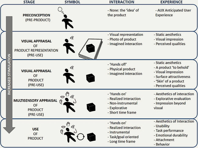
Figure 1. Progression of user-product interaction and experience alongside increased sensorial stimulation.
With these points in mind, there can be no certainty of a match between product interpretation intended by a designer and the actual product interpretation made by users (even though designers in principle may aim for such a match). Both schools of thought for design communication concede the potential for mismatches, referred to as ‘missed receipt of messages’ (process approach) or ‘diverse range of interpretation’ (semiotics approach). Plausible reasons for the occurrence of mismatches might be as follows: If the designer misjudged the messages or encoding of messages through sensorial information; if design intent could not be fully conveyed in the materialized version of a product; if users did not notice some communication channels or features that were intended to be noticed; or if users simply understood product visual qualities to represent something other than designers had planned for—i.e., they didn’t ‘get it’ from the designer’s perspective. This present research intended to probe the last of these reasons.
Research Methodology
Many issues were raised in developing a methodology to empirically investigate semantic intent and realization, since there were few precedents for a study linking original designers’ intentions to target users’ impressions.
Selection of Products and Designers
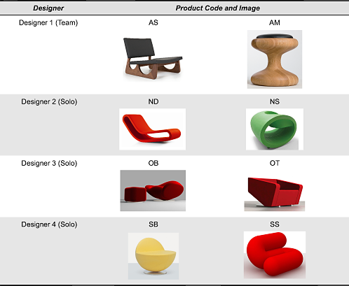
Two general approaches were considered for the selection of products. The first was to examine semantic mismatches across the varied product portfolio of one or more designers. The second was to fix the product sector and examine semantic mismatches for different designs from different designers. For the following reasons, we opted for the second approach, focusing on the design of high-end seating (e.g., chairs, armchairs, chaise lounges, sofas, stools). A total of eight products were selected for inclusion in the study (Table 1) using the following factors:
- The product sector is well represented and competitive in the authors’ country of residence (Turkey).
- Access was possible to several well-regarded and senior (10+ years experience) designers/manufacturers working in the sector.
- Product visual form and materialization is especially striking in the sector, implying the communication of a wide variety of product meanings.
- Products were targeted to the local market, thereby alleviating any problems in sourcing target user participants.
Table 1. Portfolio of evaluated products (copyrighted images reproduced with permission of designers).
Product Evaluation Sessions
The product evaluation sessions were conducted in two stages: sessions with the designers and sessions with the target users. At the commencement of their sessions, designers were asked if they had any target user in mind when designing their product, and to accordingly provide a ‘target user profile’ using terms such as age, gender, income level, level of education, lifestyle, typical activities, and common places for socializing and shopping. A semantic differential (SD) approach was adopted (Osgood, Suci, & Tannenbaum, 1957), as is typical for research seeking to ascertain the character of objects. The recruited designers and target users graded products according to their intended impression (by the designers) and actual impression (by the users), using a 5-point Likert scale against several groups of bipolar adjective/phrase pairs located at either end of the scale (e.g., formal-casual, easy to use-difficult to use). Finer scales (e.g., 7-point, 9-point) were used when it was considered that participants could usefully discern very subtle differences in the character of objects. For this present study, a 5-point scale was considered as having sufficient resolution, comprising the points ‘(++) (+) (0) (+) (++)’ to indicate levels of agreement with the bipolar pairs.
For the user sessions, a check was first made that potential participants fitted to the designer’s ‘target user profile.’ One of the most difficult and critical tasks was to physically locate such participants. In total, eighty participants were secured, divided into ten participants for each of the eight products studied (NB 1:10 designer-user ratio). Users’ SD evaluations were made in response to stimuli from the second stage indicated on Figure 1: ‘visual appraisal of product representation, pre-use.’ This was an entirely pragmatic decision since we did not have facilities to show physical products (third stage onward in Figure 1) to participants at the geographically distributed locations of the product evaluation sessions. Accordingly, participants were shown A3-sized product visual cards also containing dimension information (Appendix C). Evaluation sessions typically took 20 minutes.
Selection of Bipolar Adjectives/Phrases
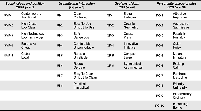
As with convention, we assumed that the designers and the target users would be able to link their appraisals of product semantics to explicit verbal descriptions. The use of the SD method assumes that graders understand the meaning of bipolar adjectives or phrases, and that the meaning is shared amongst graders. Thus, it is a linguistically sensitive method. One advantage bipolar pairs have over single descriptive evaluations is that they provide two clues/concepts about underlying meanings rather than one. It is usually the case that scholars must decide on an individual project basis which bipolar pairs to include in their SD studies, based on the underlying phenomena that they are intending to probe. In our case, we conducted a search for bipolar pairs using the artifact character traits proposed by Krippendorff (2006) as a guide, arriving at four a priori prescriptive groups into which bipolar pairs would be organized:
- social values and positions (SVP)–for status evaluations;
- usability and interaction (UI)–for usage evaluations;
- qualities of form (QF)–for descriptive form evaluations;
- personality characteristics (PC)–for figurative evaluations.
The use of grouping was a strategic decision. The group headings and descriptions were used as a guidance mechanism during user evaluations, to inform participants about the general topics against which they were asked to evaluate product visual form. Individual adjectives often have multiple interpretations (i.e., ‘in the sense of this’, or ‘in the sense of that’). By allocating bipolar pairs under group headings, we purposefully limited the semantic interpretation that might otherwise occur. For example, ‘robust-delicate’ was allocated to the UI group to emphasize a literal interpretation based on perceived product assembly and structural integrity. If no prescriptive grouping had been performed, participants would have been free to interpret ‘robust-delicate’ also in a figurative sense (PC group) connoting emotional vigour or fragility, thus generating confusion over multiple interpretations of bipolar pairs and making intent/realization evaluations less reliable.
The advantage of using a prescribed bipolar pairs for product evaluations is to provide a common reference to ease comparison between designer and user participants. By providing a wide range of bipolar pairs across four different group headings, we hoped not to omit key semantic evaluations. Conversely, we also offered participants the opportunity to indicate a ‘not applicable (N/A)’ grade for any bipolar pair that they felt was not associated with the product. By assumption, if N/A was not indicated, we considered that the bipolar pairs overlapped with design intent or impression, thus validating its inclusion.
Adjectives and phrase pairs used in previous SD design studies (e.g., Alcántara, Artacho, González, & García, 2005; Blijlevens, Creusen, & Schoormans, 2009; Chuang, Chang, & Hsu, 2001; Hsiao, S., & Chen, 1997; Hsiao, K., & Chen, 2006; Hsu et al., 2000; Krippendorff, 2006; Maurer et al., 1992; Mondragón, Company, & Vergara, 2005; Petiot & Yannou, 2004) were compiled and grouped by the authors. The aim was to gather semantic variety under each group, whilst acknowledging that it would be neither possible nor desirable to try to assemble an ‘exhaustive’ list. With this in mind, during the latter half of the review, increasingly few ‘new’ bipolar pairs were encountered, leading us to decide that further reviews were not necessary. At this stage, we compiled a set of 44 English language bipolar pairs, which were translated to Turkish in anticipation of the empirical study. Three formal tests were made to validate the bipolar pair set, prior to carrying out the fieldwork.
Test 1 — Removal of Low-Relevance Bipolar Pairs within Groups
The purpose of this test was to independently check how relevant bipolar pairs were to their assigned group. Ten senior native-English product design academics completed an online questionnaire in which they rated the relevance of each bipolar pair to its assigned group. The data analysis established a relevance ranking for each bipolar pair. A rejection rule was assigned, whereby any bipolar pair receiving a summed rating of 30% (or more) across ‘not relevant’ and ‘don’t know’ categories was removed from the bipolar set. Ten bipolar pairs were rejected following this test, leaving 34 pairs remaining. Appendix A provides details and results of the test.
Test 2 — Removal of Semantically Highly Overlapping Bipolar Pairs
The purpose of this test was to determine whether any bipolar pair within a group was redundant, on the basis of it being a synonym of any of the other bipolar pairs within the group. This was a non-trivial manual task. Synonym and usage senses for all 68 remaining solo adjectives/phrases were searched and cross-referenced using www.thesaurus.com (essentially an online version of Roget’s Thesaurus). Five bipolar pairs were rejected following this test, leaving 29 pairs for the finalized bipolar pair set, presented in Table 2. Appendix B provides details and results of the test.
Table 2. Validated set of 29 prescriptive grouped bipolar adjective/phrase pairs.
Test 3 — Check the English-Turkish Translation
An internal questionnaire completed by five native-Turkish colleagues with good English and familiar with semantic-based evaluations was used to approve or suggest better alternatives for the English-Turkish translations, based on their knowledge of national cultural factors.
Macro-Analysis of Mismatches
The macro-analysis comprised two stages of data preparation: (i) calculation of mismatch values, and (ii) a frequency distribution check. Analysis was then performed on the data subsets ‘all’, ‘groups’ (× 4), and ‘products’ (× 8).
Calculation of Mismatch Values
As per convention, data from the Likert scale questionnaire were translated from the collected qualitative encoding (++), (+), (0), (+), (++) to an ordinal quantitative encoding suitable for numerical analysis (-2), (-1), (0), (+1), (+2). Then, for each and every user’s (u) evaluation, the ‘distance’ (difference) from the designer’s (d) intended impression was calculated, leading to nine possible levels of semantic mismatch: ‘exact matches’ (0, where u = d), ‘low-level mismatches’ (± 1, where u = d ± 1), ‘mid-level mismatches’ (± 2, where u = d ± 2), ‘high-level mismatches’ (± 3, where u = d ± 3), and ‘extreme mismatches’ (± 4, where u = d ± 4).
Frequency Distribution Check
Distribution (Q-Q) plots were made for thirteen divisions of the data (all, groups × 4, products × 8) to ascertain the suitability of conducting parametric statistics tests. For most divisions, the frequency distribution did not follow an idealized normality plot. Non-parametric data analysis was therefore adopted, including non-statistical methods (ordering/ranking, visual examination of histograms, setting of high/low threshold mismatch values) as well as statistical methods (Wilcoxon-Mann-Whitney 2-sample rank-sum U-test).
Results
Table 3 presents a summary of the distribution data, from which we see for the ALL division that one third (34%) of intent was exactly matched, leaving two thirds mismatched. However, if we more liberally divide the results into two groups: matches combined with ‘low-level’ (u = d ± 1) mismatches, and ‘mid-level’ mismatches and above (u ≥ d ± 2), we see an approximately three-quarters to quarter split. In other words, as a sample, the studied designers were generally successful in maintaining semantic intent within close tolerances at a rate of approximately 75%, but were unable to successfully communicate semantic intent in one-in-four instances. This is still a relatively high mismatch rate, and is investigated in detail in the micro-analysis later in the paper. The headline result was therefore confirmation of the existence of matches as well as mismatches between semantic intent and realization amongst high-end seating, and arrived at a figure on the ‘size’ of close tolerance mismatch occurrences (75%).
Table 3. Ranking of divisional data by u ≤ d ± 1.
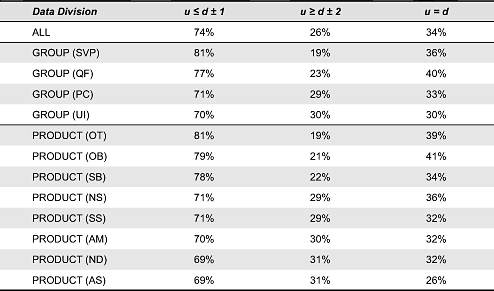
Next, the data were checked for differences between the frequency of mismatch values across the grouped data (SVP, UI, QF, PC). Histograms for the four groups are shown in Figure 2. The frequency data are shown as percentages of the total number of evaluations within the group, rather than absolute numbers, to aid cross-comparison. Based on the summed proportion of exact matches and low-level mismatches (i.e., u ≤ d ± 1), we can see that users’ evaluations within groups SVP (81%) and QF (77%) were closer to the designers’ intentions than for groups PC (71%) and UI (70%). In other words, the latter two bipolar pair groups were relatively problematic to realize intended impressions. Significant differences in the distributions between the four groups were investigated using the Wilcoxon-Mann-Whitney 2-sample rank-sum U-test. This non-parametric test permits statistical analysis of two unequal sized sample sets. Of the six 2-sample tests undertaken, only two tests revealed significant differences in mismatch level distributions.
- Groups UI and SVP (both median mismatch levels = 0) were significant at α = 0.05 (Mann–Whitney U = 139624, n1 = 640, n2 = 400, z = 2.46, p = 0.01 two-tailed)
- Groups PC and UI (both median mismatch levels = 0) were significant at α = 0.05 (Mann–Whitney U = 276395, n1 = 800, n2 = 640, z = 2.60, p = 0.009 two-tailed)
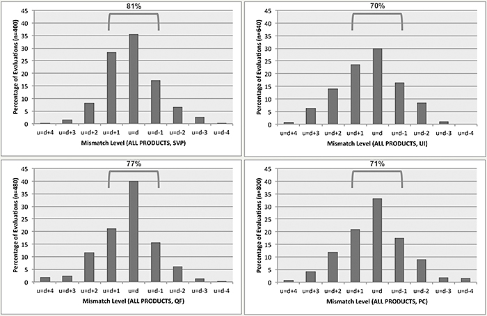
Figure 2. Histograms of mismatch values for four groups (SVP, UI, QF, PC).
These results show that differences in mismatch distributions across the groups were mostly insignificant except for group UI, which had mismatch distributions significantly different to those in PC and SVP (though not QF). If we make a visual examination of the histogram for group UI, we see an unusual linear progression from the centre of the distribution through the left tail, with a distinct and steady drop of approximately 7% for each increase in mismatch level. In contrast, the left tail drops for groups SVP, QF, and PC are less regular and more extreme, with proportionally larger numbers of u = d gradings.
The data were also checked for differences between the mismatch values on an individual product basis (AS, AM, ND, NS, OB, OT, SB, SS), irrespective of bipolar groupings. Histograms for the eight products are shown in Figure 3. Based on the summed proportion of exact matches and low-level mismatches (i.e., u ≤ d ± 1), we can see that users’ evaluations for products OT (81%), OB (79%), and SB (78%) were much closer to designers’ intentions than for products NS (71%), SS (71%), AM (70%), AS (69%), and ND (69%). In other words, with the latter five products the realization of intended impressions was relatively problematic. In particular, product AS received a relatively low percentage (26%) of u = d matches.
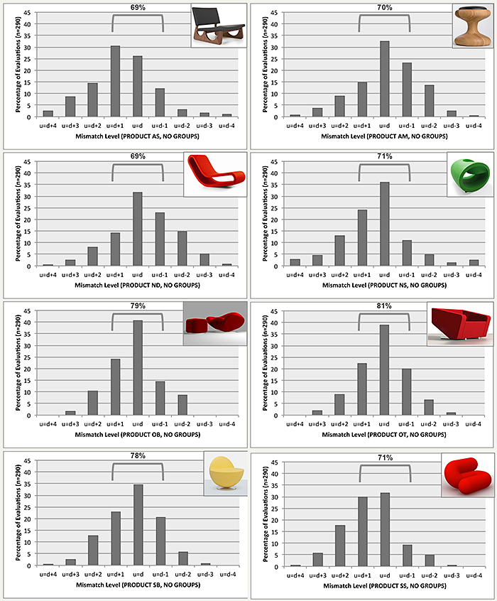
Figure 3. Histograms of mismatch values for eight products (AS, AM, ND, NS, OB, OT, SB, SS).
Significant differences in the mismatch distributions between the eight products were investigated, again using the Wilcoxon-Mann-Whitney 2-sample rank-sum U-test. All but five (of 28) 2-sample tests revealed significant differences. This result is corroborated by the wide shape variation in histograms in Figure 3. Overall, the distributions of mismatch levels were significantly different between the eight products. The five exceptional results, showing no significant difference, were as follows.
- Products AS and SS (both median mismatch levels = 1) were insignificant at α = 0.05 (Mann–Whitney U = 42772, n1 = n2 = 290, z = 0.36, p = 0.72 two-tailed)
- Products AM and ND (both median mismatch levels = 0) were insignificant at α = 0.05 (Mann–Whitney U = 44976, n1 = n2 = 290, z = 1.45, p = 0.14 two-tailed)
- Products OB and OT (both median mismatch levels = 0) were insignificant at α = 0.05 (Mann–Whitney U = 43911, n1 = n2 = 290, z = 0.92, p = 0.35 two-tailed)
- Products OB and SB (both median mismatch levels = 0) were insignificant at α = 0.05 (Mann–Whitney U = 42385, n1 = n2 = 290, z = 0.17, p = 0.87 two-tailed)
- Products OT and SB (both median mismatch levels = 0) were insignificant at α = 0.05 (Mann–Whitney U = 44134.5, n1 = n2 = 290, z = 1.03, p = 0.30 two-tailed)
Of these five results, the test between OB and OT is the most interesting: It was the only test result between two products from the same designer to deliver a non-significant result. In other words, we can say that amongst the four designers, only the designer of OB and OT was able to communicate intended messages equally successfully across both products; this is additional to the high level of semantic match already mentioned for OB and OT.
Micro-Analysis of Mismatches
In this second round of analysis, we examine the mismatch results on a detailed level that permits per-product and per-bipolar pair evaluations. This analysis was used to pinpoint precisely whereabouts semantic mismatches occurred, by revealing especially successful and problematic adjectives/phrases. Figure 4 provides a symbolic matrix of median mismatch values on which the analysis was based. The arithmetic mean was avoided as a measure of centeredness of the data given that the distributions across mismatch levels were non-normal and that the data were categorical rather than continuous.
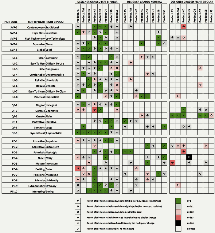
Figure 4. Matrix of median mismatch values for 29 bipolar pairs and 8 products; colour indicates mismatch level and symbol indicates relative change from the designer’s intention.
Given its richness in information, some explanation on the content and layout of Figure 4 is warranted. The matrix comprises 29 bipolar pair rows and three groups of eight products (columns). The reason for having the three groups was to directly show how the designer graded their product: either based on the left bipolar, the right bipolar, or neutral. Each cell represents the results of evaluations of one designer and the median evaluation value of ten users. Cell colorization is used to quickly identify ‘most successfully communicated’ and ‘least successfully communicated’ impressions. Symbols within cells indicate precisely how users’ impressions differed from the designer’s intended impression, based on six logical possibilities.
Results
One of the most obvious features of Figure 4 is that designers mostly chose to grade their products using the left bipolar. This is not so surprising given that the majority of left bipolar adjectives/phrases carried positive associations for seating. The considerable variation of mismatch levels between individual products and across groups and individual bipolar pairs is readily apparent from Figure 4.
Let us first examine Figure 4 on an individual product basis, expanding upon the results of the macro-level analyses to examine through which bipolar pairs designers could not adequately convey an intended impression. To do this, we will consider only ‘mid-level’ mismatches and above (u = d ≥ ± 2) outside the low-tolerance acceptability threshold previously set (u = d ≥ ± 1) and indicated by red or black coloured cells; furthermore, we will consider only those cases where a switch in bipolar pair occurred between designers’ and users’ evaluations. The result is indicated in parenthesis (n = x). The outcome of this individual bipolar pair analysis can be valuable for designers to reconsider in a highly targeted manner the communication dimension of product form and materialization, to avoid bipolar switches in meaning. Results are reported below in the manner that may be relayed back to the designer or design team for action.
- Product AM (n = 5). UI-2 switched from neutral to ‘easy to use’ (u = d ± 2); UI-5 switched from neutral to ‘reliable’; UI-8 switched from ‘impractical’ to ‘practical’; PC-6 switched from ‘exciting’ to ‘calm’ (u = d ± 2); and PC-9 switched from ‘ordinary’ to ‘extraordinary’ (u = d ± 2).
- Product ND (n = 5). SVP-1 switched from ‘traditional’ to ‘contemporary’ (u = d ± 3); UI-8 switched from neutral to ‘practical’ (u = d ± 2); PC-3 switched from ‘nostalgic’ to ‘futuristic’ (u = d ± 3); PC-5 switched from ‘mature’ to ‘immature’ (u = d ± 2); and PC-6 switched from neutral to ‘exciting’ (u = d ± 2).
- Product NS (n = 5). UI-1 switched from neutral to ‘clear’ (u = d ± 2); QF-2 switched from ‘organic’ to ‘geometric’ (u = d ± 3); QF-3 switched from neutral to ‘plain’ (u = d ± 2); PC-2 switched from ‘aggressive’ to ‘submissive’ (u = d ± 2); and PC-4 switched from ‘noisy’ to ‘quiet’ (u = d ± 4). The latter was the strongest switch amongst the entire data set for the study.
- Product AS (n = 3). PC-5 switched from ‘immature’ to ‘mature’ (u = d ± 3); PC-6 switched from ‘exciting’ to ‘calm’ (u = d ± 3); QF-2 switched from ‘organic’ to ‘geometric’ (u = d ± 2).
- Product OB (n = 3). UI-4 switched from neutral to ‘comfortable’ (u = d ± 2); PC-7 switched from neutral to ‘feminine’ (u = d ± 2); and PC-8 switched from neutral to ‘friendly’ (u = d ± 2).
- Product OT (n = 2). UI-3 switched from ‘dangerous’ to ‘safe’ (u = d ± 2); and UI-6 switched from ‘delicate’ to ‘robust’ (u = d ± 2).
- Product SS (n = 1). QF-2 switched from ‘organic’ to ‘geometric’ (u = d ± 2).
- Product SB (n = 0).
These findings show that there were only very isolated cases of problematic bipolar pairs recurring across products. On the whole, the ‘root’ of mid-level mismatches and above was different for each product; no common underlying problem in communication was identified. The only repetitions were PC-6 ‘exciting’ switching to ‘calm’ (× 2), and QF-2 ‘organic’ switching to ‘geometric’ (× 3). The latter is a somewhat surprising result, since QF-2 refers to a factual description of the characteristics of form. Users may have experienced difficulties discriminating ‘organic-geometric’ from ‘curved-angular’.
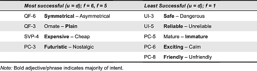
Figure 4 also permits an evaluation of the ‘success’ of design communication on an individual bipolar pair basis by counting the frequency of u = d (exact matches). The distribution was f = 1 (× 5), f = 2 (× 11), f = 3 (× 7), f = 4 (× 2), f = 5 (× 3), f = 6 (× 1). A summary of the maximum and minimum frequencies is contained in Table 4. It can be seen that whilst the most successful bipolar pairs were spread across groups, in contrast the least successful bipolar pairs belonged only to groups UI or PC, elaborating on the relatively poor performance of these groups from the macro-analysis.
Table 4. Most and least successfully communicated bipolar pairs.
Discussion
Separate discussion points will be raised in relation to (i) the data collection methodology, (ii) the macro-analysis results, and (iii) the micro-analysis results.
The principal limitation of the data collection methodology is that user evaluations were made on the basis of high-quality ‘studio’ images, rather than real physical products. The experience of walking around a product and being able to view it from any desired angle is qualitatively different to viewing a photograph. The perception of lighting, proportions, arrangement, materials, and spatial character is enriched when physically encountering a product. However, first encounters with products are often made through the two-dimensional world of marketing materials—so although the limitations are present, they actually represent many real-world conditions for product appraisals. For future studies, inclusion of physical artifacts and multisensory experience could lead to more detailed understanding of mismatches between intended and realized user experience, beyond the specific subject of ‘meanings’ and incorporating the wider subject of ‘aesthetics of interaction’ (Locher, Wensveen, & Overbeeke, 2010). In the case of seating, this would imply an evaluation method permitting users to touch and sit on the products.
Regarding the SD method, it is acknowledged that by ‘imposing’ a list of possible semantic descriptions, we cannot claim to have independently captured designers’ intended impressions or users’ actual impressions. Some semantic intent/impressions might have been missed because it was not within the scope of the 29 bipolar pairs that were provided. In other words, the 29 bipolar pairs may have probed only partial intent/impressions. Alternative methods promoting volunteered adjectives/phrases and poetic descriptions can be contemplated in future research to remedy this limitation, levering intent and impression directly from designers’ and users’ perspectives.
At the macro-level of analysis, the findings reveal that ‘success’ within one bipolar group does not necessarily predict success in another. For example, product NS had median mismatch levels not greater than u = d ± 1 for the SVP group, but for the QF group half of the bipolar pairs had median mismatch levels greater than u = d ± 1. Some observations regarding product communication success across products can also be made. Two of the products for which mismatch levels were highest (AS, AM) were designed through a team rather than a solo project. It is plausible that the relatively poor performance of these two products in semantic realization was because members of the design team may not have been able to reconcile different approaches to building intended meanings into their collective designs. However, without follow-up studies, this remains as speculation.
We see the importance of the micro-level analysis in revealing subtleties in the data on a product-by-product basis that could not otherwise be exposed. It is these subtleties, manifest in the individual bipolar pairs, which designers can take action on and explore how better to communicate design intent. Table 4 provides clues about which bipolar pairs might be more easily recognised and shared (u = d, f = 6, f = 5) and which might be difficult to grade or appraise consistently amongst people (u = d, f = 1). The findings showed that impressions based on symmetry—as a factual description of form—had the highest occurrence of exact matches. In contrast, two of the bipolar pairs with the lowest occurrence of exact match (‘safe-dangerous’ and ‘reliable-unreliable’) may have been inherently difficult to judge based on assessment of visual form—they probably require hands-on interaction to be meaningfully assessed beyond imagined interaction stimulated by a photograph. Indeed, as a general rule, for the bipolar pairs we grouped under ‘usability and interaction’, it is conceded that the visual modality may not be the preferred channel for conveying intended messages: Interaction implies multisensory experience.
Conclusions
The empirical study reported in this paper has for the first time illuminated the ‘size’ of semantic mismatches that exist between an intended impression to be left by a product (from designers) and the actual impression left by that product (on users). This has been possible by using a structured approach to product semantic appraisals, always maintaining a direct link between designer(s’) and user(s’) evaluations in all data processing and analysis.
In relation to RQ1, ‘do users perceive the same meaning from product visual qualities as designers intended?’ The straightforward answer is: in many case yes, but in a substantial minority of cases semantic intent is not realized. RQ2 asked ‘if not, what kinds and extent of mismatch are present?’ We have shown that mismatch levels outside a tight tolerance of u = d ≥ ± 1 (using a 5-point bipolar Likert scale) occur only in approximately 25% of messages. The remaining 75% of semantic intent is realized as intended by designers, within the stated tolerance.
To pinpoint the exact locations of the 25% of problematic design communication, we developed and demonstrated micro-level semantic mismatch analysis and visualization techniques. These techniques open the opportunity for designers to apply their creativity in turning mismatches into matches in any redesign or successor to the product in question, by revising product form and materialization to target mismatched bipolar pairs (Coates, 2003).
A question remains as to whether the results from high-end seating would be repeated in studies of other products. One criticism of this present study can be that the chosen sector is rather elitist: Products with high retail prices and an emphasis on ‘style.’ Perhaps even seating for admiration more than everyday use. Products with less striking or less differentiated visual qualities imply more subtle ways to communicate messages, which may be less possible for end users to discriminate between, and consequently a source of larger quantities or levels of mismatch. Follow-up studies in different product sectors should be able to illuminate these reservations.
The present study did not investigate how designers incorporate meanings into their designs, either from the point of view of (i) the work methods and creative thinking that they employ, or (ii) the product features that they choose (design) as the media for conveying intended meanings. These matters would form a logical extension to the work presented in the paper, for example by conducting retrospective interviews with designers to probe the reasons for particularly ‘successful’ (e.g., OT, OB) or ‘unsuccessful’ (e.g., AS) realization of semantic intent—directly following-up the results from the micro-analysis for these products.
References
- Ahmed, S., & Boelskifte, P. (2006). Investigation of designers’ intentions and a users’ perception of product character. In Proceedings of the NordDesign Conference (pp. 372-381). Reykjavik, Iceland: University of Iceland.
- Alcántara, E., Artacho, M., González, J., & García, A. (2005). Application of product semantics to footwear design. Part I - Identification of footwear semantic space applying differential semantics. International Journal of Industrial Ergonomics, 35(8), 713-725.
- Barthes, R. (1988). Semantics of the object. In R. Howard (Trans.), The semiotic challenge (pp. 179-190). Oxford, UK: Basil Blackwell.
- Berkowitz, M. (1987). Product shape as a design innovation strategy. Journal of Product Innovation Management, 4(4), 274-283.
- Blijlevens, J., Creusen, M., & Schoormans, J. (2009). How consumers perceive product appearance: The identification of three product appearance attributes. International Journal of Design, 3(3), 27-35.
- Bloch, P. (1995). Seeking the ideal form: Product design and consumer response. Journal of Marketing, 59(3), 16-29.
- Cagon, J., & Vogel, C. (2002). Creating breakthrough products: Innovation from product planning to program approval. Upper Saddle River, NJ: Prentice Hall.
- Chamorro-Koc, M., Popovic, V., & Emmison, M. (2008). Using visual representation of concepts to explore users and designers’ concepts of everyday products. Design Studies, 29(2), 142-159.
- Chang, H., Lai, H., & Chang, Y. (2006). Expression modes used by consumers in conveying desire for product form: A case study of a car. International Journal of Industrial Ergonomics, 36(1), 3-10.
- Chuang, M., Chang, C., & Hsu, S. (2001). Perceptual factors underlying user preferences toward product form of mobile phones. International Journal of Industrial Ergonomics, 27(4), 247-258.
- Coates, D. (2003). Watches tell more than time: Product design, information and the quest for elegance. London, UK: McGraw-Hill.
- Creusen, M., & Schoormans, J. (2005). The different roles of product appearance in consumer choice. Journal of Product Innovation Management, 22(1), 63-81.
- Crilly, N. (2011). Do users know what designers are up to? Product experience and the inference of persuasive intentions. International Journal of Design, 5(3), 1-15.
- Crilly, N., Good, D., Matravers, D., & Clarkson, P. (2008a). Design as communication: Exploring the validity and utility of relating intention to interpretation. Design Studies, 29(5), 425-457.
- Crilly, N., Maier, A., & Clarkson, P. (2008b). Representing artefacts as media: Modeling the relationship between designer intent and consumer experience. International Journal of Design, 2(3), 15-27.
- Crilly, N., Moultrie, J., & Clarkson, P. (2004). Seeing things: Consumer response to the visual domain in product design. Design Studies, 25(6), 547-577.
- Demir, E. (2008). The field of design and emotion: Concepts, arguments, tools, and current issues. Journal of the Faculty of Architecture, 25(1), 135-152.
- Demir, E., & Erbuğ, Ç. (2008). Product group dependent determinants of user satisfaction. In P. Desmet (Ed.), Design and emotion moves (pp. 78-108). Newcastle, UK: Cambridge Scholars Publishing.
- Desmet, P., & Hekkert, P. (2007). Framework of product experience. International Journal of Design, 1(1), 57-66.
- Fenko, A., Schifferstein, H., & Hekkert, P. (2009). Shifts in sensory dominance between various stages of user-product interactions. Applied Ergonomics, 41(1), 34-40.
- Fisher, T. (2004). What we touch, touches us: Materials, affects, and affordances. Design Issues, 20(4), 20-31.
- Fiske, J. (1990). Introduction to communication studies. London, UK: Routledge.
- Hassenzahl, M. (2003). The thing and I: Understanding the relationship between user and product. In M. Blythe (Ed.), Funology: From usability to enjoyment (pp. 31-42). Dordrecht, the Netherlands: Kluwer Academic Publishers.
- Hsiao, K., & Chen, L. (2006). Fundamental dimensions of affective responses to product shapes. International Journal of Industrial Ergonomics, 36(6), 553-564.
- Hsiao, S., & Chen, C. (1997). A semantic and shape grammar based approach for product design. Design Studies, 18(3), 275-296.
- Hsu, S., Chuang, M., & Chang, C. (2000). A semantic differential study of designers’ and users’ product form perception. International Journal of Industrial Ergonomics, 25(4), 375-391.
- Jin, S. H., & Boling, E. (2010). Instructional designer’s intentions and learners’ perceptions of the instructional functions of visuals in an e-learning context. Journal of Visual Literacy, 29(2), 143-166.
- Khalaj, J., & Pedgley, O. (2012), Comparison of designers’ intended messages and users’ constructed messages communicated through visual qualities of furniture. In Proceedings of the International Conference of the Design Research Society [CD-ROM]. Bangkok, Thailand: Chulalongkorn University.
- Krippendorff, K. (2006). The semantic turn: A new foundation for design. Boca Raton, FL: Taylor and Francis.
- Krippendorff, K., & Butter, R. (1984). Product semantics: Exploring the symbolic qualities of form. Innovation, 3(2), 4-9.
- Lindh, U. W. (2010). Spatial interpretations in relation to designer intentions: A combined strategies study in an auditorium with variable lighting. In Proceedings of the International Conference on Colour and Light in Architecture (pp. 258-263). Venice, Italy: IUAV.
- Locher, P., Wensveen, S., & Overbeeke, K. (2010). Aesthetic interaction: A framework. Design Issues, 26(2), 70-79.
- Maurer, C., Overbeeke, C., & Smets, G. (1992). The semantics of street furniture. In S. Vihma (Ed.), Objects and images: Studies in design and advertising (pp. 86-93). Helsinki, Finland: University of Industrial Art.
- McDonagh-Philp, D., & Lebbon, C. (2000). The emotional domain in product design. The Design Journal, 3(3), 31-43.
- Mondragón, S., Company, P., & Vergara, M. (2005). Semantic differential applied to the evaluation of machine tool design. International Journal of Industrial Ergonomics, 35(11), 1021-1029.
- Muller, W. (2001). Order and meaning in design. Utrecht, the Netherlands: Lemma.
- Norman, D. (1998). The design of everyday things. London, UK: MIT press.
- Osgood, C., Suci, G., & Tannenbaum, P. (1957). The measurement of meaning. Urbana, IL: University of Illinois Press.
- Petiot, J., & Yannou, B. (2004). Measuring consumer perceptions for a better comprehension, specification, and assessment of product semantics. International Journal of Industrial Ergonomics, 33(6), 507-525.
- Schifferstein, H. (2006). The relative importance of sensory modalities in product usage: A study of self-reports. Acta Psychologica, 121(1), 41-64.
- Schifferstein, H., & Wastiels, L. (2014). Sensing materials: Exploring the building blocks for experiential design. In E. Karana, O. Pedgley, & V. Rognoli (Eds.), Materials experience: Fundamentals of materials and design (pp.15-26). Oxford, UK: Elsevier.
- Vihma, S. (Ed.). (1990). Semantic visions in design: Proceedings from the symposium on design research and semiotics. Helsinki, Finland: University of Industrial Arts.
- Wendt, T. (2013), Intention vs. interpretation: What matters? Retrieved July 29, 2013, from http://www.uxbooth.com/articles/intention-vs-interpretation-what-matters
Appendices
Appendix A: Test 1 — Removal of Low-Relevance Bipolar Pairs within Groups
Test Rules
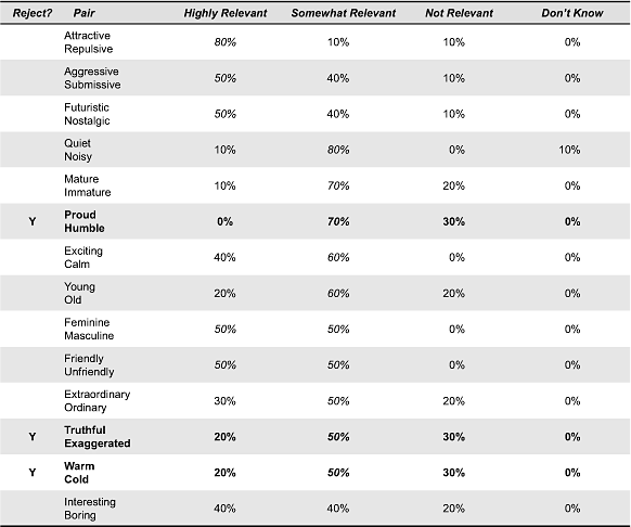
- Rule 1) Highlight the highest grade for each bipolar pair in italic. If a pair has the same grade in multiple groups, then highlight the lower group (i.e., pessimistic approach).
- Rule 2) Rank order the highlighted pairs: first the ‘highly relevant’ group, then ‘somewhat relevant’, then ‘not relevant.’ If two pairs have the same grade, then place those with higher ‘not relevant’ scores lower.
- Rule 3) Rejection rationale: Take the summation of the grades for ‘not relevant’ and ‘don’t know’ groups, since these indicate highest levels of uncertainty about the relevance of pairs.
- Rule 4) Decide on a rejection threshold % for the summation, e.g., 20% = 20 rejected pairs; 30% = 10 rejected pairs; 40% = 4 rejected pairs. Decision = 30% threshold because others remove relatively too much or too little of the data set.
- Rule 5) Rejected pairs highlighted in bold and indicated in column one of Table 5 to Table 8.
Table 5. Group SVP: Social values and position of a product.
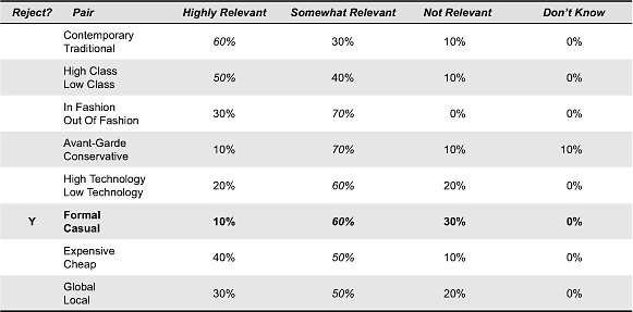
Table 6. Group UI: Usability and interaction of a product.
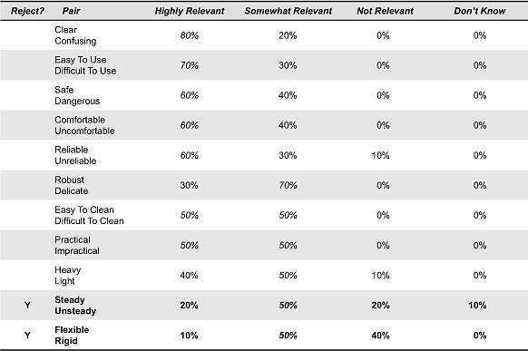
Table 7. Group QF: Qualities of form of a product.
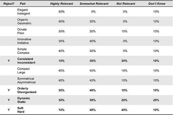
Table 8. Group PC: Personality characteristics of a product.
Appendix B: Test 2 — Removal of Semantically Highly Overlapping Bipolar Pairs
Test Rules
- Rule 1) ‘Reject’ if BOTH of the bipolar adjectives/phrases have at least one synonym.
- Rule 2) Adjust synonym frequency data in parentheses. Now ‘Reject’ if ONE of the bipolar adjective/phrases is itself a synonym mentioned MORE than once.
- Rule 3) Adjust synonym frequency data in parentheses. Now ‘Keep’ all remaining pairs.
(Synonym frequency data are provided in parentheses)
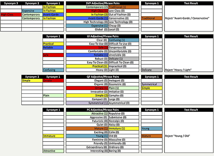
Figure 5. Result after Rule 1.
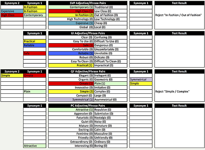
Figure 6. Result after Rule 2.
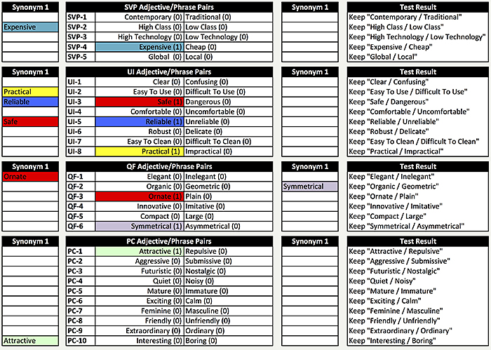
Figure 7. Result after Rule 3.
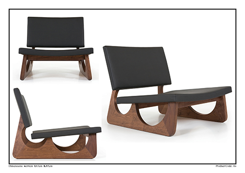
Appendix C: Example of Product Visual Card (Product AS)