
Positively Picturing Pain? Using Patient-generated Pictures to Establish Affective Visual Design Qualities
Catherine Stones
University of Leeds, Leeds, UK
This paper examines the role that pictures play in self-help material for people with chronic pain. It reports on preliminary research that is contributing to the design of a picture-led tool to be used in a pain-management context. It is argued that pictures generated by people with pain may be used as the basis for a new approach for designing pictures. By identifying common themes used by people to describe their pain and converting them though reversal, e.g. constrained to free, we can construct a set of visual qualities that we can then apply to the design of supportive, motivational pictures. In addition, this paper performs content analysis on some key books in the chronic pain management area, examining how they employ pictures. It is found, somewhat unsurprisingly, that though analogies are rich within some texts, serving to motivate the reader, they are rarely visualised. Instead pictures are used almost predominantly to instruct. This could be problematic for readers with low literacy skills or short attention spans is something that designers can possibly address by including pictures that are more positive in tone.
Keywords – Affective Design, Graphic Design, Health Communication, Pain, Pictures.
Relevance to design practice – This research is relevant for graphic designers or any image makers who need to create pictures that are positive in tone. It presents a methodology that can be used in a variety of health contexts. It presents a set of design qualities to be used when choosing/designing picture content.
Citation: Stones, C. (2013). Positively picturing pain? Using patient-generated pictures to establish affective visual design qualities. International Journal of Design,7(1), 85-97.
Received July 13, 2012; Accepted February 4, 2013; Published April 30, 2013.
Copyright: © 2013 Stones. Copyright for this article is retained by the author, with first publication rights granted to the International Journal of Design. All journal content, except where otherwise noted, is licensed under a Creative Commons Attribution-NonCommercial-NoDerivs 2.5 License. By virtue of their appearance in this open-access journal, articles are free to use, with proper attribution, in educational and other non-commercial settings.
Corresponding Author: c.m.stones@leeds.ac.uk
Dr. Catherine Stones is a lecturer in graphic design in the School of Design, University of Leeds, UK. She leads the Graphic Design for Healthcare research area within the school, designing and publishing work related to healthcare, in particular chronic pain. She collaborates with a number of NHS clinicians and consultants in the UK.
Introduction and Contexts of the Study
It is vital that chronic pain self-help material be well designed and written. According to the UK’s National Health Service (NHS) research (Moore & Cole, 2008) a person with a health condition spends, on average, less than three hours per year with a health care professional. They have a remaining 8,733 hours of the year to spend on their own with a chronic condition, such as pain. Given mixed literacy levels and the multicultural background of many patients, pictures are recognised as an important feature of health information design (Houts, Doak C. C., Doak L. G., & Loscalzo, 2006), serving not simply as decoration or to make a document more readable, but also potentially as a valuable source of content. Limited advice however is provided by the NHS regarding choice and content of pictures in communication design (Duman, 2003) and guidance is sometimes not explicitly focused around a patient’s needs (Finan, 2002). Health communication is a complex process not least because it involves patients who are generally not familiar with medical terms, and who often receive the information when they are sick and distracted (Osborne, 2006). This poses a particular challenge for the designer who has to develop empathy with the patient. The involvement of the patient then in the construction and evaluation of pictures is vital. It is important not only to involve the patient in the design process via discussion and evaluation, but also to understand what pictures are already ‘in the patient’s head’. Fundamentally, one of the questions this early research hopes to address is: by understanding how pain is pictured by patients with chronic pain, is it possible to elicit design characteristics that may aid in the construction of positive pictures for use in self-help materials? Put more simply, how can designer-constructed pictures take account of patient-constructed pictures?
This paper reports on research that forms part of a larger study, informing the design, production and evaluation of a self-help visual tool for patients with chronic (long term) pain. The tool features interactive, paper-based pictures and is designed to help patients log and understand their pain and improve their lives through the principle of acceptance (Hayes, Strosahl, & Wilson, 2004). The tool was to be used by a patient independently at home but shown to the clinician at a later date as a discussion point–to assess the social impact that pain was having on the patient. This meant that the tool had to be motivating in tone in order to maximise usage. The tool needed to include a depiction of pain itself, and also needed to include pictures that would support positive reflection and change. Screenshots are included later in this paper to demonstrate how elements of the tool’s visual design employed principles stemming from this research.
Prior to the planning or production of the picture-based tool four research objectives were set, as follows:
- To analyse the function of pictures and the current theories of affective design applicable to health communication design.
- To evaluate how pictures are used in existing self-help literature about chronic pain;
- To evaluate how the patients themselves picture pain;
- To discuss the potential for using patient-generated pictures to inform the development of pictures in self-help material.
Objectives 2 and 3 demanded separate methodologies presented in two distinct sections in this paper, but together they provide an overall view of the differences between the pictures that we make for patients (to help express positive approaches and solutions for pain management) and the pictures the patients make themselves (to express themselves and their feelings about pain). Objective 4 leads to the presentation of visual principles that, when applied to a design, allows us to potentially bridge the gap between the findings of Objectives 2 and 3.
Picture Use in Health Communication
Osborne (2006, p.30) identifies five types of visual information employed in health communication.
- Layout and design
- Pictographs and cartoons
- Pain scales and visual tools
- Maps, genograms and other diagrams
- Forms and other interactive documents
Examining these categories and Osborne’s (2006) description of them, we can conclude that visual material has a pervasive presence in health communication–from the picture content of a cartoon that visually illustrates a point within the text, to the more subtle suggestion, say, of composition hierarchy, which might lead the reader’s eye to a particular point in the design.
While these categories are broad, they form a useful starting point for examining visual material. We might start by classifying four of these categories as essentially ‘abstract’ in nature–they use geometric shapes (lines in pain scales, symbols in maps, grids within forms) or formal graphic properties (such as colour in a map or a particular typeface in a design) to represent meaning. One of the categories however–‘Pictographs and Cartoons’ is potentially more ‘literal’, more conventionally ‘picture-like’ or veristic, and it is this type of visual material that is the focus of this study. The term ‘picture’ is used broadly here to describe drawings, illustrations, paintings or photographs that contain visual representations of objects, characters, scenes, events or activities.
Of course, the difference between abstract and literal approaches is not always a clear cut dichotomy; some pain scales use literal approaches, such as the pain scale using Chernoff faces featured in Hockenberry, Wilson, and Winkelstein (2008) for instance. Do patients with pain use abstract or literal elements to express their pain and, equally, what type of pictures are already used in health communication to help patients deal with their pain?
In addition it is vital to understand what functions pictures serve and how effective they are when included in healthcare communication more generally. Houts, Doak C. C., Doak L. G., and Loscalzo (2006), in their extensive literature review concerning picture use in health communication, critically collate research concerning how pictures can be used successfully to facilitate attention, comprehension, recall and adherence. These four areas will only be summarised here. Whilst there are few studies on attention specifically (how often a picture is noticed or the type of pictures most likely to be noticed), it appears likely that health materials featuring pictures versus those that feature text only are more likely to be read (Delp & Jones, 1996). Patients also appear to prefer pictures (Katz, Kripalani, & Weiss, 2006) and therefore they play an important role in appeal as well as attention. Pictures appear to make a positive difference to the comprehension of a wide variety of healthcare topics including cancer screening (Brotherstone, Miles, Robb, Atkin, & Wardle, 2006), nystatin suspension (Mansoor & Dowse, 2003), risk communication (Paling, 2006), hospital discharge instructions (Austin, Matlack, Dunn, Kosler, & Brown, 1995) and wound care (Delp & Jones, 1996). Pictures seem to make a particular difference for those with low literacy (Michielutte, Bahnson, Dignan, & Schroeder, 1992) and therefore play a compensatory role (Levie & Lentz, 1982). Many of these studies refer to experiments that compare text only with picture/text versions and so offer little help in guiding the form of the picture itself. However such studies are vital in reiterating the importance of picture inclusion.
Though there are fewer studies regarding recall, there still appears to be positive evidence to suggest that pictures can aid in recall, both free recall (without prompts) and cued recall (with prompts) (Houts, Doak C. C., Doak L. G., & Loscalzo, 2006), particularly for people with low literacy (Patel, Eisemon, & Arocha, 1990). Pictures can also aid adherence (Delp & Jones, 1996), particularly again, with people with low literacy (Ngoh & Shephard, 1997). Picture content is rarely discussed in the studies to date however, which again shows only a surface understanding of the ways in which pictures can communicate. Examination of content seems only to have been prompted when findings fail to concur with expectations. For instance, the lack of difference in adherence when pictures were used in breast self examination leaflets (Labranche, Helweg-Larsen, Byrd, & Choquette, 1997) was accounted for by the inclusion of a male clinician in the picture.
The four functions summarised above–attention, comprehension, recall and adherence–are important areas for the designer to focus upon. What is less clear from the literature cited above is how pictures function in terms of providing an affective message to the viewer. Taking a model from outside health communications allows us to view a slightly different set of functions for pictures. Levie and Lentz (1982) highlighted four key functions of pictures within texts (see Table 1).
Table 1. Functions of text illustrations.
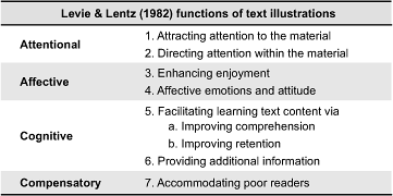
The most notable difference between the functions, for this study, is the inclusion of an ‘Affective’ category, which interestingly cites affective emotions as an outcome of picture viewing. Houts, Doak C. C., Doak L. G., and Loscalzo (2006) reflect upon most of Levie and Lentz’s (1982) functions (namely 1, 3, 5a, 5b and 7) but only very briefly on ‘affection’. For example, they only cite examples from charity campaigns with reference to provoking emotions in potential donors. What is unclear from current literature then is how pictures can be affective for patients. This is clearly an area in need of more investigation.
Affective Design in Health Communication
Affect is a general term used by theorists to describe a range of feelings and emotions (Monahan, 1995). The term ‘affective’ design refers to empathetic, meaningful design that intends to evoke affect. Carliner (2000) added the term ‘affective’ design to a framework for Information Design, referring to it as “designing the communication product for its optimum emotional impact”, however he did not reflect in any depth about what emotions might be suitable and how they might be elicited through information design (Carliner, 2000, p.568). More recent reflections on affective design (Helander & Khalid, 2012) consider how positive ‘emotional’ qualities are added to designs to increase their appeal, citing examples where sales increase in relation to positively affective products. To date, the term ‘affective design’ or ‘emotional design’ tends to be used predominantly in reference to product design or computer system interface design (Desmet, 2008; McDonagh, Hekkert, Van Erp, & Gyi, 2004; Norman, 2004). The terms then relate strongly to products that are either bought or selected/used over key competitors, with positive affection playing a role in that selection criteria or continued use (e.g. “This product will make me feel good”). In this respect affective design in those areas differs from affective design in health communication. The latter operates, in countries such as in the UK at least, outside a commercially competitive environment. Informative health material is given to patients at no cost to the patient. Public health persuasive posters do not compete against each other, and information leaflets that are freely available do not have to gain a competitive advantage. Couple this key difference with the culture of objectivity, where information rather than persuasion is often the key aim (in information resources at least), and affective design in healthcare becomes a complex issue. As Peters, Lipkus, and Diefenbach (2006) point out “The provision of more subjective interpretations may be difficult and be resisted by health professionals who prefer to provide only ‘objective facts’” (p. 144). Given this complexity then, there is increasing need for research into best practice for positive affective design in healthcare.
Research in the health communication area does examine the impact of affect but tends to focus on negative rather than positive affect. Studies also mostly examine overall messages rather than pictures or the visual quality of the material. Research studies are extensive in terms of ‘Fear Appeal’ (Dillard, Plotnick, Godbold, Freimuth, & Edgar, 1996; Job, 1988) influenced by the theories of Janis and Feshbach (1953). Much of this research focuses on public health promotional campaigns rather than supportive tools, but it serves to show how affect is deemed important in certain areas of health communication. Witte and Allen (2000) reviewed the findings of 100 research papers relating to fear appeal and concluded that high fear provocation combined with a clear message of high self-efficacy proved most effective. They only recommended one use of pictures specifically in fear provocation, which was to include ‘gruesome’ pictures (Witte & Allen, 2000, p. 606), though little elaboration is offered in terms of what these pictures might be of, other than an undesirable symptom, or how they may be presented. In other reviews of fear appeal effectiveness, findings regarding picture usage were absent (Ruiter, Abraham, & Kok, 2001). The role of pictures in instilling fear or disgust has been mostly discussed with particular reference to cigarette packet design. Gruesome literal pictures featured on cigarette packets have been shown to be effective in provoking negative affect in particular countries (Hammond, 2011; Hammond, Fong, Borland, Cummings, McNeill, & Driezen, 2007; White, 2008), though limitations to these studies, such as the employment of self-reporting (Job, 1988), have made some findings problematic. Once again, there is little discussion regarding picture content or style and Hammond (2011) argues that “future research on tobacco health warnings should consider effective types of message content for pictorial warnings to a greater extent. There is a particular need to evaluate different themes or ‘executional styles’” (p. 334).
It is harder to locate studies in the area of positive affect and healthcare as most public health campaigns often rely on two strategies–either fear appeal or straightforward presentation of fact (Monahan, 1995). There is however an increasing debate about the use of fear appeal as a primary strategy (Hastings, 2004; Monahan, 1995), given evidence presented of successful positive approaches to health communication. The latter approach is commonly used for patient information and tools. Positive affective design examples can be found in areas such waiting room environments (Ayas, Eklund, & Ishihara, 2008) which have been found to be particularly successful where they evoke a positive, calming emotion. Um, Song, and Plass (2007) designed two versions of the same software about a health-related area, one designed plainly and the other designed according to aesthetic guidelines that were essentially described as ‘emotional design principles’ (though we could argue by looking at their examples that adding colour, increasing imagery content and adding faces to elements is only a basic way of considering ‘good’ design). Their ‘positive’ design resulted in more positive feelings and greater cognition. Their subjects however were college students without invested feelings about the subject and the subject matter itself was not emotive. Nevertheless it is useful to see design that can induce a positive affect and that a measurable difference in mood can be perceived.
The Role of Positive Affect in Cognition and Attitude Formation
Despite the lack of examples in health communication regarding pictures that explicitly seek to induce positive emotions, it is clear, when reviewing and summarising research on affect and cognition that positive affect may play a beneficial part in how we learn and how we make decisions. Positive affect can play a part in effective learning (Um et al., 2007). Positive affect may also enhance motivation (Erez & Isen, 2002), and can also lead to more positive opinions (Petty, Schumann, Richman, & Strathman, 1993). In terms of models of persuasion, and in particular dual-process models of persuasion, there is compelling evidence to show that affect can play an important role in changing attitudes. Peters, Lipkus, and Diefenbach (2006) cited four important functions that affect plays in the construction of health preferences. It can act as information (the affect may act as a heuristic, giving guidance), it can aid focus and the absorption of new information, it can act as a motivator, and it can also allow for meaningful comparisons to be made. Peters, Lipkus, and Diefenbach (2006) conclude that “we may need to tailor our communication approaches to a person’s emotions” (p. 147) but firstly it is helpful to consider a broader model of attitude formation where affection already has been applied.
According to the Elaboration Likelihood Model (Petty & Cacioppo, 1986), attitudes are formed through two routes of persuasive influence to form either a central attitude change or a peripheral attitude change. The central attitude change is formed when the audience engages at high level with the material presented and interacts with the proposed message (either positively or negatively). The central attitude change is stable and long-lasting, according to the model, and therefore most desirable. A peripheral attitude is more unstable, more short-lived and is formed when motivation to interact with the material is low, or difficult (such as being distracted), the opinion formed is neutral, or, quite simply, the audience doesn’t need to think about it to any depth. It is crucial therefore to design material that meets the need of the audience, and is highly relevant in order to meet the first criteria of central attitude shifts. But how does affect play a role in the ELM?
According to Peters, Lipkus, and Diefenbach (2006) there are two forms of affect that can play a role in attitude formation–integral affect (positive or negative feelings about a stimulus that are based on prior experience, and that are experienced while thinking about the stimulus) and incidental affect (a mood state that is independent of the stimulus but which can be misinterpreted as forming from the stimulus). An example of an integral affect would be feeling worried when reading a mammogram leaflet having heard about a friend’s negative experience of one. An example of an incidental affect would be worrying before reading a mammogram leaflet due to receiving bad news about a business deal. The former affect is triggered by the stimuli, the latter affect was occurring independently of it. Incidental affect is likely to be an important element to consider in this study, since patients with chronic pain already have emotional responses, accumulated over time, with respect to their long-term condition. The affect may not be triggered by looking at material but can ‘block’ how receptive they are to the information presented in it.
Petty, Barden, and Wheeler (2002) have claimed that affect that is incidental (such as a mood state unconnected to the stimulus/message) can act detrimentally, forcing the patient into only a short-term peripheral attitude change. In addition, given the non-threatening nature of positive messages–engendering feelings of ease and comfort–there is a risk that positive affect may lead only to peripheral processing of information (Petty & Cacioppo, 1986), leading in turn to only short-term effects.
Monahan (1995) however, sees positive affect as having a potentially longer impact than peripheral processing suggests due to the combination of both rational and affective processing that is triggered during encounters with positive messages designed to make the patient think, as well as to feel.
These three views lead to one conclusion: that the designer needs to account for incidental affect in the design–to understand the affective views that the patient already has before attempting to design positive messages for them. In terms of attitude formation and decision making, Slovic, Finucane, Peters and MacGregor (2007) argue that “in the process of making a judgment or decision, people consult or refer to an ‘affect pool’ containing all the positive and negative tags consciously or unconsciously associated with the representations”(p. 1335). If the positive or negative affects we already have play a large part in our decision making, then to ignore the present affect when designing for patients is a missed opportunity.
These studies tell us positivity is important but not how to induce it in a way that is meaningful for patients already anxious about their condition. The principle at stake here is that positivity should be induced during the task of experiencing health material. But to what extent is this already occurring in self-help literature and how might a designer construct a more positive approach to picture-making?
Part 1: What Role Do Pictures Play in Information Design in Chronic Pain Self-Help Literature?
It is vital to understand current practice in picture-making in the area of chronic pain. To what extent is self-help material already providing patients with a positive affect in terms of picture content? The literature above reflects academic thinking from a range of disciplines and does not necessarily reflect recent design practise as experienced by a patient with chronic pain. Hence there is a need to examine both areas prior to suggesting a new method for positive picture construction.
Methodology
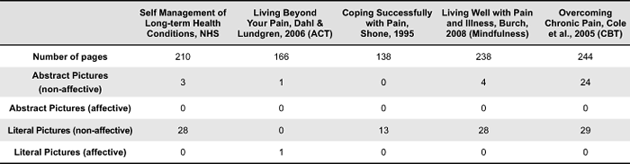
Five key books were examined in depth. They were selected because they employed slightly different self-management techniques. Techniques were taken from Cognitive Behavorial Therapy (CBT), Acceptance and Commitment Therapy (ACT), and Mindfulness/Meditation Therapy. Where these techniques were explicitly identified by the author/s, the therapy name has been indicated in brackets in the table below. Two books without named approaches took a generic or mixed-style stance on pain management. One of these books, Self Management of Long-term Health Conditions, was produced by the NHS as part of their Expert Patient’s Programme and is therefore an internal document, selected as an example of bespoke material developed for people who are already keen to self-manage. Other books and materials exist, of course; although this is only a relatively small sample of books, they provide a fair overview of the use of pictures in self-help pain literature in general.
Quantitive-based content analysis was carried out on pictures featured within the material. Leading on from Osborne’s (2006) picture type descriptions cited earlier, instances of the visual approach adopted (abstract or literal in style) were recorded, together with any uses of positive affection in the picture content. Picture content was classed as positively affective if say, the picture was attempting to suggest positive approaches or be motivational in tone. Where a picture was purely instructional or information-led, rather than affective, it was labelled non-affective. Coding was performed by one primary investigator with no ambiguity encountered during the coding process of this particular sample. An additional coder would be advisable for a larger sample of material.
Results
It would appear that while these books feature many pages of text, the pictures are relatively sparse in quantity–see Table 2. Most pictures are literal in approach and objectively present facts such as ways to stretch the body to minimise pain. For example all the literal pictures are pictographs (simple line drawings) showing positions of the body during exercises or workings of the body. Although many positive analogous themes are adopted in pain management texts, they are rarely visualised. For instance, Dahl and Lundgren’s book Living Beyond Your Pain (2006) employs 12 different approaches to describe pain in words, attitudes to life and to pain management. The objects and situations used in the text include: quicksand, a journey on a bus, a stream, a journey on a road, a tiger cub, a compass, a tug of war, a chessboard, a homeless person, a radio, a bull’s eye and obstacles in a river. Almost all are described purely textually. Only one is shown via a picture that is positive in tone and this is described below.
Table 2. Results of content analysis of self-help literature.
The Bull’s Eye analogy has been pictured in circular and in this case literal form, using various shades of grey to indicate closeness to feeling ‘vitally alive’. The Bull’s Eye exercise involves choosing one of the life domains, articulating the values, then devising an action to help you move in the direction of your values goal. You then have to indicate on the diagram how successful the action was in moving you in the right direction. This interaction is articulated as ‘for each committed action you take in your valued direction, mark the appropriate space on the dartboard’ (Dahl & Lundgren, 2006, p.141) This is a potentially powerful device as it invites interaction, indicates that the central point is potentially achievable and also uses an everyday object that is associated with play (and is therefore unthreatening). The picture however, is very objectively presented with no use of colour or motivational motifs. It is positive due to its content rather than its visual style and this remains a missed opportunity.
Use of positive pictures is rare in the material examined–only one instance was found of such an approach, giving support to Peters, Lipkus, and Diefenbach (2006) view about the difficulty of embedding affect into a document in a discipline where objectivity is currently the dominant approach. Whilst the text of all of these books is often positive in tone, the pictures take an objective stance, either literally indicating the physical impact of pain or presenting abstract charts and diagrams about the psychological impact of pain. There is only one attempt to replicate a sense of positivity within the pictures, possibly because it is difficult to do so. Stephen Dworking explains that “There is no universal symbol because pain is individual…pain is such a complex thing to try to put into image form. It is not a single issue or image-making process, because in the end you always begin to generalise, you don’t get specific pain” (Padfield, 2003, p.22).
Given the importance of pictures highlighted in the literature review, and the role that affection can play in the comprehension of information it seems that designers and authors must work harder to reflect the findings of research into their material. What we lack however so far, are the pictorial strategies to do so. How do we devise positive design strategies for picture-making? One technique proposed in the following section originates from the patients themselves and their negative view of pain. By taking patients’ negative pictures, can we construct positive pictures to ‘give back’ to them?
Part 2: How Do People with Chronic Pain Visualise Their Pain?
Padfield (2011) points out that even though technology offers us increasing insight into the physical aspects of pain, little is understood about the psychological aspects of pain–“We have become less tolerant of that which is opaque and invisible; less able to ‘read’ aspects of illness, pain and disease which cannot be accessed by technology, abandoning such experiences to spaces of illegibility, ambiguity and contention” (p. 244). Art Therapy and similar activities (Pincus, Wachsmuth-Schlaefer, Sheikh, & Ezaz-Nikpay, 2003) serve a valuable purpose, enabling people to picture, understand and communicate their pain. Pictures can acknowledge that pain exists by visually rendering the pain for people to see and share. One of the very keystones of Acceptance and Commitment Therapy (ACT), the principle adopted for the construction of the picture-led tool, is acknowledging and subsequently accepting that the pain exists and that it may continue to exist. The picture of pain therefore is not one to be avoided but rather one to be acknowledged. The challenge for the designer lies in creating pictures that attempt to speak to a wide audience whilst still acknowledging that patients already picture their own pain individually, and often uniquely. As Drowkin, an artist who has much experience working with people with pain stated “how could we avoid generalising, yet make symbols which signified beyond the individual” (Padfield, 2003, p. 22). As Pincus et al. (2003) pointed out, people should be encouraged during image therapy sessions to work with their own pictures, and when examining art therapy images broadly we see an enormous range of visual styles, themes and expressions at play. With closer inspection though, are there are some general themes to these patient-generated pictures that we can extract and work with?
Methodology
Establishing the Sample
In order to examine how people with chronic pain pictured their pain it was important to source authentic visual material. Since art therapy has been applied to the area of chronic pain for over two decades (Shapiro, 1985) it was deemed acceptable to use existing images sourced from previous art therapy sessions. To gain an understanding of a range of picture-making activity, two types of art generation were chosen for examination. Firstly a workshop was chosen where art making activity occurred within a group environment and where a facilitator supported individuals in expressing their pain over the course of several days. Secondly pictures were examined which had been the result of a much more collaborative picture making process over a longer period of time, in which individuals worked closely with an artist, to essentially “art direct” their pictures. Each of these types of art generation have their strengths. The workshop enabled dialogue not just with the facilitator but also with peers. It enabled a range of materials to be used and, importantly, the pictures were not created within the boundaries of any specific aesthetic. The collaborative pictures, on the other hand, represented a more sustained process of picture making where aesthetic as well as expressive concerns were evident, where pictures were gradually refined, and the pictures were a result of focused negotiation and discussion between the person with pain and the artist creating the image. It was hoped by examining the results of two kinds of picture making processes, a wider variety of visual approaches to picturing pain would be evident.
In terms of sourcing the pictures from a group therapy session, an artist who ran art therapy classes was contacted and interviewed about the ‘Art for Pain’ workshops that she delivered. She provided a range of visual material generated by fourteen people. Twenty-nine pictures were made available. Ethical and copyright approval was sought and granted by the organisation that offered the workshops. Pictures analysed from these workshops are labelled AfP.
In terms of sourcing pictures resulting from a collaborative working method ‘The Perceptions of Pain’ project was chosen as the subject of study. These pictures were the result of close and sustained collaboration between an artist called Deborah Padfield and people with chronic pain over an eight month period. The artist used the medium of photography to visualise the pictures that the people with chronic pain described. The images created are crafted to a high standard and there is a unification of imagery and quality that would be unlikely to be achieved by an art therapy class. To some extent this method is atypical but in other ways it offers insight into longer methods of working in which visual material is generated through sustained enquiry. Thirty-eight pictures from this source were examined which had been generated by ten people with pain. These pictures were already published in the public domain (Padfield, 2003). Pictures analysed from this collaboration are labelled PoP.
Method of Analysis
Pictures were analysed using a traditional semiotic approach in which the two-part principle of denotation and connotation were used. Pictures were examined in turn and the key components of each image were described in words, in terms of what they denoted. These were objectively recorded and presented below in Table 2. Once this stage was completed, a second stage of analysis occurred in which each description was examined in order to identify common themes within pain pictures, following a similar inductive method adopted by Hanna and Jacobs (1993). For instance, where rope was used to bind objects, or cages were depicted, then a common theme of ‘constraint’ was identified. As no list of common themes existed in previous literature, this approach to categorisation employed grounded theory (Charmez, 2006), in which results emerged through open enquiry and systematic examination of, in this case, pictorial data. Since this is early stage work, themes were kept as broad as possible and at the first level of connotation only, that is to say, no complex or multiple readings were made into individual pictures and no other visual cues such as composition or colour contributed to the identified themes. This helped keep subjectivity to a minimum. One reviewer was used to both describe the pictures and to identify themes. Where a common theme was not attributed to a picture, the reviewer created a miscellaneous category to ensure that no pictures were inappropriately forced into a particular theme.
Once themed categories had been formed, qualitative analysis occurred allowing for further examination of pictures within each category–for instance, since themes were made very broadly, a theme labelled ‘constraint’ may also have consisted of not only trapped objects, but also heavy objects, and it was important to discuss pictures in more detail, to draw out more similarities through discussion. More discussion-led analysis also examined picture-types used as well as overall ‘trends’ in style, to allow for more open analysis that was not tied to particular themes.
Results and Discussion
Denotations
Fifty diverse depictions were identified from 67 separate pictures. Since pain is invisible to the eye, patients frequently pictured objects instead, drawing analogies between their pain and items in the world–pain is presented as being ‘like’ a particular object. See Figures 1 and 2 for examples of how visual comparisons are embedded into the pictures. In Figure 1 we see nails and other sharp objects pressed into the body. In Figure 2 we see a multiple approach being used, pain is being expressed through a variety of objects such as ‘bellows’ and ‘comets’.
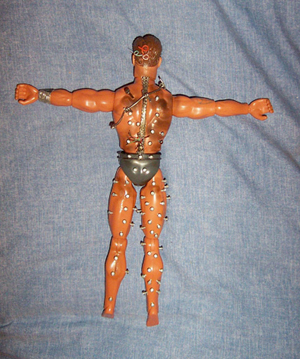
Figure 1. AfP workshop image: An example of sharp objects.
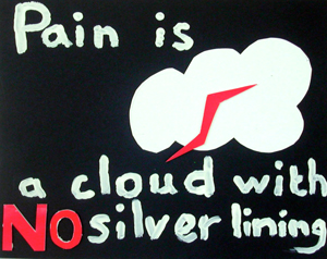
Figure 2. AfP workshop image: An example of multiple objects.
Most pictures featured recognisable objects. The following table shows recorded descriptions of the objects and scenes adopted. The picture descriptions are presented as an unordered list to indicate to the reader the diversity of content visualised.
Table 3. Picture descriptions of content used by patients with chronic pain.
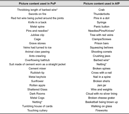
From two different groups of pictures, produced in different circumstances (one collaborative, one individual) there are three identical elements (in content not in style) pictured (marked above by an asterisk), creating 47 diverse pictures from which to elicit themes. These themes are shown in Figure 3.
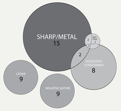
Figure 3. Common themes identified in patient generated pictures of pain.
Pain is a very individual experience though it has been suggested that common themes can be identified in the ways people talk about their experiences (Garro, 1992). Similarly, although there is a diverse range of objects featured in the pictures above, there are certain commonalities to many of the pictures produced during the art workshops.
Constraint as a broad theme consists of several sub-themes: Being trapped, squeezed or heavy. There is sometimes a heaviness present in the pictures–weights are used to pull down on the body, a suit is made from cement or a rubbish tip is heavy with waste. Some pictures share similar properties of extremes of temperature–burning heat or freezing cold. Objects that are metallic, hard and sharp in form and texture often appear–pins, knives and wire. Images from nature–animals, flowers, fruit, clouds–become threatening, turning in on the body. Quantitative labeling of content into themes enables us to quickly identify negatively toned content in patient-generated pictures. Further, more open examination of pictures enables more commonalities to become apparent.
Verbs
Visual verbs play an active role within the pictures–a person with pain is ‘trapped’ inside concrete, ‘stabbed’ with knives, a house of cards ‘tumbles’ to the floor or bellows are ‘squeezed’–see Figure 2 for an example of visual verb usage. This perhaps reflects the shifting nature of pain, though here it is the onset or the increase of pain, rather than relief that is the focus. Such movement is not limited to pictorial descriptions of pain and thus the designer can also explore further verbal/written testimony from the patients to increase understanding. Garro (1992), in the analysis of patient’s narratives of pain, describes two descriptions of pain used by two patients. One recalls her experience of living with pain as a journey along a road. The road she travelled down represents her pain, and as it improves, she comes back along it. Another patient described pain as a sword hanging over her, representing the unpredictability of pain. Verbs were used to suggest a richer picture of how the patient feels–in both the cases above, the verbs suggest change–one of pending, threatening change (impending change of the sword falling), the other of actual, potentially positive change (a change of direction on the road).
Pictures of pain are often active pictures, containing a frozen narrative moment. Many of the pictures imply uncertainty and not a fixed state (for instance, bellows can be released, stabbing can stop). This can perhaps help inform the design of pictures that suggest movement, or pending movement towards a more positive goal.
Visual Style
Several of the AfP workshops feature real photographs of the participants or their families, montaged together with larger analogous objects. Personalisation is very important–there is a sense of ownership and using photography connotes that it is real pain felt by a real individual.
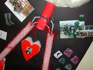
Figure 4. AfP workshop image: Montage example.
In terms of visuals, the colours that are often used to represent pain are dark, with deep red used to connote blood and pain itself, and black used to represent a sorrowful experience.
The visual treatments of the AfP images often include montage, swayed in part by montage being one of the first methods the artist/facilitator introduces to people in the workshop. This, in part, removes anxiety in the patient who might feel that they ‘can’t draw’. Mixed media-based pictures are often adopted and visuals consist of drawings and paintings, photography and sculpture. Whilst the PoP pictures were essentially photographic the lighting techniques varied greatly, as did the use of colour and black and white, and the pictures were often very rich and varied in texture. For instance, in one picture red knives were juxtaposed with soft skin, and in another fleshy human skin portrayed in black and white is combined with a rusty-coloured cement mixer. This variety in texture and media can be seen to represent the individuality of the person with the pain, and the individual nature of their relationship to that pain.
In terms of visual approach none of the images examined adopted a fully abstract approach; that is to say that all pictures were literal in mode, using real objects to represent their pain rather than taking a diagrammatic approach. Unlike the narrative representational structure suggested by Kress and Van Leeuwen (1996), vectors (arrows or other directional indicators) are rarely featured, though Figure 2 interestingly adopts arrows to show what the word pain leads to. There is little attempt generally to use pictures to depict an explanatory system of pain, instead the pictures tend to capture just one moment of the pain, leaving the viewer or reader to complete the work, to imagine the extent of the physical sensation.
Devising a Set of Positive Design Qualities Based Patient-Generated Pictures
In order to devise a set of design qualities, Desmet’s (2008) theory that “people can be inspired by products that represent essential values of self images” (p.117) is employed and then subverted. Desmet (2008), when discussing the importance of positive design, suggests that products can make people feel positive by triggering happy memories or allowing them to reconnect with something they’ve enjoyed in the past, aiding them generally to connect with a positive self-image. The difference in this context is that people with long-term pain may not want to remember or reconnect with themselves in pain–in fact it could be argued that the point is to help them forget about the negative impact of pain. Thus the premise of this work is to collate the negative pictures and to ‘reverse’ them, to create a picture for patients that attempts to help them reject their negative self image.
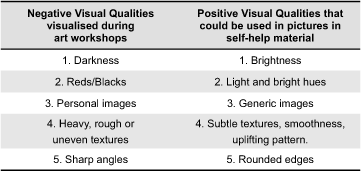
The way pictures can be ‘reversed’ leans heavily on opposites in language. The qualities here are presented in word form, ready to be expressed through pictures. An example of their visual application follows the themes and styles presented. As an example, constraint clearly plays an important role in patient’s pictures (see Figure 3)–wire traps and coils round the body, prison bars encase, clamps tighten, and therefore any theme used to counter this requires, we could argue, a similar but counter-action. For example, a picture could be employed that represents a movement from feeling trapped to feeling free to create a positive, reassuring picture. Other reversals could include: a stationary object becoming mobile, an item becoming unlocked or free, or a sharp object being blunted. A set of six positive affective themes and five positive affective visual qualities is devised here, based on the themes and discussion drawn out in part 2, that may help counter the negativity of the internal pictures externalised during art workshops. Such qualities are suggested in Table 4 and Table 5 below.
Table 4. Six affective themes that positive pictures could possess.
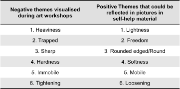
Table 5. Five affective visual qualities that positive pictures could possess.
What is suggested here is that these qualities should become apparent in positive pictures. However, what wouldn’t be reversed is the overall approach to visualisation–e.g. analogous and literal in fundamental form, since this is the visual language that is already used by patients. Designers also could choose to use techniques such as montage to echo patient’s approach to image production, however this would be harder to justify given often that the choice reflects the style of the art therapy group, materials available or drawing ability, not necessarily how the mental picture is ‘seen’ in the patient’s mind’s eye.
Application of the Positive Design Qualities
As a brief example of how we can use these positive visual properties in the design of information for people with chronic pain, the author presents prototype designs of an interactive tool to aid people to reflect on the impact pain has on their lives and to encourage positive change (see Figure 5). The tool was designed to feature literal pictures and analogy extensively, borrowing and extending a concept from ACT called ‘The Bus’ (Hayes et al., 2004). The bus journey theme represents pain as a passenger on a bus that is being driven by the patient. The purpose of the theme is to show the patient positively that they, not pain, are in control of their lives (e.g. they, not pain, are the driver of the bus).
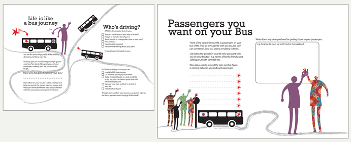
Figure 5. Example of material developed to be positive in tone, using themes and visual qualities identified.
The bus theme was selected to be pictured as it adheres to several positive themes highlighted by the results of content analysis in part 2–it provides a sense of freedom (positive theme 2) as well as movement (positive theme 5). In one instance, pictured below, pain is depicted as light and flying outside the bus, an antithesis to the trapped feeling often expressed by patients in their pictures, emphasising apparent weightlessness (positive theme 1).
In terms of positive visual qualities, the person’s ‘friendly’ passengers were represented by evenly textured (positive visual quality 4) bright colours (positive visual quality 1), again to counter the negative presentation of texture in their images. Most elements except pain are represented by curved lines (positive visual quality 5).
Pain itself was visualised borrowing from the negative qualities of patient pictures and was shown as sharp and red which again, shows possible usage of the data from Study 2. A designer may use the patient’s own negative representation of pain which could then be surrounded by more positive picture themes and visual qualities.
This helps, again, to represent the experience of managing pain more positively. Users of the tool are encouraged to interact physically with it–write and draw on it, make marks–in the same way as the workshops encourage interaction to aid personal reflection and to make the experience more memorable.
Conclusion and Further Work
In terms of developing material related to acceptance (that is, encouraging patients to acknowledge that though the pain exists they can live a positive life not wholly dictated by that pain) it is vital that positive but empathetic pictures be used. Not all people with pain have the will, interest or capacity to read a dense text such as Dahl and Lundgren’s (2006), particularly those with low literacy levels.
The findings suggest that there is a significant gap between pictures used in publications and a patient’s picture of their own pain as evidenced through inductive examination of pictures produced in art workshops. Most clearly, pictures in self-help publications are used for instructional purposes and do not yet exploit the analogously themed nature of pictures as used in art workshops. The challenge is to employ themes that patients can understand and that are generally applicable.
This paper suggests six broad positive themes and five positive visual styles that could be used in the design of positive pictures for patients with pain. This work also suggests that while there are some rich positive themes already used in self-help texts, they are yet to be visualised to make them more accessible, appealing and in some cases, more memorable. These findings point to the need for further research into this area, by expanding the scale and range of existing materials studied in Part 1 and expanding the evaluation of new pictures created, based on the properties identified in Study 2. This paper currently does not report on cultural differences in either the construction or consumption of pictures and this would also be vitally needed to develop fully accessible materials in the future.
This is early-stage research, taking a novel approach to considering picture construction. It makes a case for putting the patient at the very centre of picture design, and for there being some sort of interaction between the reader’s internal picture and the designer’s constructed picture. The incidental affect (Peters, Lipkus, & Diefenbach, 2006), namely the affect already in the patient’s head, should be considered before and during the design of information for the patient if affect is going to play a positive role in a central attitude change. There is already evidence to suggest that use of mental pictures plays an important role in the management and expression of pain. Pincus, Wachsmuth-Schlaefer, Sheikh, and Ezaz-Nikpay (2003) describe successful outcomes of using mental picture therapy with patients, in which, through practise, pain can be transformed and to some extent, controlled. As yet though it is unclear what the relationship is between the use of a person’s own internal pictures and third-party perceived external pictures. Can one adjust the other? People with chronic pain construct pictures to communicate mostly negative feelings about their pain and their lives with pain. Pictures in self-help material should play a role in trying to communicate more positive attitudes. In order to do that we need to first understand more about the pictures already ‘inside’ the patient’s head in order to transform them. This paper contributes knowledge in this area and suggests a means by which we can transform those pictures into more positive ones, with the long-term goal to radically improve the positive quality of pictures used in pain-related self-help material.
This paper adds knowledge to the field of affective graphic design for healthcare (that is, design that attempts to evoke or quell particular emotions) and presents one technique by which design characteristics may be elicited, using patient-generated pictures as the very starting point.
Acknowledgments
The author would like to acknowledge the help and support of Dr. Frances Cole, GP and Pain Management Specialist, NHS Bradford UK; and Cate Clark, artist and facilitator of pain workshops.
References
- Austin, P. E., Matlack R., Dunn K. A., Kosler C., & Brown, C. K. (1995). Discharge instructions: Do illustrations help our patients understand them? Annals of Emergency Medicine, 25(3), 317-320. doi:10.1016/S0196-0644(95)70286-5
- Ayas, A., Eklund, J., & Ishihara, S., (2008). Affective design of waiting areas in primary healthcare. The TQM Journal, 20(4), 389-408. doi:10.1108/17542730810881366
- Brotherstone H., Miles A., Robb K. A., Atkin W., & Wardle, J. (2006). The impact of illustrations on public understanding of the aim of cancer screening. Patient Education and Counseling, 63(3), 328-335. doi: 10.1016/j.pec.2006.03.016.
- Burch, V. (2008). Living well with pain and illness: The mindful way to free yourself from suffering. London, UK: Piatkus Books.
- Carliner, S. (2000). Physical, cognitive, and affective: A three-part framework for information design. Technical Communication, 47(4), 561-576. Retrieved May 5, 2012, from http://www.ingentaconnect.com/content/stc/tc/2000/00000047/00000004/art00009
- Charmaz, K. (2006). Constructing grounded theory: A practical guide through qualitative analysis. Sage Publications Limited.
- Cole, F., MacDonald, H., Carus, C., & Howden-Leach, H. (2005). Overcoming chronic pain. London, UK: Robinson.
- Dahl, J., & Lundgren, T. (2005). Living beyond your pain. Oakland, CA: New Harbinger Publications.
- Delp, C., & Jones, J. (1996). Communicating information to patients: The use of cartoon illustrations to improve comprehension of instructions. Academic Emergency Medicine, 3(3), 264-270. doi:10.1111/j.1553-2712.1996.tb03431.x
- Desmet, P. M. A. (2008). Inspire and desire. In P. M. A. Desmet, J. Van Erp, & M. A. Karlsson (Eds.), Design and emotion moves (pp. 96-113). Cambridge, UK: Cambridge Scholar Press.
- Dillard, J. P., Plotnick, C. A., Godbold, L. C., Freimuth, V. S., & Edgar, T. (1996). The multiple affective outcomes of AIDS PSAs: Fear appeals do more than scare people. Communication Research, 23(1), 44-72. doi:10.1177/009365096023001002
- Duman, M. (2003). Producing patient information. London, UK: King’s Fund.
- Erez, A., & Isen, A. M. (2002). The influence of positive affect on the components of expectancy motivation. Journal of Applied Psychology, 87(6), 1055-1067. doi:10.1037/0021-9010.87.6.1055
- Finan, N. (2002). Visual literacy in images used for medical education and health promotion. Journal of Audiovisual Media in Medicine, 25(1), 16-23. doi:10.1080/0140511022011837X
- Garro, L. C. (1992). Chronic illness and the construction of narratives. In M. J. D. Good, P. E. Brodwin, B. J. Good, & A. Kleinman (Eds.), Pain as human experience: An anthropological perspective. Berkeley, CA: University of California Press.
- Hammond, D., Fong, G. T., Borland, R., Cummings, K. M., McNeill, A., & Driezen, P. (2007). Text and graphic warnings on cigarette packages: Findings from the international tobacco control four country study. American Journal of Preventive Medicine, 32(3), 202-209. Retrieved May 5, 2012, from http://www.who.int/entity/fctc/guidelines/ArtElevenHammondTwo.pdf
- Hammond, D. (2011). Health warning messages on tobacco products: A review. Tobacco Control, 20(5), 327-337. doi:10.1136/tc.2010.037630
- Hanna, K., & Jacobs, P. (1993). The use of photography to explore the meaning of health among adolescents with cancer. Issues in Comprehensive Pediatric Nursing, 16(3), 155-164. doi:10.3109/01460869309078272
- Hastings, G., Stead, M., & Webb, J. (2004). Fear appeals in social marketing: Strategic and ethical reasons for concern. Psychology and Marketing, 21(11), 961-986. doi:10.1002/mar.20043
- Hayes, S. C., Strosahl, K. D., & Wilson, K. G. (2004). Acceptance and commitment therapy: An experiential approach to behavior change. New York, NY: Guilford Press.
- Helander, M. G., & Khalid, H. M. (2012). Affective engineering and design. In G. Salvendy (Eds.), Handbook of human factors and ergonomics (pp. 569-596). New York, NY: Wiley.
- Hockenberry, M. J., Wilson, D. & Winkelstein, M. L. (2008). Wong’s essentials of pediatric nursing. New York, NY: Mosby.
- Houts, P. S., Doak, C. C., Doak, L. G., & Loscalzo, M. J. (2006). The role of pictures in improving health communication: A review of research on attention, comprehension, recall and adherence. Patient Education and Counseling, 61(2), 173-190. Retrieved May 5, 2012, from http://www.pec-journal.com/article/S0738-3991%2805%2900146-1/abstract
- Janis, I., & Feshbach, S. (1953). Effects of fear-arousing communications. Journal of Abnormal and Social Psychology, 48(1), 78-92. Retrieved May 5, 2012, from http://psycnet.apa.org/journals/abn/48/1/78/
- Katz, M. G., Kripalani, S., & Weiss, B. D., (2006). Use of pictorial aids in medication instructions: A review of the literature. American Journal of Health-System Pharmacists, 63(23), 2391-2397. Retrieved May 5, 2012, from http://healthliteracy.worlded.org/pictorial_med_instructions.pdf
- Kress, G., & Van Leeuwen, T. (1996). Reading images: The grammar of visual design. Oxford, UK: Routledge.
- Labranche, E. R., Helweg-Larsen, M., Byrd, C. E., & Choquette, R. A. (1997). To picture or not to picture: Levels of erotophobia and breast self-examination brochure techniques. Journal of Applied Social Psychology, 27(24), 2200-2212. doi:10.1111/j.1559-1816.1997.tb01648.x
- Levie, W. H., & Lentz, R. (1982). Effects of text illustrations: A review of research. Educational Communication and Technology Journal, 30(3), 195-232. doi:10.1007/BF02765184
- Mansoor, L. E., & Dowse, R. (2003). Effect of pictograms on readability of patient information materials. The Annals of Pharmacotherapy, 37(7-8), 1003-1009. doi:10.1345/aph.1C449
- Michielutte, R., Bahnson, J., Dignan, M. B., Schroeder E. (1992). The use of illustrations and narrative text style to improve readability of a health education brochure. Journal of Cancer Education, 7(3), 251-260. doi:10.1080/08858199209528176
- Monahan, J. L. (1995). Thinking positively: Using positive affect when designing health messages. In E. Maibach, & R. L. Parrott (Eds), Designing health messages: Approaches from communication theory and public health practice (pp. 81-98). Thousand Oaks, CA:Sage.
- Moore, P., & Cole, F. (2008). The pain toolkit. London, UK: NHS.
- McDonagh, D. C., Hekkert, P., Van Erp, J., & Gyi, D. (Eds.) (2004). Design and emotion: The experience of everyday things. New York, NY: Taylor and Francis.
- Ngoh, L. N., & Shepherd, M. D. (1997). Design development, and evaluation of visual aids for communicating prescription drug instructions to nonliterate patients in rural Cameroon. Patient Education & Counseling, 31(3), 245-61. Retrieved May 5, 2012, from http://www.sciencedirect.com/science/article/pii/S0738399196009767
- Norman, D. A. (2004). Emotional design: Why we love (or hate) everyday things. New York: Basic Books.
- Osborne, H. (2006). Health literacy: How visuals can help tell the healthcare story. Journal of Visual Communication in Medicine, 29(1), 28-32. doi:10.1080/01405110600772830
- Padfield, D. (2003). Perceptions of pain. Stockport, UK: Dewi Lewis Publishing.
- Padfield, D. (2011). Representing the pain of others. Health, 15(3), 241-257. doi:10.1177/1363459310397974
- Paling, J. (2006). Helping patients understand risks. Gainesville, FL: The Risk Communication Institute.
- Patel, V. L., Eisemon, T. O., & Arocha, J. F. (1990). Comprehending instructions for using pharmaceutical products in rural Kenya. Instructional Science, 19(1), 71-84. doi:10.1007/BF00377986
- Peters, E., Lipkus, I., & Diefenbach, M. A. (2006). The functions of affect in health communication and in the construction of health preferences. Journal of Communication, 56(1), 140-162. doi:10.1111/j.1460-2466.2006.00287.x
- Petty, R. E., Barden, J., & Wheeler, S. C. (2002). The elaboration likelihood model of persuasion: Health promotions that yield sustained behavioral change. In R. J. DiClemente, R. A. Crosby, & M. Kegler (Eds.), Emerging theories in health promotion practice and research (pp. 71-99). San Francisco, CA: Jossey-Bass.
- Petty, R. E. , Schumann, D. W. , Richman, S. A., & Strathman, A. J. (1993). Positive mood and persuasion: Different roles for affect under high and low elaboration conditions. Journal of Personality and Social Psychology, 64, 5-20. doi:10.1037/0022-3514.64.1.5
- Petty, R. E., & Cacioppo, J. T. (1986). Communication and persuasion: Central and peripheral routes to attitude change. New York, NY: Springer-Verlag.
- Pincus, D., Wachsmuth-Schlaefer, T., Sheikh, A. A., & Ezaz-Nikpay, S. (2003). Transforming the pain terrain: Theory and practice in the use of mental imagery for the treatment of pain, In A. A. Sheikh (Ed.), Healing images (pp. 177-222). Amityille, NY: Baywood.
- Ruiter, R. A. C., Abraham, C., & Kok, G. (2001). Scary warnings and rational precautions: A review of the psychology of fear appeals. Psychology of Health, 16(6), 613-630. doi:10.1080/08870440108405863
- Shapiro, B. (1985). “All I have is the pain”: Art therapy in an inpatient chronic pain relief unit. American Journal of Art Therapy, 24(2), 44-48.
- Shone, N. (1995). Coping successfully with pain. London, UK: Sheldon Press.
- Slovic, P., Finucane, M. L., Peters, E., & MacGregor, D. G. (2007). The affect heuristic. European Journal of Operational Research, 177(3), 1333-1352. doi:10.1016/j.ejor.2005.04.006
- Job, R. F. S. (1988). Effective and ineffective use of fear in health promotion campaigns. American Journal of Public Health, 78(2), 163-167. doi: 10.2105/AJPH.78.2.163
- Um, E. R., Song, H., & Plass, J. (2007). The effect of positive emotions on multimedia learning. In C. Montgomerie & J. Seale (Eds.), Proceedings of World Conference on Educational Multimedia, Hypermedia and Telecommunications (pp. 4176-4185). Chesapeake, VA: AACE.
- White, V., Webster, B., & Wakefield, M. (2008). Do graphic health warning labels have an impact on adolescents’ smoking-related beliefs and behaviours? Addiction, 103(9), 1562-1571. doi:10.1111/j.1360-0443.2008.02294.x
- Witte, K., & Allen, M., (2000), A meta-analysis of fear appeals: Implications for effective public health campaigns. Health Education and Behaviour, 27(5), 591-615. doi: 10.1177/109019810002700506
