Impacts of Geometrical Manufacturing Quality on the Visual Product Experience
Department of Product and Production Development, Chalmers University of Technology, Gothenburg, Sweden
Geometrical variation, stemming from the manufacturing process, can distort the intended appearance of a product. When adapting a proposed design to manufacture, decisions need to be made on what geometrical deviations can be accepted on a final product. However, little research has been conducted to understand their actual impacts on the product experience. A study is presented, where we investigate differences between consumer assessments of photographs of products with a prominent geometrical deviation and equivalent products with good geometrical quality. The results show that for products perceived as having high industrial design emphasis, poor manufacturing quality can influence a number of quality-related assessments. However, product aesthetics was not influenced by geometrical deviations, indicating that product aesthetics is primarily judged based on what is interpreted as the intended design. The interpretation of producer intent is demonstrated as a key factor determining consequences of geometrical deviations. Further, it is suggested that the visual experiences of products with poor geometrical quality can be negatively affected without full consumer awareness.
Keywords – Aesthetics, Craftsmanship, Manufacturing Quality, Tolerances, Perceived Quality, Visual Product Experience.
Relevance to Design Practice – Attaining small unit-to-unit variation can be associated with increased costs or dramatic product changes. This paper aims to support the trade-offs required when assessing the importance of having an ideal manufacturing quality in relation to other values embedded in a specific industrial design concept and in relation to increased product cost.
Citation: Forslund, K., Karlsson, M., & Söderberg, R. (2013). Impacts of geometrical manufacturing quality on the visual product experience. International Journal of Design, 7(1), 69-84.
Received November 15, 2011; Accepted October 7, 2012; Published April 30, 2013.
Copyright: © 2013 Forslund, Karlsson, and Söderberg. Copyright for this article is retained by the authors, with first publication rights granted to the International Journal of Design. All journal content, except where otherwise noted, is licensed under a Creative Commons Attribution-NonCommercial-NoDerivs 2.5 License. By virtue of their appearance in this open-access journal, articles are free to use, with proper attribution, in educational and other non-commercial settings.
*Corresponding Author: karin.forslund@chalmers.se
Introduction
When adapting a product design for manufacturability and developing it into detail, the initial design intent may be distorted. Further, once attaining a fully defined product, assigned tolerances and production capacity determine the level of variation affecting each manufactured product, resulting in unit-to-unit differences in colour and geometry. Here, focus is set on visible geometrical deviations resulting from manufacturing and assembly variation. Managing the effects of geometrical variation is not only a matter of selecting the appropriate materials and manufacturing processes and attaining the provided tolerances. The product geometry can induce variation to a varying degree. For instance, the degree to which sheet metal parts on car exteriors suffer from spring-back deflection depends on the part geometry. The part geometry also sets the prerequisites for locator placement, controlling assembly stack-up effects and variation amplification (Söderberg & Lindkvist, 1999). Further, the effects of variation on product experience are appearance-dependent. Geometrical variation is often apparent through the relationships between visible components (i.e., the split-lines), in terms of non-parallelism, misalignment, or uneven gap sizes. Depending on the colour, form, structure, and surfaces of different designs, deviations are varyingly perceptible to the onlooker (Figure 1). This is referred to as a product’s visual sensitivity to geometrical variation (Forslund & Söderberg, 2010). Therefore, achieving a geometrically satisfactory product is an iterative process of product adaptation with several trade-offs to be made along the way. It is important to make adequate assessments of the significance of achieving a good geometrical result in relation to an appealing design concept from other perspectives. The actual role of manufacturing quality for the consumer’s product experience has however gained relatively little attention (Crilly, Moultrie, & Clarkson, 2004). Product experience has been defined as “the entire set of effects that is elicited by the interaction between a user and a product” and has been classified into aesthetic pleasure, attribution of meaning, and emotional response (Desmet & Hekkert, 2007). It may seem straightforward that reducing the number of perceivable defects in a product ensures an enhanced product experience. It is also close at hand to describe appearance conformance as a type of “expected quality” as described in the Kano model (Kano, Seraku, Takahashi, & Tsuji, 1984).
Figure 1. Appearance-dependent visibility of geometrical deviations where product A reveals deviations while B has a forgiving design.
A main problem, however, is that all manufactured components deviate from their intended (nominal) state on a continuous scale where the difference between defect and conforming units are not always evident. All produced units should be seen as afflicted by an amount of “noise” that can influence customers to a varying extent. In relation to recent research on product experience, (see for instance Creusen & Schoormans, 2005; Dagman, Karlsson, & Wikström, 2010; Desmet & Hekkert, 2007; Jordan, 2000; Schifferstein & Hekkert, 2008; Warell, 2008), where the sensory and emotional experience of products has been addressed in depth, descriptions of what dimensions of the product experience that are influenced by this “noise” are relatively scarce.
Monö (1997), describing product design as a process of producer-consumer communication, pointed out that flaws in design and manufacturing could distort the message intended by the designer (see also Crilly, Maier, & Clarkson, 2008; Forslund, Dagman, & Söderberg, 2006). However, apart from distorting a message, it has been claimed that visible manufacturing quality has a special function in communicating functional quality. For instance, Debrosse, Pillet, Maire, and Baudet, (2010), presenting an analysis of the sensory evaluation process in a number of companies, point out that while for some products, such as luxury goods and furniture, “a quasi perfect aesthetics is its own criterion;” for other products, visible deviations can “transmit the global quality level of the whole product” (Debrosse, et al., 2010). Falk, Quattelbaum and Schmitt (2010) describe that “When customers possess imperfect product information, with respect to technical aspects, substitution features, relying on sensory impressions, are used for the assessment of product quality.” Accordingly, they state that gaps (clearances) act as indicators of assembly quality. The effects of geometrical deviations on product appearance have also been brought up in relation to the development of tools supporting visualization of computer-aided tolerancing results in high-end visualization software. Visible deviations have been connected to the “Cosmetic Quality” (Juster, N. P., Fitchie, M., Taylor, S., Dew, P., Maxfield, J., & Zhao, J., 2001), “Aesthetic Quality” (Maxfield, Dew, Zhao, Juster, & Fitchie, 2002), “Visual Quality Appearance” (Wickman & Söderberg, 2001), or “Perceived Quality” (Söderberg, Wickman, & Lindkvist, 2008) of products. According to Petiot, Salvo, Hossoy, Papalambros, and Gonzales, (2009) “Perceived Quality” and “Craftsmanship” are synonymous concepts. They are strongly associated with the automotive industry and the strive for “Premiumness” (Law & Evans, 2007; Williams, Tennant, & Singh, 2005). Wang and Holden (2000) pointed out that “the idea of craftsmanship was about creating products that were skillfully made, lasting in nature and possessing a timeless elegance.” In practice, this would involve attention to detail, material selection, careful workmanship, and innovative product design. To the layman, it would be “the level or impression of quality that a product exhibits.” Wang and Holden identified attributes that signify the craftsmanship of a product or part as fit to system, appearance, feel, accessibility, operability, and others, such as finish or graphical display. They also concluded that consumer background had no significant impact on the assessment of craftsmanship. In another study, Petiot et al. (2009) similarly found that the nationality of subjects had little influence on the perception of craftsmanship attributes. Williams et al. (2005) defined craftsmanship as “the perception of quality experienced by a customer, based on sensory interaction and emotional impact.” While giving examples of craftsmanship attributes, such as comfort, authenticity of materials, build quality, colour harmony, ergonomics, and tactility, it was also pointed out that the customer experience of quality was not limited to these attributes. In Hossoy Papalambros, Gonzales, and Aitken (2004) consumer perceptions of craftsmanship were placed into four main clusters; “auditory attributes,” “quality issues,” “driving comfort,” and “usability.” Yun, You, Geum, and Kong (2004), studying touch/feel quality of surface covering materials, pointed out that Perceived Quality was a concept intuitively understood but difficult to define. It was exemplified as dependent on “the finish of the material,” “the degree of craftsmanship,” “cost,” and “general ambience.” In summary, “craftsmanship,” although focused on the experience of quality, is a broad concept, not so well distinguished from the aims and scope of industrial design in general.
Within marketing literature, the “perceived quality approach” is concerned with the process of gaining a quality judgment (Ophius & Van Trijp, 1995). Olson and Jacoby (1972) brought forth that products should be considered as consisting of an array of cues, such as price, brand name, packaging, and colour, from which the customers could form various impressions, such as quality. They also differentiated between the intrinsic cues that are part of the physical product and the extrinsic cues that are product-related attributes, such as brand, price, store name, and country of origin. Steenkampf (1990) developed the framework further and defined quality cues as valued by the consumer because of their perceived relationship with quality attributes; “the functional and psychosocial benefits or consequences provided by the product.” Studies have shown that the intrinsic cues often have a stronger influence on perceived quality judgments than extrinsic cues (Pincus & Walters, 1975; Szybillo & Jacoby 1974).
There are therefore propositions that visible manufacturing deviations function as quality cues, representing actual quality attributes, i.e., the deviations have a semantic function. It could also be assumed that geometrical deviations resulting in non-parallelism, misalignment, or uneven gap sizes would influence the aesthetic appreciation, since conditions of symmetry and order are distorted (see for instance Muller, 2001). In this paper, we present a study investigating which aspects of the product experience are actually influenced by geometrical deviations. The focused aspects are as follows:
- The potential representative functions. (Do visible deviations carry a semantic message of quality or function as quality cues?)
- The effect on the aesthetic experience.
Study
A study was conducted where ratings of a product with good geometrical quality (referred to as nominal) were compared to the ratings of the same product modified to have a large, non-parallel gap between two main parts (referred to as the modified product). The main interest was whether the geometrical deviation (the gap) would yield any difference between the two otherwise identical products (Figure 2). When making the assessments, the large gap was not to be brought to the participants’ attention. A number of follow-up questions were included to steer the participants’ attention stepwise to the geometrical deviation. The following questions were posed:
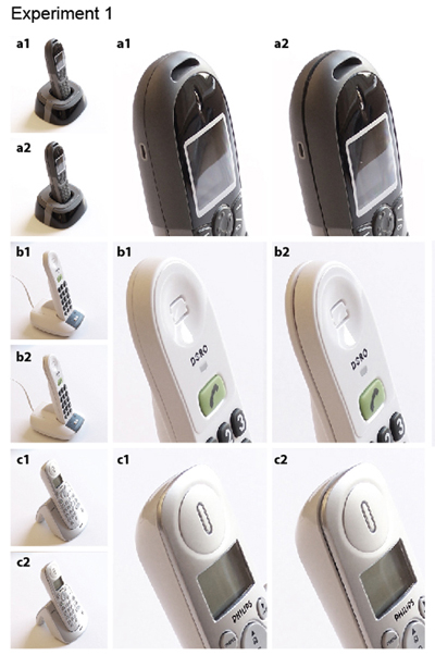
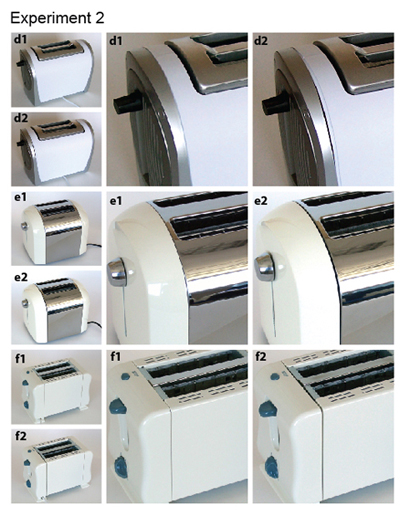
Figure 2. Products included in the experiments.
Part 1:
- Are any of the assessments influenced by the geometrical deviation?
- Does the influence of the geometrical deviation differ between the two products shown?
Part 2:
- Are participants able to detect the geometrical deviation?
- Which product is preferred when comparing a nominal and modified product (regardless of whether the deviation has been detected or not)?
Part 3:
- What are the reactions to the geometrical deviation once brought into attention?
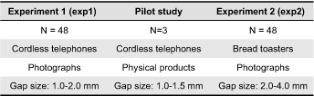
Two consecutive experiments were performed (Table 1). After experiment 1, where photographs of cordless telephones were used, a pilot study was initiated using physical telephones as stimuli. The study was abandoned after interviewing three participants, since it was judged that the experiment would yield an outcome very similar to experiment 1. Consequently, experiment 2 was performed using bread toasters.
Table 1. Performed experiments.
Although the second experiment was based on the findings from the first one, the experiments and their results will be presented together, since at large, they follow the same procedure.
Participants
In the first experiment, 48 participants were quota sampled to participate. The participants were between 19 and 65 years old, including 24 women (M = 41.71, SD = 12.20, range = 45) and 24 men (M = 37.50, SD = 13.88, range = 40). In the pilot study, three persons, two female, and one male, between 21 and 24 years old participated. Another 48 participants participated in the second experiment. Again, they were between 19 and 65 years old, comprising 24 women (M = 42.63, SD = 15.20, range = 44) and 24 men (M = 37.71, SD = 13.88, range = 46). When recruited, the participants were not informed about the focus of the study but told that it was a study on how they experienced product design.
Stimuli
Both studied products have simple structures, with only a number of split-lines visible on most models. They are also products that most people would recognize and feel familiar with and where it was technically possible to manipulate the exterior components to attain an enlarged gap. The included variants of the products were sampled so that they should have similar split-line structures, roughly equally visible split-lines and the three products should have different types of appearances. In the second experiment, the sampling was also performed based on price.
Photographs of the products were used as displayed stimuli. The main reason was that there are practical difficulties in obtaining three different physical products for which a non-parallel gap can be manipulated to be equally visible. Since the products had different colour, gloss, grain, split-line radii, visible inner edges, and surface curvature next to the split-lines, the split-lines had slightly different visual sensitivity to variation. Further, for the different products, a varying amount of see-through occurred in terms of fasteners visible inside the gaps. The use of photographs enabled an experiment with control over what visual stimuli were displayed to the participants and an isolation of the factor gap geometry as the studied parameter. After manipulating the physical gap sizes of the products, the images were adjusted in an image editing tool to remove the fasteners visible through the gaps, and ocular inspection was used to control gaps to be equally visible from the viewing angle represented in the photographs.
The fact that photographs were used, however, implies that the results could primarily be claimed to be valid for the visual perception of images. The approach was that the results nevertheless would be useful for learning more about the visual experience of products with poor geometrical quality.
The gap sizes were set to levels that are very large in relation to what is acceptable for most cordless telephone and bread toaster manufacturers, but that may occur on low quality alternatives. A large gap was considered important to make it as distinguishable as possible for the participants. Since the aim of the study was to investigate what type of response a gap that large would elicit, and not any threshold levels for customer acceptance or avoidance of a specific product, a slightly exaggerated gap size was considered appropriate.
In experiment 1, it was regarded as acceptable for the brand names to be visible since the logos were placed in areas where an imperfect photo editing might distort the experiment and since there was nevertheless a risk of the participants recognizing the product brand. In the second experiment, brand names were not visible due to the chosen viewing angle. Subjects were not provided with any additional information of the products. Images were displayed on a 1920*1200 computer screen as illustrated in Figure 3.
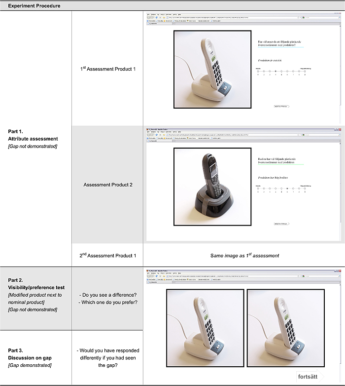
Figure 3. Experiment procedure for experiment 1 and experiment 2.
Procedure
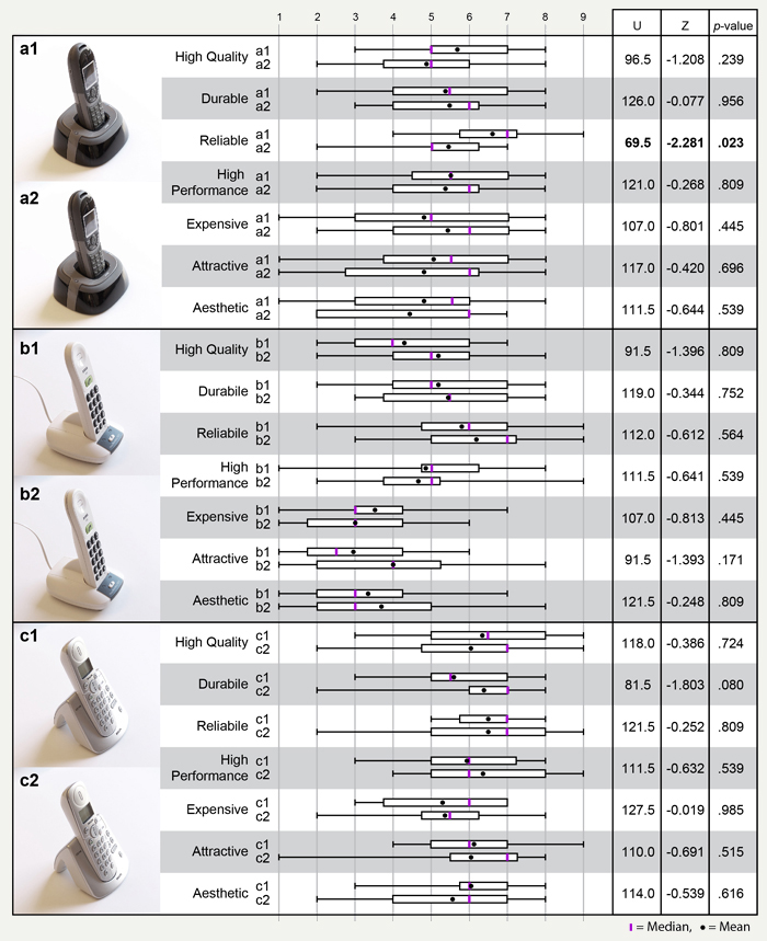
The subjects answered a web-based test while one of the researchers was present to pose follow-up questions. In the first part of the experiment, each person saw first one nominal and then one modified telephone, displayed along with unipolar nine-point Likert-type scales (Table 2). When selecting the quality-related attributes, both the word “quality” and a number of traditional quality-related attributes (“durable,” “reliable,” “high performance”) (see for instance Garvin, 1987) were included. An assessment of product “price” was also considered to be of interest. Then, participants were asked to assess aesthetics. To better capture subjective opinions on the product appearance, the word “appealing” was also included, since it was thought that the word “aesthetic” might prompt only analytic reflections on what objectively would be aesthetic.
Table 2. Attribute assessments.
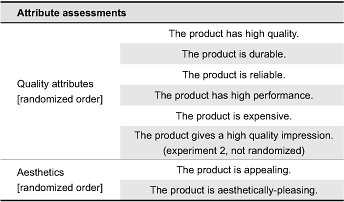
In experiment 2, an additional quality attribute, quality impression, was added. The motivation being that “quality impression” might be a word with a lower threshold for letting the participants’ general impressions influence their assessments. The word was placed in-between quality and aesthetics assessments to provide a similar structure of the experiment (Table 2) and was not part of the randomization of the quality attributes. During the assessments, participants were asked to “think aloud,” and the interviews were recorded and transcribed. All interviews were conducted in Swedish and translated to English.
The second part of the experiment was concerned with more focused questioning concerning the split-line appearance. A nominal and a modified product of the same variant (i.e., a1-a2) were placed next to each other, and the participants were asked whether they could see any difference between the products. The displayed product was always the modified product that had been displayed in the previous task. Regardless of whether the participants identified the modified split-line, they were then asked which one of the products, they would prefer or thought “looked best.” As a third step, the gap was demonstrated to ensure that all participants had visually recognized the split-line, and a discussion was held on what they thought of it. While the detailed wording depended on previous responses, the question was: “You have been looking at that one. Would you have responded differently if you had seen the other product instead?” The aim was not to attain an additional assessment scale evaluation but to make participants utter some sort of comment on the difference between the two products.
There were 12 different combinations of nominal and modified products (a1-b2, b2-a1, a1-c2, c2-a1, a2-b1, b1-a2, a2-c1, c1-a2, b1-c2, c2-b1, b2-c1, and c1-b2), each participant being randomly assigned with a combination. Since there were 48 participants, each combination was shown four times. After completing the test, the first product was assessed again (see Figure 3). The scales were shown one at a time and all ratings were completed for one product before proceeding to the next one.
Pilot Study on Physical Cordless Telephones
After the first experiment, a reflection was that the experiment might have benefitted from including physical products instead of photographs. To use physical products in the experiments, however, required that the gap sizes had to be reduced in order to avoid complete see-through. An increased difference in visual sensitivity was here accepted as necessary. The experiment design and procedure was to be as similar as possible to the first one. To display stimuli in the way previously performed on a computer screen, the products were hidden in boxes and revealed in an order analogous to experiment 1. The subjects were provided a seating position with a fixed viewing angle when looking at the products. After performing the pilot test with three subjects, it was cancelled, since a clear interpretation of the three tests performed was that there was no difference from the first experiment. The results will be further described in the general discussion.
Results
Part 1: Attribute Assessments
Analysis
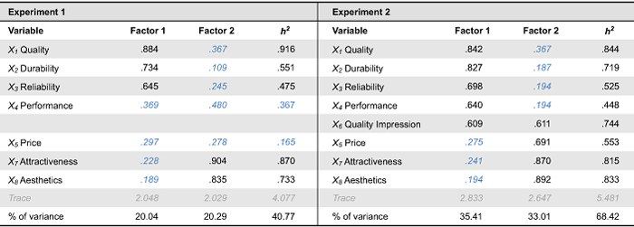
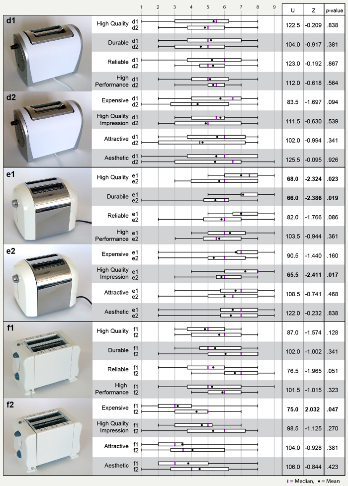
To investigate whether the enlarged gaps have any effect on judgment, Mann-Whitney U-tests were performed for each pair of sets of responses. A non-parametric procedure is often considered more appropriate than for instance a traditional t test when analyzing Likert items. The significance values were adjusted through a Bonferroni adjustment. In experiment 1, this leads to a significance level of α = 0.05/21 = 0.00238. Given these criteria, no differences between nominal and modified products could be discerned from the first experiment (see results in Appendix A). One attribute, reliability, was rated higher for the nominal product, but this is interpreted as an effect of multiple comparisons. All test participants could see the gap when it was pointed out to them. In experiment 2, three of the attributes would display significant differences between e1 and e2 (Appendix B). However, using Bonferroni adjustment (α = .00208) to account for the 24 pair-wise comparisons, the differences would individually have to be judged insignificant. Unlike experiment 1, where it seemed likely that the one significant difference was an effect of the number of pair-wise comparisons, the differences identified in experiment 2 concerned similar ratings for the same product. During the experiments, it was shown that the participants often gave similar scores to several of the quality-related attributes. An exploratory common factor analysis (Principal Axis Factoring) was therefore conducted to identify a new set of representative variables, based on actual correlations in the data.
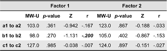
Since there was already a distinction between quality-related and aesthetics-related assessments, we were working from a theory drawn from previous research about the relationships among the variables, and a common factor analysis was judged more appropriate than a more general principal components analysis (Field, 2005). Comparisons of products or brands together have previously been performed, using similar methods (Lattin, Carroll, & Green, 2003). A factor analysis for experiment 1 was also performed although primarily to be used for comparative purposes. It was decided to retain all factors in subsequent analyses. Hair, Black, Babin, Anderson, & Tatham (2006) discuss alternatives for further analysis of factor analysis results: surrogate variables, summated scales, or factor scores. Factor scores were selected to include all variables loadings in the comparison. New Mann-Whitney U-Tests was performed on the factor scores, now adjusting the α-value for six pair-wise comparisons (α = 0.05/6 = 0.0083). The only significant difference, although borderline significant, between products in table 4 is between e1 and e2 on factor 1 with p = 0.008. The protocols from the interviews were analyzed and compared to the results from factor analyses. Further accounts on the factor analyses can be found in Appendix C.
Results
Few participants identified the gaps; i.e., commented on them while making the assessments. In experiment 1, three participants commented on the gap at some point during the interview. In experiment 2, six participants commented on the gap at some point during the experiment. Of these, two participants immediately discovered and put great emphasis on the gap and subsequently set low scores on several questions. Some participants mentioned the gap after a while, why it is uncertain whether previous responses were influenced by it. In both experiments, a number of participants made statements that could be connected to the gap, but where it was not explicitly stated, e.g. “It looks weak for some reason” or “It looks plastic – cheaply assembled.” Focusing on experiment 2, a first factor with high loadings on quality, durability, reliability, and performance (Table 3) was found. The second factor loaded high on aesthetics, attractiveness, and, interestingly, price. It can be noted that quality also has a moderate loading on factor 2 and that quality impression loads on both factors. For a large number of the respondents, answering quality-related attributes based on visual stimuli evoked a reflection upon the relationship between industrial design and quality. A common reaction was that with design, producers wanted to manipulate consumers into high quality perceptions. Although the participants discussed quality with self-awareness and suspicion that perhaps would not have been as prominent in a purchase situation outside the studio-environment, it is of interest to see what assessments followed.
Table 3. Rotated factor pattern/structure matrix.
Loadings below 0.55 are displayed in blue italic and h2 denoting communality.
When participants interpreted the producers as putting efforts into the industrial design, they reflected upon the producer strategy for, or ability to, achieve high quality: This observation was, in some cases, followed by an acknowledgement of the product quality, such as “It’s shiny and pretty, so they want you to think it has high quality,… but whether it actually has high quality…it probably does” or “I’m sure it has higher quality – it looks well-made. In other cases, it made participants suspicious of the quality provided: “I think it looks like a cheap product that they try to make look expensive in order to charge a higher price” or “designer products makes you feel as if less effort was put on quality.”
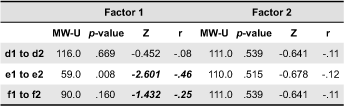
Further, it is interesting to see that product f, especially the version with the gap, actually had quite high average scores on factor 1. Throughout the experiment, this product was interpreted as a simpler product or even a second-hand one. While some participants considered simplicity as related to overall poorness, it was also common to evaluate quality through a different rationale. Some participants interpreted the “budget” appearance as genuine and therefore assigned high scores to the quality-related questions: “it looks like an ordinary toaster should, simply, so it looks reliable” or “if it has lasted that long, I’m sure it is reliable.” At points, this also occurred in experiment 1 where the simpler product (b) attained similar comments and ratings. Although the difference between f1 and f2 is not significant, the effect size (Table 4) indicates a small effect (as defined by Field, 2005). Product f was considered a simple product made with low industrial design emphasis and product e, a product made with high design emphasis. The suggestion is that for factor 1, quality-related attributes are assessed through two different mechanisms on product e and product f, with the common denominator being a sense of trustworthiness. Therefore, factor 1 can be interpreted as a “trustworthiness” factor and factor 2 a mixture of experienced aesthetics/appeal and perceived industrial design emphasis (Table 4). Since the only significant difference in factor scores are between e1 and e2 on trustworthiness, the suggestion is that the poor gap played a part in tipping over the attitude to the perceived industrial design emphasis to suspiciousness instead of acknowledgment of quality. It is also interesting to note that the gap had little impact on aesthetics/perceived industrial design emphasis. Although a small number of participants mentioned that quality was up to their own reflection, a common view was also that quality, reliability, and durability were the same thing. Overall, the most difficult question to answer was the assessment of performance. Price was a word triggering a lot of reactions. An interesting phenomenon was that when the test participants assessed price, they tended to make an evaluation of what others would think, both producers and other consumers. In a sense, this weakened their criticism. It should also be noted that assessments were coloured by the other product that each participant saw and also that the differences identified in the factor analyses were diminished in the 2nd assessments. For instance, participants looking at product e2 raised their assessments after having compared it to product f1.
Table 4. Comparison between pairs where r is effect size.
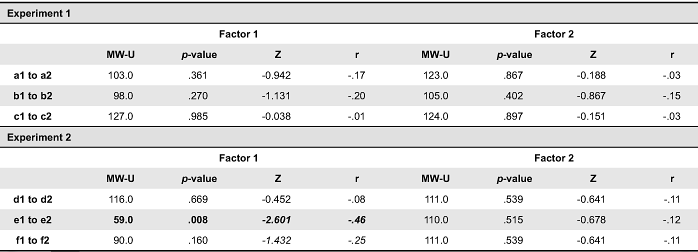
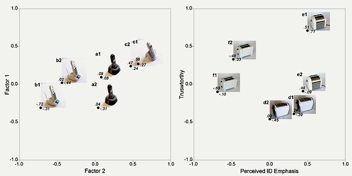
Figure 4. Mean factor score values for the products.
Part 2: Visibility-Preference Test
Analysis and results
The responses from part two were analyzed and categorized and are summarized in Figure 5. In the second part of the experiments, when looking at a nominal alongside a modified product, a larger number of participants detected the gap in experiment 2 than in experiment 1. It was also shown that all participants were able to see the gap once demonstrated, signifying that its low impact on the assessments was not due to lack of visibility. The most interesting category displayed in Figure 5 is the forced preference choice made by the people who had not seen a difference between the products. In this task, 33 out of 49 participants selected the nominal product. The cumulative binomial probability for 33 or more out of 49 is P(X ≥ 33) = 0.011. Of these, some participants just picked one of the product; others commented the colours in the images or some general feeling about the product. Once the gaps were demonstrated, a majority preferred the nominal products to the ones with the large gap, but there were also some participants who preferred the gap and some participants who are referred to as ambivalent. A typical opinion on the gap, classified as ambivalent is: “It’s a question of which one I would buy. If I was purchasing it, I might consider other aspects, but I still think that one (gap) looks best. But I am uncertain of what it would mean for durability.” This ambivalence also occurred in the brief pre-study on physical product, why it is not only due to the fact that photographs were used.
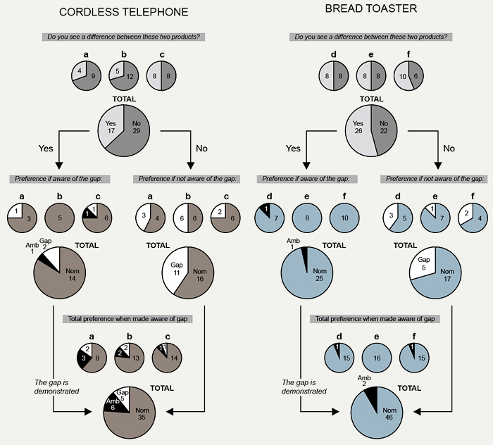
Figure 5. Visibility/preference test.
Part 3: Interview on Gap
Analysis and results
The comments collected in part 3 relating to the gap were coded and categorized. When the gap was pointed out, some participants assigned the gap very little importance; “If I was standing in the store, I wouldn’t have reflected upon it.” Others were surprised stating “did I really look at that?” The gap was not demonstrated as a manufacturing defect. Instead the area of the product was pointed out. Not all participants made remarks on the cause of the gap but among those who did, it was interpreted in different ways. A group of participants commented that it had been poorly assembled or produced (exp 1: N = 6, exp 2: N = 12). In this group, it was common to attribute the gap to poor quality or to claim that it gave a worse rating on all attributes or a poor general impression (exp 1: N = 1, exp 2: N = 7). Three participants stated that aesthetics were unaffected, since the gap was just a quality issue (exp 2: N = 3). It was also common to take the modified product for broken or previously used (exp 1: N = 12, exp 2: N = 10). Here, participants only stated that they preferred the unit that was not broken and made few connections to any attributes. This also occurred among those who did not reflect much upon the cause of the gap. Fourteen (14) persons (exp 1: N = 6, exp 2: N = 8) just said that they wanted the best of the two units of the same product and assigned little meaning to the gap. Further, there were participants who did not clearly conceive whether or not the gap was supposed be there. A number of participants claimed that their reaction depended on whether or not the gap was intended (some of these referred to as ambivalent in the section above) (exp 1: N = 8, exp 2: N = 4). Others merely discussed the gap as if it was part of the intended design (exp 1: N = 7, exp 2: N = 0). Among these latter two groups, it was more common to discuss aesthetic implications or functional implications such as that that it would gather dirt or crumbs. A number of participants thought the gap made the product more aesthetic or more interesting to look at (exp 1: N = 10, exp 2: N = 2) while others said it decreased the product aesthetics (exp 1: N = 4, exp 2: N = 6). Among the mentioned implications of the gap in the total experiment were quality or quality impression (exp 1: N = 2, exp 2: N = 15), durability (exp 1: N = 3, exp 2: N = 4), reliability (exp 1: N = 3, exp 2: N = 2), performance (exp 1: N = 0, exp 2: N = 6), and cheaper/less exclusive (exp 1: N = 1, exp 2: N = 1). It was also referred to as less solid/genuine (exp 1: N = 1, exp 2: N = 3) and more rickety (exp 1: N = 2, exp 2: N = 2). Three participants referred to it as extremely annoying. A number of participants stated that they had focused on the difference with the other displayed product, why the gap had had marginal influence. Others said that the gap had little effect since the product didn’t look any good in the first place.
General Discussion
Method discussion
We have shown that the results differed between telephones and bread toasters and amongst the attribute assessments, an impact of the enlarged gap was only found for one of the bread toasters. A combination of experiment parameters would need to be further iterated to find the level on which the most fruitful inquiries on manufacturing quality could be made.
What type of product is studied is of relevance from several perspectives. For instance, the bread toaster experiment yielded the most useful result since more realistic gaps were achievable and since the test participants focused more intensively on the product appearance and design and did not do as many inferences from functionality (buttons) or brand, which was not visible in this experiment. The fact that for telephones, the gap can be a consequence of someone dropping the phone also made it less likely to be interpreted as a manufacturing issue than on the more stationary bread toasters. How the effect of manufacturing variation is represented could also be further varied. We chose non-parallel enlarged gaps. Poor flush or misalignment might have been less likely to be interpreted as the product being broken, while other side effects might have emerged, such as the bread toasters not being displayed from the same viewing angle. To increase the probability of detection during the test, the gap has to be large which on the other hand encompasses a risk that it is no longer interpreted as a realistic manufacturing defect. It can also be argued that commonly manufacturing imperfections don’t occur isolated, but often aggregated. There are some indications that the results of the experiment are related to the controlled environment. A strong impression was that when products were displayed, participants would not interpret them as defect or deviating since they were chosen for the experiment. Studying geometrical quality in a purchase situation would provide interesting results although issues of controlling the experiment would have to be solved differently.
After the first experiment, an inquiry was whether the experiment would have yielded a different result if physical products had been used. The result of the pilot study was that the result of the experiment would not have been significantly altered when using physical products instead of photographs. None of the three pilot study participants mentioned the gap during the attribute assessments. When the three participants were shown a nominal and a non-nominal product next to each other towards the end of each test, none of them could point out a difference between the products. However, again, all of them were able to see it clearly as they were shown the gap and at this point displayed surprise. Discussions on background and intent of the gap also occurred during the pilot tests. Having performed 48 previous tests, the interpretation was that the three additional tests did not add to the data collection and that the way in which respondents answered and reacted to the questions did not differ from experiment 1. It could be argued that the physical products were experienced with limited possibilities of interaction which could be a factor contributing to the results. The fact that three different products were included made it necessary to limit the participants viewing angles, since equal visibility of the gaps could only be assured from one angle. If only one product had been chosen, product manipulation would have been less critical. However, without the ability to compare the effects of the gap on different products, several topics of interest would have been left out.
It should be emphasized that our standpoint is that the methodological difficulties encountered in this study are intrinsically connected to performing experiments on geometrical deviations. Products have to be manipulated since there is a small probability of attaining two produced product units with a tolerance outcome that generates a large difference in gap size in one area but nowhere else. If using product prototypes, the deficiencies in surface quality and geometrical quality are likely to be on the same scale as the defects that are to be part of the experiment and therefore inappropriate. If using renderings of virtual products where the shapes can be remodeled, differences in human perception between physical and virtual products would have distorted the results. Manipulating and photographing existing products was considered the most appropriate method, however, with the restriction that the participants’ product interaction had to be limited.
Considering these aspects, the aim of this research was to gain further understanding of mechanisms controlling consumer response to products with poor geometrical quality and for some of the posed questions a fruitful level of inquiry could be attaind.
Discussion of results
It was shown that a small fraction of the participants (9/96) saw the gap during the first test while all participants could discriminate it when demonstrated in the second.
For product e, there was a significant difference between assessments of the nominal and the modified product for one extracted factor that through interview coding was named “trustworthiness.” It was strongly loaded by quality, durability, reliability, performance, and quality impression. The main parts of these results come from participants who have not expressed that they noticed the gap. It is further demonstrated that 33 out of 49 participants picked out the nominal product as their preferred choice out of two variants. This is an indication that while the presence of the gap in the photograph was not noticed consciously, the fact that it influenced overall product judgments suggests that it was processed subconsciously. The suggestion is that with the tendency to display suspicion towards a product perceived as created with high industrial design emphasis, the gap could yield an increased sense of lacking trustworthiness, although this interpretation was not articulated. Just as interesting is the fact that for product e, there was no significant difference between assessments of factor 2 (aesthetics, attractiveness and price). If looking at the last part of the experiment, including the discussion on the gap, it is shown that if the gap is not interpreted as a flaw or unintentional, the statements refer to aesthetics or semantics to a greater extent. If the product was broken, participants typically claimed they wanted another unit. If it is interpreted as unintended, no participants assign it higher quality or increased aesthetics. This means that the consequences of the deviation appear not to be any universally aesthetic principles. It is rather the lack of fulfilment of intent that generates a poor quality impression. While the uncertainty of designer intent might have been reduced with smaller ambiguity of the presented stimuli, this ambiguity actually shed light on the fact that participants needed to know the cause of the gap in order to be able to respond to it.
Product design has previously been depicted as a process of producer-consumer communication (Crilly, Good, Matravers, & Clarkson, 2008; Monö, 1997). Only producers actually know the intended geometry or tolerance specification for each product. In Karana, Hekkert, and Kandachar, (2009), it was found difficult to map meanings to manufacturing processes, since there was not enough knowledge on them amongst the test participants. It could be argued that while tolerance limits are not known to customers, its effects in terms of non-parallelism and lacking symmetry are widely conformed to when designing products. However, there was still an amount of uncertainty as to geometrical intent. Some of the participants stated they wanted to touch the product to investigate whether the parts were loose or firmly assembled why haptic feedback is an important cue to interpret intent.
An unforeseen effect was that for product b and f, both representing the cheapest product of each product category, there was a small indication that the large gaps made the products attain higher scores on factor 1. Both products were simple with white colour. During interviews, a number of participants stated that, while the gap itself did not give a good impression, the presence of this marked out-line added something to the appearance. An interpretation of this is that while large gaps can decrease quality assessments, it can also have positive effects on appearance in terms of aesthetics and semantic expression which in turn generates an increased quality impression. No doubt, the ability of product features to interact in generating an overall impression is complex.
Conclusions and Implications
What has been presented in this paper is an investigation of how geometrical quality stands in relation to product appearance in influencing the visual product experience.
The contribution is both strengthening previous assumptions and further clarifying some aspects. With increased industrial design emphasis, geometrical quality becomes increasingly important. This is because when customers critically evaluate the notion that efforts have been put into industrial design, and display awareness of the intent in terms of the strategy behind the product, they also display caution when making quality inferences. Geometrical quality can be one contributor to whether this is followed by product acceptance or rejection when assessing quality. Part of the rationale behind the quality assessment is a notion about the trustworthiness of the product.
Whether or not the gap was conceived as a lacking fulfilment of geometrical intent was an important factor for determining the significance assigned to it. It is shown that interpretation of geometric intent can vary and that it is the lacking fulfilment of intent that has the largest consequences on the product perception. Although associations with poor aesthetics were stated, no significant differences in assessments of aesthetics were shown for any of the products. Further, a number of participants actually thought the large gap gave the product a more positive impression despite the fact the gap was non-parallel. Therefore if looking at the geometrical relationships between parts as an aesthetic aspect, perceptions are more subjective and bound to diverge.
As a summary, we wish to bring forth two types of responses to geometrical deviations that were identified;
1. A comprehension that manufacturers did not fulfil geometric intent which becomes associated with poor overall quality in terms of lacking capacity. Here, the gap can be considered a quality cue or holding a communicate function since the meaning of the gap as related to product background is what signifies decreased quality. This can be seen as an index sign as described by Monö (1997).
2. A notion of lacking trustworthiness that primarily occurs without awareness and that is triggered by high perceived industrial design emphasis. In a sense this is a “feeling” bearing emotional components and is less sensitive to conscious interpretation of geometric intent.
The fact that a significant proportion of the participants, who did not state that they noticed the gap, thought that the product without the gap looked the best (among two units of the same product), when provided with a forced-choice question is brought forth to demonstrate that the gap appears to be noticed without participants being aware of it. This might indicate that the gap had subconscious effects and strengthens the suggestion that the difference in trustworthiness of product e was actually connected to the gap.
It can also be concluded that studying impacts of small scale product aspects such as geometrical deviations on the customer visual experience of the product as a whole is a methodological challenge, especially connected to the selection and manipulation of product stimuli. The description of the approach taken on in this paper and the results from the different experiments will highlight issues to consider when conducting further research on the topic or performing similar experiments.
Since the effects of a deviation on consumer response depends on whether or not they are interpreted as a lacking fulfilment of intent. A key implication for design practice is therefore that if designing products where geometric intent is not clearly visually communicated to the customer, the negative effects of potential deviations on the product experience can be reduced.
Acknowledgments
This work was carried out within the Wingquist Laboratory VINN Excellence Centre at Chalmers University of Technology. It was supported by the Swedish Governmental Agency for Innovation Systems.
References
- Creusen, M. E. H., & Schoormans, J. P. L. (2005). The different roles of product appearance in consumer choice. Journal of Product Innovation Management, 22(1), 63-81.
- Crilly, N., Good, D., Matravers, D., & Clarkson, P. J. (2008). Design as communication: Exploring the validity of relating intention to interpretation. Design Studies, 29(5), 425-457.
- Crilly, N., Maier, A., & Clarkson, P. J. (2008). Representing artefacts as media: Modelling the relationship between designer intent and consumer experience. International Journal of Design, 2(3), 15-27.
- Crilly, N., Moultrie, J., & Clarkson, P. J. (2004). Seeing things: Consumer response to the visual domain in product design. Design Studies, 25(6), 547-577.
- Dagman, J., Karlsson, M., & Wikström, L. (2010). Investigating the haptic aspects of verbalised poduct experiences. International Journal of Design, 4(3), 15-27.
- Debrosse, T., Pillet, M., Maire, J.-L., & Baudet, N. (2010). Sensory perception of surfaces quality - Industrial practices and prospects. In P. Lévy, C. Bouchard, T. Yamanaka, A. Aoussat (Eds.), Proceeding of the International Conference on Kansei Engineering and Emotion Research [CD Rom]. Paris, France: Arts et Métiers ParisTech.
- Desmet, P. M. A., & Hekkert, P. (2007). Framework of product experience. International Journal of Design, 1(1), 57-66.
- Falk, B., Quattelbaum, B., & Schmitt, R. (2010). Product quality from the customer’s perspective - systematic elicitation and deployment of perceived quality information. In G. Huang, K. Mak, & P. Maropoulos (Eds.), Proceedings of the 6th CIRP-Sponsored International Conference on Digital Enterprise Technology (pp. 211-222). Berlin, German: Springer.
- Field, A. P. (2005). Discovering statistics using SPSS (2nd ed.). London, UK: Sage Publications.
- Forslund, K., Dagman, A., & Söderberg, R. (2006). Visual sensitivity: Communicating poor quality. In D. Marjanović (Ed.), Proceedings of the 9th International Design Conference (pp.713-720). Zagreb, Croatia: Faculty of Mechanical Engineering and Naval Architecture.
- Forslund, K. & Söderberg, R. (2010). The effects of variation on perceived quality. In M. Giordano, L. Mathieu & F. Villeneuve (Eds.), Product lifecycle management: Geometrical variations (pp. 503-519). Bognor Regis, UK: ISTE and Hoboken, NJ: John Wiley & Sons.
- Garvin, D. A. (1987). Competing on the eight dimensions of quality. Harvard Business Review, 65(6), 101-109.
- Hair, J. F., Black, W. C., Babin, B. J., Anderson, R. E., & Tatham, R. L. (2006). Multivariate data analysis (6th ed.). Upper Saddle River, NJ: Pearson Education.
- Hossoy, I., Papalambros, P., Gonzales, R., & Aitken, T. J. (2004). Modelling customer perceptions of craftsmanship in vehicle interior design. In I. Horváth, & P. Xirouchakis (Eds.), Proceedings of the Conference on Tools and Methods of Competitive Engineering (pp. 1091-1093). Rotterdam, the Netherlands: Millpress.
- Jordan, P. W. (2000). Designing pleasurable products. London, UK: Taylor & Francis.
- Juster, N. P., Fitchie, M., Taylor, S., Dew, P., Maxfield, J., & Zhao, J. (2001). Visualising the impact of tolerances on cosmetic product quality. In S. Culley, A. Duffy, C. McMahon, & K. Wallace (Eds.), Proceedings of the 13th International Conference on Engineering Design (pp. 669-676). London, UK: Professional Engineering Publishing.
- Kano, N., Seraku, N., Takahashi, F., & Tsuji, S. I. (1984). Attractive quality and must-be quality. Journal of Japanese Society for Quality Control, 14(2), 147-156.
- Karana, E., Hekkert, P., & Kandachar, P. (2009), Meaning of materials through sensorial properties and manufacturing processes. Materials and Design, 30(7), 2778-2784.
- Lattin, J., Carroll, J. D., & Green, P. E. (2003). Analyzing multivariate data: SAS companion. Belmort, CA: Thomson Brooks/Cole.
- Law, B., & Evans, S. (2007). Understanding luxury in the premium automotive industry. In Proceedings of the Conference on Designing Pleasurable Products and Interfaces (pp. 168-179). New York, NY: ACM Press.
- Maxfield, J., Dew, P. M., Zhao, J., Juster, N., & Fitchie, M. (2002). A virtual environment for aesthetic quality assessment of flexible assemblies in the automotive design process. SAE International Journal of Materials & Manufacturing, 111, 209-217.
- Monö, R. G. (1997). Design for product understanding: The aesthetics of design from a semiotic approach. Stockholm, Sweden: Liber.
- Muller, W. (2001). Order and meaning in design. Utrecht, the Netherlands: LEMMA Publishers.
- Olson, J. C., & Jacoby, J. (1972). Cue utilization in the quality perception process. In M. Venkatesan (Ed.), Proceedings of the Third Annual Conference of the Association for Consumer Research (pp. 167-179). Iowa City, IA: Association for Consumer Research.
- Ophius, P. A. M. O., & Van Trijp, H. C. M. (1995). Perceived quality: A market driven and consumer oriented approach. Food Quality and Preference, 6(3), 177-183.
- Petiot, J.-F., Salvo, C., Hossoy, I., Papalambros, P. Y., & Gonzales, R., (2009). A cross-cultural study of users’ craftsmanship perceptions in vehicle interior design. International Journal of Product Development, 7(1/2), 28-46.
- Pincus, S., & Waters, L. K. (1975). Product quality ratings as a function of availability of intrinsic product cues and price information. Journal of Applied Psychology, 60(2), 280-282.
- Schifferstein, H. N. J., & Hekkert, P (Eds.). (2008). Product experience. Amsterdam, the Netherlands: Elsevier.
- Steenkampf, J. E. M. (1990). Conceptual model of the quality perception process. Journal of Business Research, 21(4), 309-333.
- Szybillo, G. J., & Jacoby, J. (1974). Intrinsic versus extrinsic cues as determinants of perceived product quality. Journal of Applied Psychology, 59(1), 74-78.
- Söderberg, R., & Lindkvist, L. (1999). Computer aided assembly robustness evaluation. Journal of Engineering Design, 10(2), 168-181.
- Söderberg, R., Wickman, C., & Lindkvist, L. (2008). Improving decision making by simulating and visualizing geometrical variation in non-rigid assemblies, Manufacturing Technology, 57(1), 175-178.
- Wang, J.-H., & Holden, J. (2000). Craftsmanship evaluation in automotive products. International Journal of Industrial Engineering, 7(4), 286-290.
- Warell, A. (2008). Multi-modal visual experience of brand-specific automobile design. The TQM Journal, 20(4), 356-371.
- Wickman, C., & Söderberg, R. (2001). Defining quality appearance index weights by combining VR and CAT technologies. In Proceedings of the International Design Engineering Technical Conferences & Proceedings of the Conference on Computers and Information in Engineering [CD Rom]. New York, NYASME .
- Williams, M. A., Tennant, C., & Singh, A. (2005). Integrating craftsmanship metric data from the automotive supply chain into the OEM to improve the new product introduction process. In Prodeedings of the 7th International Research Conference on Quality Innovation and Knowledge Management [CD Rom]. Victoria, Australia: Monash University.
- Yun, M. H., You, H., Geum, W., & Kong, D. (2004). Affective evaluation of vehicle interior craftsmanship: Systematic checklists for touch/feel quality of surface covering material. In Proceedings of the 48th Annual Meeting of the Human Factors and Ergonomics Society (971-975). London, UK: Sage Publications.
Appendix A
Appendix B
Appendix C
Experiment 1
There was a 13.7:1 ratio of samples and variables. All eight variables were positively correlated (with at least one correlation above 0.4 for each variable). The determinant was 0.035 and the Kaiser-Meyer-Olkin (KMO) was 0.754. Barlett’s Test of Sphericity showed a χ² of 309,101 at p = 0.000 for N = 96 with 21 design factors. All measures of sampling appropriateness (MSA) were above the recommended level of 0.5. The initial factors explained 67.3% of the variance. The initial eigenvalue of the third , unretained factor was 0.852.
Table 5. Rotated Factor Pattern/Structure Matrix.
Loadings below 0.55 are displayed in blue italic and h2 denoting communality.
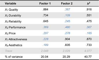
Table 6. Comparison between pairs where r is effect size.
Experiment 2
With a 12:1 ratio of samples and variables (using both sets of responses from each test person) we had slightly above the appropriate number of samples required to perform factor analysis (10:1 appropriate according to (Lattin et al., 2003)). All eight variables were positively correlated (with at least one correlation above 0.4 for each variable), but since the determinant was 0.003 (> 0.00001), extreme multicolinearity was not present (Field, 2005). The Kaiser-Meyer-Olkin (KMO) measure of sampling adequacy was 0.832 (> 0.5) (Field, 2005) and Barlett’s Test of Sphericity showed a χ² of 542,742 at p = 0.000 for N = 96 with 28 design factors. All measures of sampling appropriateness (MSA) were above the recommended level of 0.5 (Hair, et al., 2006). Two factors were extracted using the scree plot elbow rule and Kaiser’s rule to retain all factors with λi > 1 (Lattin et al., 2003). The initial factors explained 75.86% of the variance. After rotation the two factors explain 68.42% of the total variance. The initial eigenvalue of the third, unretained factor was 0.603. CarMax rotation of the matrix of loadings was used to maintain orthogonal (independent) factors. In the table below, factor loadings are displayed. For the current sample size, an approximate guideline for significant loading is 0.60-0.55 (Hair et al., 2006). In experiment 2, the factor score covariance was above 0.7 for both factors scores (.880 and .891), indicating internal consistency of the solution.
Table 7. Rotated Factor Pattern/Structure Matrix.
Loadings below 0.55 are displayed in blue italic and h2 denoting communality.
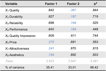
Table 8. Comparison between pairs where r is effect size.